Skyscanner rebrand is sunny with a chance of Speedos
There's more than a hint of skimpy beachwear to this new logo design.

Sign up to Creative Bloq's daily newsletter, which brings you the latest news and inspiration from the worlds of art, design and technology.
You are now subscribed
Your newsletter sign-up was successful
Want to add more newsletters?
Travel brands have a tough time of it in general. With a few very rare exceptions – currently, Airbnb springs to mind – we tend not to care too much about travel brands. When it comes to booking holidays, loyalty to a particular brands ranks far below more pressing concerns such as getting the best deal on your chosen destination.
Skyscanner's one of those brands that you'd go with if it could get you an excellent price on the holiday you wanted, but that's probably the full extent of your brand loyalty. However it hopes to change that with its bold new branding and logo design, developed with Koto.
The company's old logo was an unintrusive and uninspiring effort in muddy cyan, with a symbol that looked like the sort of thing you'd see on a weather map to suggest an afternoon of partly cloudy weather.
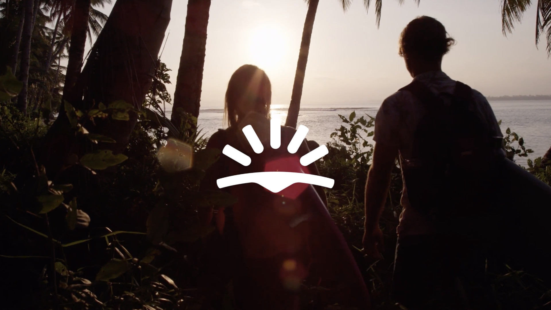
Article continues belowThe new symbol, says Koto, is a key step in Skyscanner's brand evolution. It's described as embodying the optimism of a sunrise as well as the positive impact that the company wants to have on the world of travel. Skyscanner also notes that it combines the four elements that reflect its brand's mission: optimism, sustainability, ideas, and places to discover.
We get the sunrise bit; the stylised shape underneath, though, we're not quite so sure about. To us it looks more like a pair of skimpy, low-rise Speedos. Which, to be fair, is just the sort of thing that you might want to pack if you were booking your dream holiday through Skyscanner, so fair play there.

And there's much more to this project than the new Skyscanner logo. Koto acknowledges that a brand shouldn't stop at the splash screen, and so it's developed a whole design system for Skyscanner to use across all its touchpoints.
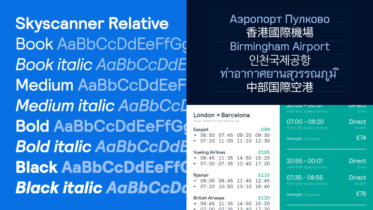
There's a bespoke sans-serif font, Skyscanner Relative, as well as an eye-catching colour scheme that starts with Sky Blue (#0770e3) and features a supporting palette of warm tones that are meant to reflect its variety of possible destinations.
Sign up to Creative Bloq's daily newsletter, which brings you the latest news and inspiration from the worlds of art, design and technology.

As well as that, there's also new photography, illustration from Skyscanner's in-house team, and iconography to help guide customers through Skyscanner's site. It all adds up to a bold look, and it's hard not to be impressed by it.
However at the same time, we're not sure it's about to change anyone's relationship with travel brands; we suspect most people will remain focused on the bottom line rather than the logo design, but we definitely admire its ambition. Find out more about it over at Koto.
Related articles:

Jim McCauley is a writer, performer and cat-wrangler who started writing professionally way back in 1995 on PC Format magazine, and has been covering technology-related subjects ever since, whether it's hardware, software or videogames. A chance call in 2005 led to Jim taking charge of Computer Arts' website and developing an interest in the world of graphic design, and eventually led to a move over to the freshly-launched Creative Bloq in 2012. Jim now works as a freelance writer for sites including Creative Bloq, T3 and PetsRadar, specialising in design, technology, wellness and cats, while doing the occasional pantomime and street performance in Bath and designing posters for a local drama group on the side.
