
It's the age-old logo design dilemma. You've spend decades building up brand equity in a well-known and much-loved wordmark. But it's starting to feel dated. Do you go for occasional small tweaks that most people won't notice, but which will subtly bring your design up-to-date, as Aston Martin has done recently? Or do you go for broke, and head off in a radical direction?
The latter path is fraught with danger. You could alienate your audience, who miss the old logo and hate the new one. Or you might lose sales, as people simply don't recognise the new design as your brand (Tropicana's failed 2009 packaging redesign is a cautionary tale here).
But that shouldn't necessarily disuade you. Because sometimes taking a brave and radical new direction can really pay off, and the new logo for Orion Pictures, shown above, is a textbook example. As a reminder, here's what the old logo for the MGM-owned movie studio looked like...

For those of a certain age, this classic design will evoke fond memories of cinema trips from the 1980s and 1990s, to see films like Dances with Wolves, The Silence of the Lambs, Bill & Ted's Excellent Adventure, The Terminator and Robocop. And doubtless some will feel it's a logo that should never be changed.
But we beg to differ. Because while this new logo is a big departure, we feel it captures the essence of the original in a fresh, attractive and exciting way.
To put this into context, we've spent the last 10 years on Creative Bloq reporting on logo redesign, and most have followed a very familiar pattern. Take the original logo, reduce it down to its essentials, and reset it in a flat, minimalist, sans-serif font that makes it look remarkably similar to every media and tech company. Thrillingly, the new Orion logo goes in a very different direction.
Colour, depth and movement
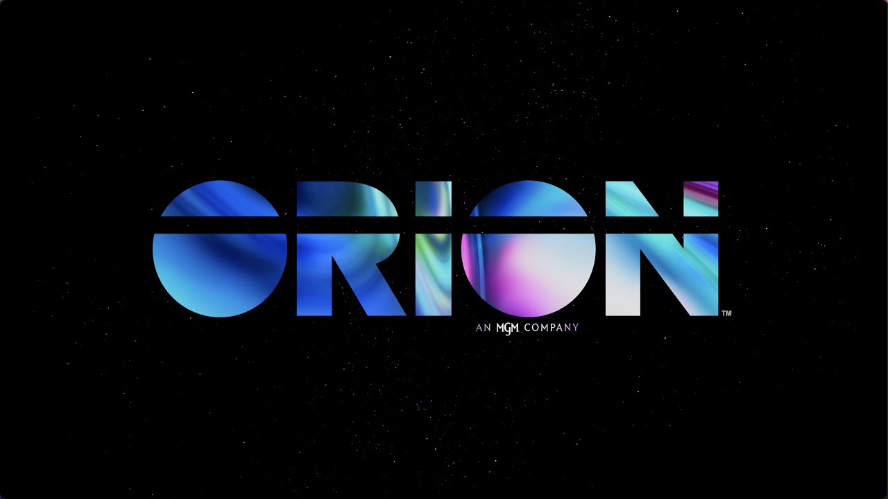
The switch to bright, Gen Z-friendly hues – tapping into the vaporwave trend while still staying crisp and professional – is the most obvious change. But as well as going from monochrome to colour, this new design makes clever use of gradients to a dramatic sense of depth and roundedness. It's not skeumorphism by any means, but it really does feel three-dimensional.
We love the way the shading of the 'O's suggests a planet, and how the solid, geometric letterforms exude confidence and authority overall. You also get an instant feeling of movement; which couldn't be more suitable to a motion picture studio.
All of this, though, might have looked a little overblown without the radical extension of the black line through the letters. To our eyes, it's slightly jarring but in a good way; imbuing the design with a strong point-of-view, and keeping it on the cutting edge for a 2020s audience.
In practice, of course, audiences are going to experience this design not as a still image but part of a motion sequence. And so to fully appreciate how well it works, it's worth watching the 17-second clip above, which shows how it will actually appear on cinema and TV screens.
Fresh yet familiar
Just like age-old intro cinema fans know and love, it begins with an image of dancing stars, before the logo swims into view. But the new sequence updates it brilliantly, with sleek, modern animation and extravagant bursts of colour and light. Here Orion has hit the perfect balance, as everything looks reasssuringly familiar, yet fresh and new at the same time.
Orion says the new logo aims to reflect a more inclusive approach to storytelling at the studio. And while the colour palette is not exactly a rainbow – that kind of literalism would have seemed pretty clunky – that still kind of makes sense to us. And suitably enough, the new logo is premiering with the Amazon Prime release of Anything's Possible, a coming-of-age story that follows Kelsa, a confident high school girl who is trans, as she navigates through senior year.
Read more:

