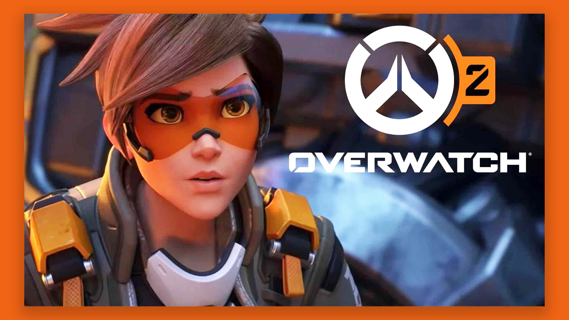
Turns out the Overwatch 2 logo features the world's tiniest design fail
It's not quite pixel-perfect.

Sign up to Creative Bloq's daily newsletter, which brings you the latest news and inspiration from the worlds of art, design and technology.
You are now subscribed
Your newsletter sign-up was successful
Want to add more newsletters?
Gamers can be a fussy bunch, and with catastrophes like the botched Cyberpunk and GTA 'remaster' launches over the last couple of years, they've had plenty to complain about. But this just be the most ridiculous objection yet – and it's right up our street.
Yep, we love a good logo design fail here at Creative Bloq – especially one that's hardly visible to the naked eye. One Reddit user has spotted that the logo for Overwatch 2, released this month, isn't quite pixel perfect. One side of the supposedly symmetrical symbol is 1px higher than the other. Bin the whole thing! (You won't find a pixel out of place in our roundup of the best logos of all time.)
Yep, one Redditor has noticed that the logo on the 'waiting for game' screen isn't quite symmetrical. And hey, while it might seem insignificant, we're pretty sure more than one graphic designer has been kept awake at night by a single pixel out of place.
Article continues belowAnd as you might expect, Redditors have been responding to the find with appropriate indignation. "Blizzard needs to publicly apologize for this if they want people to keep playing. It's unacceptable," one user comments, while another adds, "Thanks, I can't unsee this now." As some have pointed out, this is actually a pretty difficult mistake to make – haven't the designers heard of Adobe Illustrator's mirror tool? If you're reading, folks, may we direct you to our roundup of the best Adobe Illustrator tutorials.
Read more:
- Is this really the most offensive logo?
- We still can't get over this hilarious Tesla logo resemblance
- The Coca-Cola logo: a history from 1886 to today
Sign up to Creative Bloq's daily newsletter, which brings you the latest news and inspiration from the worlds of art, design and technology.

Daniel John is Design Editor at Creative Bloq. He reports on the worlds of design, branding and lifestyle tech, and has covered several industry events including Milan Design Week, OFFF Barcelona and Adobe Max in Los Angeles. He has interviewed leaders and designers at brands including Apple, Microsoft and Adobe. Daniel's debut book of short stories and poems was published in 2018, and his comedy newsletter is a Substack Bestseller.
