Ryan Gosling is still traumatised by the Avatar logo design

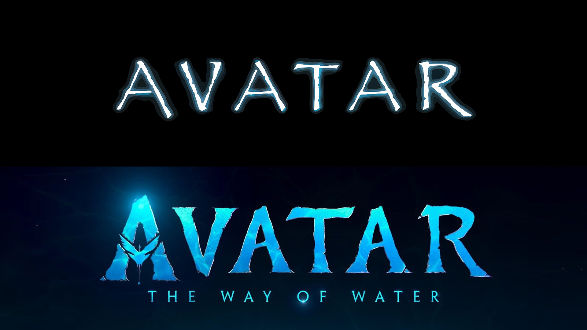
It's not often that typography and logo design become recurring subjects for television comedy, but Saturday Night Live's 2017 skit on the Avatar logo and the Papyrus font is one of show's most memorable pieces. And like James Cameron's blockbuster movie, it deserved a sequel.
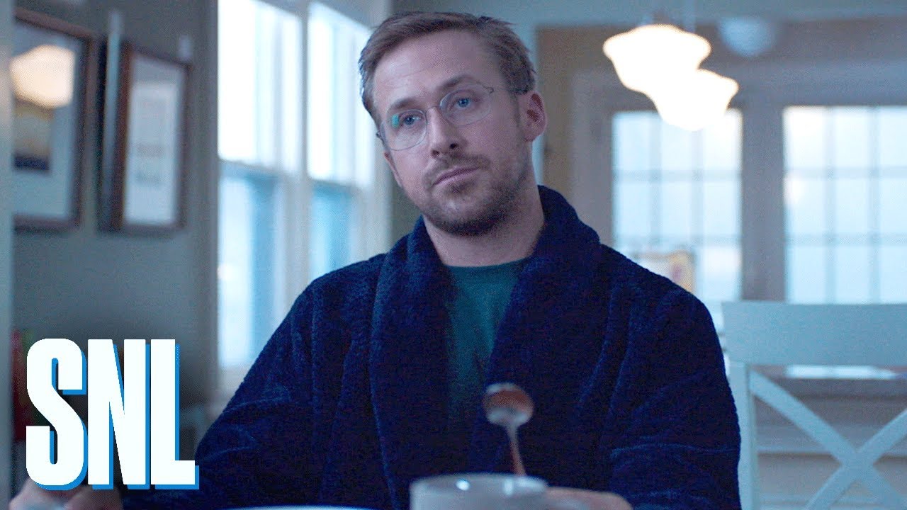
Ryan Gosling has reprised his role as the graphic designer haunted by Disney's 'lazy' decision to use Papyrus for the Avatar logo design. Can he finally get closure? (See our pick of the best free fonts for alternatives).
The original Saturday Night Live Paprus skit (see below) has racked up 22 million views on YouTube. It's perhaps natural, then. that Gosling should choose to revisit the piece in his third stint hosting the show.
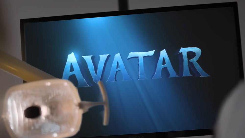
Article continues belowPapyrus 2 picks up after the traumatic events of the first sketch, taking us through the protagonist's progress as he undergoes therapy to get over his obsession – until he's triggered by seeing 2022 sequel Avatar: The Way of Water and the slight font change in the new Avatar logo during a trip to the dentist. That sends him on a downward spiral with a cinematic twist.
Gosling clearly still carries the trauma with him. Avatar: The Way of Water actually uses a new bespoke font named Toruk. Ahead of the release, director and co-producer James Cameron has finally broken his silence on the matter, telling Empire magazine "Just think of how much we could have grossed if it wasn't for that damn font."

Asked by Chris Costello, who designed the font back in 1982 if Papyrus was used to reference Indigenous tribes, Cameron says: "I was not aware that our font was an off-the-shelf thing; I assumed the art department or the title company came up with it. Of course, it was trolled mercilessly as a lazy choice, but frankly, I like the font."
"Ryan Gosling needs to get out more, instead of freaking out over our font," he adds in jest. "Time to move out of your mom's basement, Ryan! And if Papyrus resonates with the issues of Indigenous cultures in the public consciousness, then that fits well with Avatar, so I'm not losing any sleep over it."
Sign up to Creative Bloq's daily newsletter, which brings you the latest news and inspiration from the worlds of art, design and technology.
See our pick of the best free handwriting fonts for more type inspiration, and check out the brick-inspired typeface in the new Lego branding.

Joe is a regular freelance journalist and editor at Creative Bloq. He writes news, features and buying guides and keeps track of the best equipment and software for creatives, from video editing programs to monitors and accessories. A veteran news writer and photographer, he now works as a project manager at the London and Buenos Aires-based design, production and branding agency Hermana Creatives. There he manages a team of designers, photographers and video editors who specialise in producing visual content and design assets for the hospitality sector. He also dances Argentine tango.


