Study reveals most popular startup typefaces and pairings
Are the 'cool' fonts really as popular as they seem?

Sign up to Creative Bloq's daily newsletter, which brings you the latest news and inspiration from the worlds of art, design and technology.
You are now subscribed
Your newsletter sign-up was successful
Want to add more newsletters?
Having picked apart fonts for years over here on Creative Bloq, we're pretty tuned in to the fact that lettering styles can be rather divisive. After all, one designer's fun font is another person's Comic Sans (apologies to all the Comic Sans defenders out there).
We like to think that we've noticed some typography trends this year, but what we really need is some hard data to give us a glimpse into which fonts people are actually using. Luckily that's just what the team at Icons8 have gone and done with its recent study.
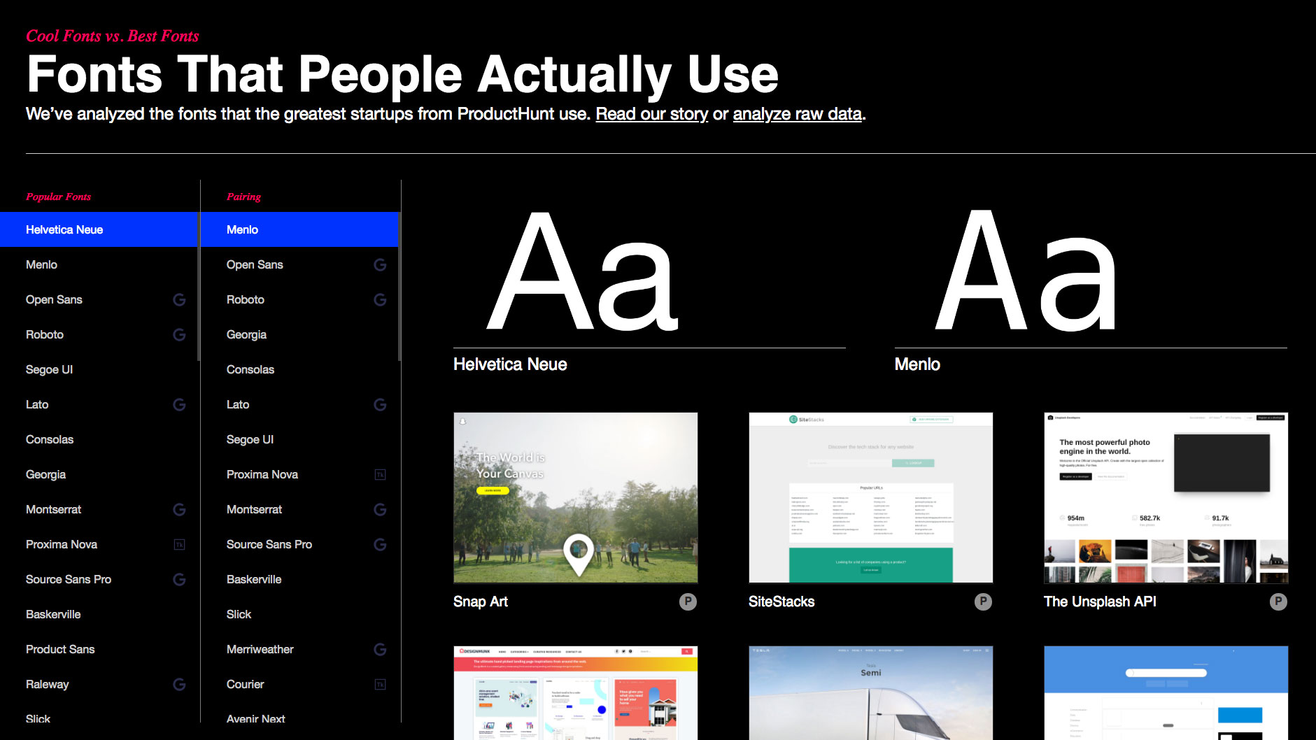
The results of this research can be found on the study's straight-talking website, Fonts That People Actually Use. Priding itself on exposing the cool fonts vs. the best fonts, this research explores which fonts are the most popular, what font combinations are the most effective, and whether or not designers actually follow these trends and rules.
Article continues below 
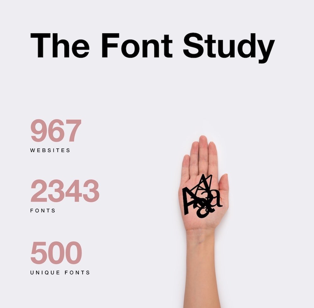
To gather its research, Icons8 analysed more than 900 websites from top Product Hunt startups. By checking the choice of typeface and font combinations on these sites, Icons8 made interesting and occasionally unpredictable findings.
As it happens, Google Fonts lead the way in terms of popularity, font names are often misspelt, and our old friend Comic Sans is nowhere to be seen (apologies again to all the Comic Sans defenders out there.)
As well as finding thousands of different typefaces, Fonts That People Actually Use also narrowed down the top 50 styles and the 50 most common font pairings. The styles that proved most popular include Open Sans, Roboto, Lato, and Montserrat.
With a wealth of raw data to analyse, Icons8's findings are sure to appeal to type fans and data junkies alike.
Sign up to Creative Bloq's daily newsletter, which brings you the latest news and inspiration from the worlds of art, design and technology.
Related articles:

Dom Carter is a freelance writer who specialises in art and design. Formerly a staff writer for Creative Bloq, his work has also appeared on Creative Boom and in the pages of ImagineFX, Computer Arts, 3D World, and .net. He has been a D&AD New Blood judge, and has a particular interest in picture books.
