
Google has been gradually rolling out new icons across the whole of Google Workspace this year, but it was only with the update to Gmail's logo last month that many sat up and took notice. Users were becoming increasingly flummoxed by the confusing similarity between all of the new designs – but it seems help might finally be at hand.
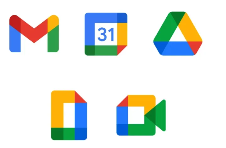
The icons for Gmail, Google Photos, Google Maps and many more have been transformed into much more minimalist versions of their previous designs, all featuring the same four colours: blue, green, red and yellow. One of the key qualities of our best logos is how unmistakeable they are, and Google isn't doing itself any favours with its bafflingly consistent icons.
In response to the controversy, one designer has shared a free Chrome extension designed to take you back to simpler times (just what we all need in 2020). Yep, Claudio Postinghel's 'Restore old Google icons' does exactly what it says on the tin, bringing the originals back to your Chrome tabs and favourites. No more accidentally opening Google Docs instead of Google Meet when you're already late for your meeting.

Unsurprisingly, considering the initial reaction to the new suite of icons, users are loving Postinghel's extension. "Thanks!! Now I'll finally stop mistakenly go on Drive to write down emails," one user comments on ProductHunt, while another adds, "OMG thanks! Gave the new icons time to get use to... can't do it. Driving me crazy." The extension will certainly be good news for this particular Twitter user:
Please tell me there's a Chrome extension that replaces Google's rebrand with the old (better) logos. Genuinely struggling to tell my tabs apart at this point.October 29, 2020
From these new Google Workspace icons to Microsoft's new Bing logo, it seems tech brands are striving for consistency across their software logos. Indeed, Google says that the new designs are meant to emphasise the fact that Google's Workspace apps are "part of the same family". Judging by the response, it seems the company has been a little too successful in that regard. If Google is looking for a little inspiration next time around, these 23 stunning iOS app icons are a solid place to start.
Read more:

