Microsoft rebrands Bing (and we’re not sure what to think)
Was this really the best name available?
Microsoft's Bing might not be the most popular search engine on the web, but that doesn't mean it isn't deserving of a fresh coat of paint every now and again. The company has just announced a new name and logo for the service – and one is much more impressive than the other.
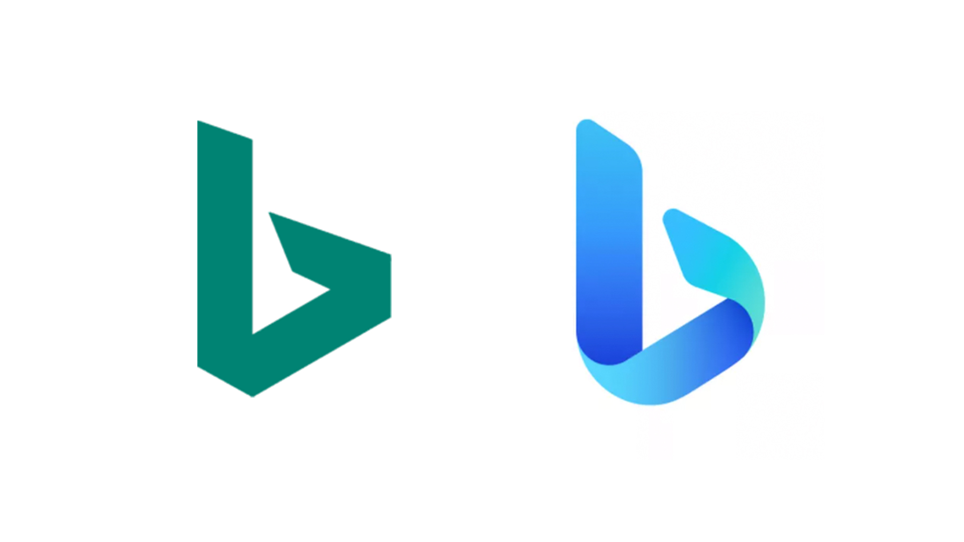
The new logo (below) is a more contemporary take on the lowercase 'b', with a friendlier curved design as opposed to the original's more geometric aesthetic. Eschewing the current flat design trend, the new symbol's subtle gradients give it a slightly 3D look. While we wouldn't exactly call it one of the best logos of all time, it's certainly an improvement over the sharper original.

Microsoft has also announced that from today, Bing is officially called Microsoft Bing. Catchy, right? Okay, it's not the most inspired choice, there's at least some rationale behind the moniker. Microsoft says the name "reflects the continued integration of search experiences across the Microsoft family," citing Bing's (sorry, Microsoft Bing's) presence in other applications such as Microsoft Edge, Microsoft 365 and even Microsoft Flight Simulator.
Article continues below 
This isn't actually the first time we've seen the new Bing logo – Microsoft appears to have been testing it since April. But this is the first time the new design has been rolled out to all users.
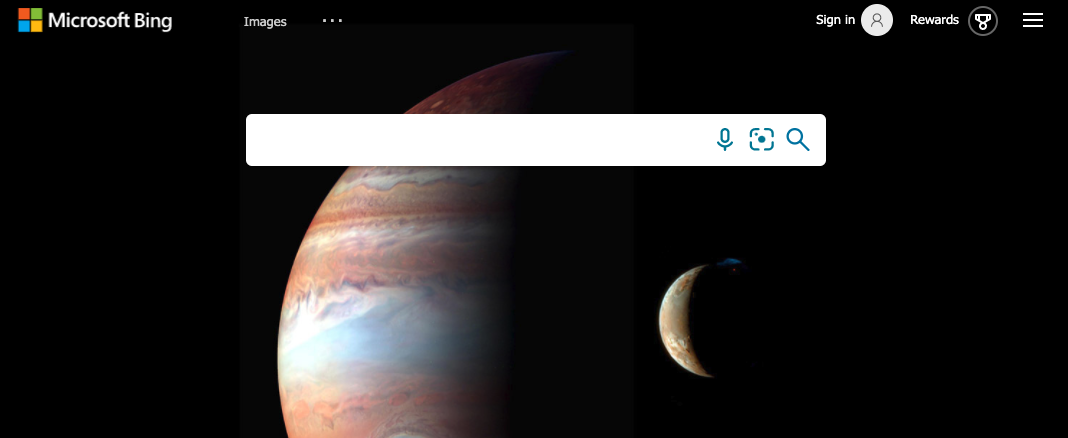
That said, while the new Microsoft Bing logo now appears across the service's social media accounts, the website itself currently features a new version of the Microsoft logo which reads Microsoft Bing (above). Perhaps the new 'b' symbol will eventually take its place, or maybe Microsoft is eventually planning to replace the 'b' with this more generic Microsoft-themed design. Either way, the discrepancy is a tad confusing.
With Google bringing its Gmail logo in line with the rest of G Suite, it seems tech brands across the board are keen to make their various service icons more consistent. And while we're hardly fans of the new name (let's just say we can't see Microsoft Bing becoming a verb like Google), the classy new logo is a winner for us. Overall, it's hardly the worst rebrand we've seen recently (find out if people still hate last year's most hated rebrands).
Read more:
Sign up to Creative Bloq's daily newsletter, which brings you the latest news and inspiration from the worlds of art, design and technology.

Daniel John is Design Editor at Creative Bloq. He reports on the worlds of design, branding and lifestyle tech, and has covered several industry events including Milan Design Week, OFFF Barcelona and Adobe Max in Los Angeles. He has interviewed leaders and designers at brands including Apple, Microsoft and Adobe. Daniel's debut book of short stories and poems was published in 2018, and his comedy newsletter is a Substack Bestseller.
