The past couple of years have seen Microsoft update many of its icons to bring them inline with its Fluent Design System. A process, which, in short, aims to create simplicity and coherence across its entire platform. Today, Microsoft's search engine Bing is the latest of its services to receive the Fluent design treatment, and the results are surprisingly impressive.
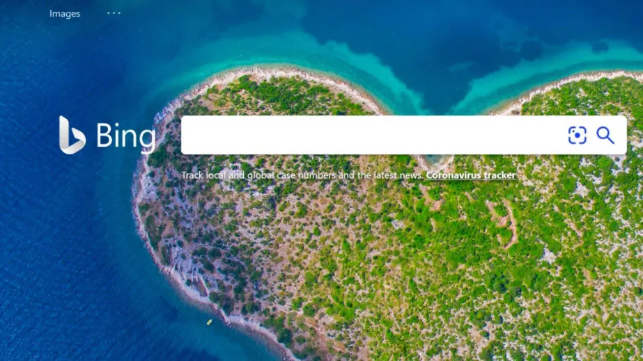
The new Bing logo keeps the immediately recognisable lowercase 'b', but loses the sharp edges in favour of a much curvier design. There are also some very subtle, gorgeous new gradients in there too. While it seems like a simple change, the effect is quite profound, with the old, quite harsh design replaced with a sleek, classy new look. Is it enough to make it on to our list of the best logos of all time? Or make people choose the service over Google? Doubtful. But it's definitely a step in the right direction.

However, we can’t help but think Microsoft could have extended the redesign to update the font as well. Or maybe gone all out and changed the name too – is it just us or does Bing feel super-'90s?
Whatever you think, there's no denying the new Bing logo falls in line with the uniformed, more modern look Microsoft is going for. The Windows logo led the way, with Microsoft's Office app icons quickly following suit.
The new Bing logo doesn't appear for everyone just yet, and there's no news on when – or indeed if – it will be fully operational. The Thurrott website suggests the company may be A/B testing the new logo with a limited number of users, so whether it will make it to the masses remains to be seen. If it does make the cut, our guess it will be rolled out to everyone in the coming weeks and months.
Read more:

