The new Ant-Man 3 posters are a Photoshop nightmare
Are these the worst posters of the entire MCU?
Sign up to Creative Bloq's daily newsletter, which brings you the latest news and inspiration from the worlds of art, design and technology.
You are now subscribed
Your newsletter sign-up was successful
Want to add more newsletters?
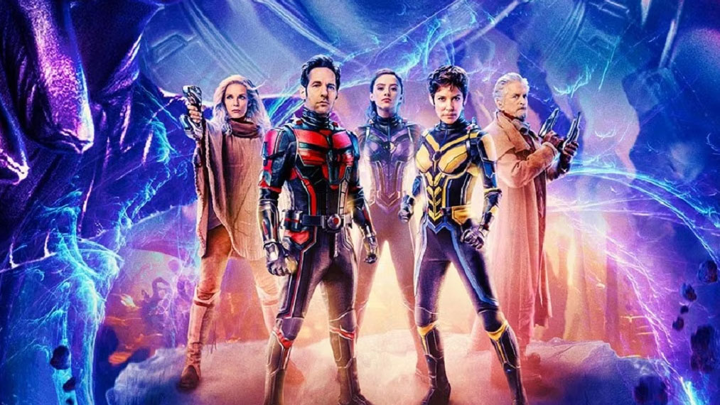
A new batch of posters have been released for Marvel's upcoming film, Ant-Man and The Wasp: Quantumania. We can't believe how different the designs are from the original Ant-Man posters – and not in a good way. This series of posters spotlight the characters from the movie, with some featuring them as individuals and others as a group. In both instances, though, there are problems (which include some pretty hilarious Photoshopping).
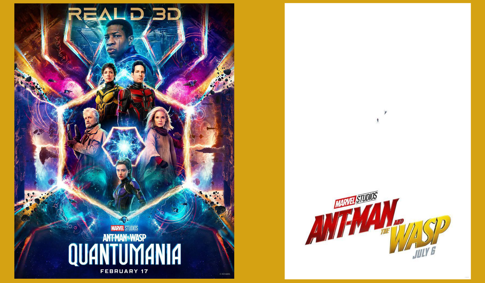
This designs, which feel like Marvel threw a bucket of 'extra' at the page with no real concern for the overall effect, are completely at odds with the original Ant-Man posters, which oozed confidence with their minimalist design. How, we wonder, did they go from some of the best poster designs we've seen, to this?
If you need inspiration from a good film poster design, take a look at the new Scream 6 poster that has fans guessing. (There's a rumoured hidden message that may or may not reveal who Ghostface is.)
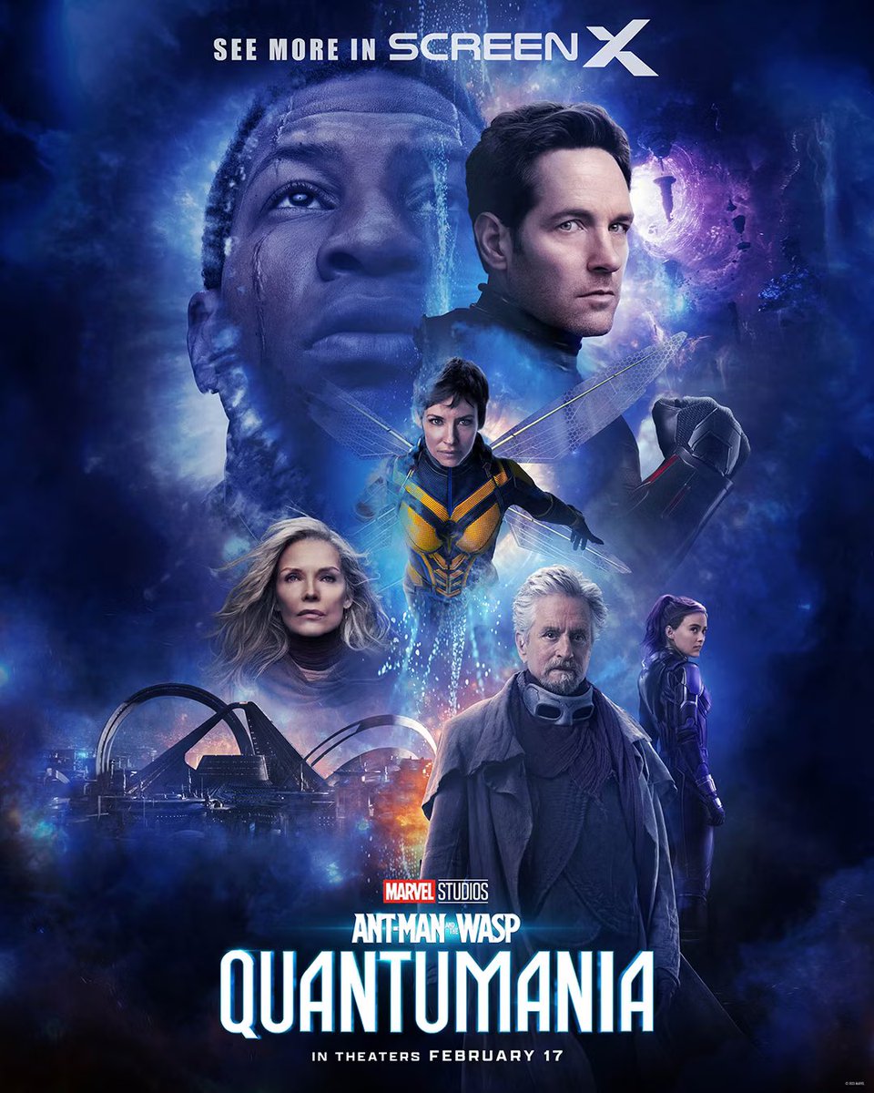
Many Marvel fans are in agreement online, noting multiple issues with the designs and wondering where it all went wrong. We'll point out a few remarkable issues with the posters here, starting with this unbelievable Photoshop blunder.

Ah, the perils of Photoshop. Look at Paul Rudd and Evangaline Lilly. Look at their heads. LOOK AT THEIR HEADS. Who Photoshopped them on, and why are they so big? Why has half of Rudd's face melted? Why is the lighting different on all of them? So many questions, so little time.

Is there a reason why the stream of water that's running down the page is making The Wasp look as if half her head is missing?
And the clunky placement of the characters set against that skyline in the bottom-left corner is less than subtle.
Sign up to Creative Bloq's daily newsletter, which brings you the latest news and inspiration from the worlds of art, design and technology.
"And so the MCU's pattern of "awesome-looking teaser posters followed by hideous final poster" continues," said one Twitter user, with others commenting on the overuse of floating heads and clutter.

The complicated aesthetic of the left-hand poster makes us yearn for the original Ant-Man poster as a palette cleanser. It was clever, confident and witty where the new posters are cluttered, confusing and ill-conceived.
Though we do actually love the colour palettes, the posters would have worked better if they were simpler – and our Photoshop tutorials roundup could have been useful to sort out those issues with their heads.
Read more:

Georgia has worked on Creative Bloq since 2018, and has been the site's Editor since 2023. With a specialism in branding and design, Georgia is also Programme Director of CB's award scheme – the Brand Impact Awards. As well as immersing herself with the industry through attending events like Adobe Max and the D&AD Awards and steering the site's content streams, Georgia has an eye on new commercial opportunities and ensuring they reflect the needs and interests of creatives.
