This ugly free font attacks skewed politics
Ugly Gerry takes aim at gerrymandered US districts.
Sign up to Creative Bloq's daily newsletter, which brings you the latest news and inspiration from the worlds of art, design and technology.
You are now subscribed
Your newsletter sign-up was successful
Want to add more newsletters?
When it comes to sharing the best free fonts we've discovered online, we usually like to bring you the most visually appealing sets. This isn't the case with Ugly Gerry though. As its name suggests, the font is unsightly. In fact it's downright grotesque. However Ugly Gerry looks bad deliberately because it's inspired by the equally unappealing practice of gerrymandering.
If you're not down with the political lingo, gerrymandering is the process by which political parties manipulate district boundaries in order to win a numeric victory over the opposition. It's can be a difficult concept to get your head around, but all you need to know is that many people consider it a blight on the political system.
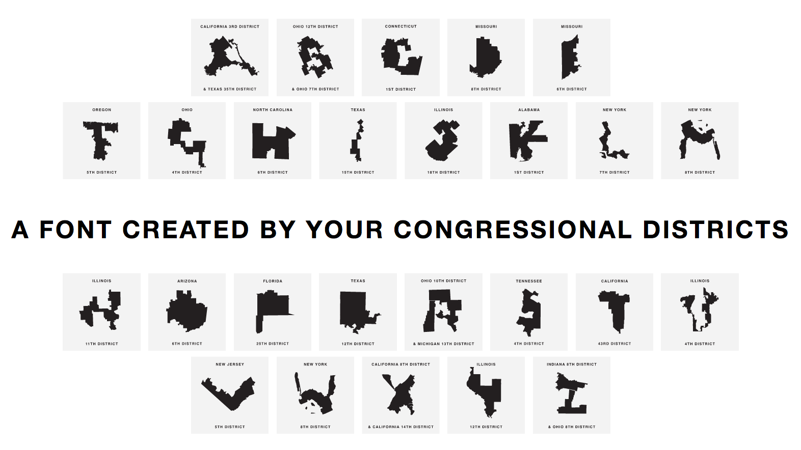
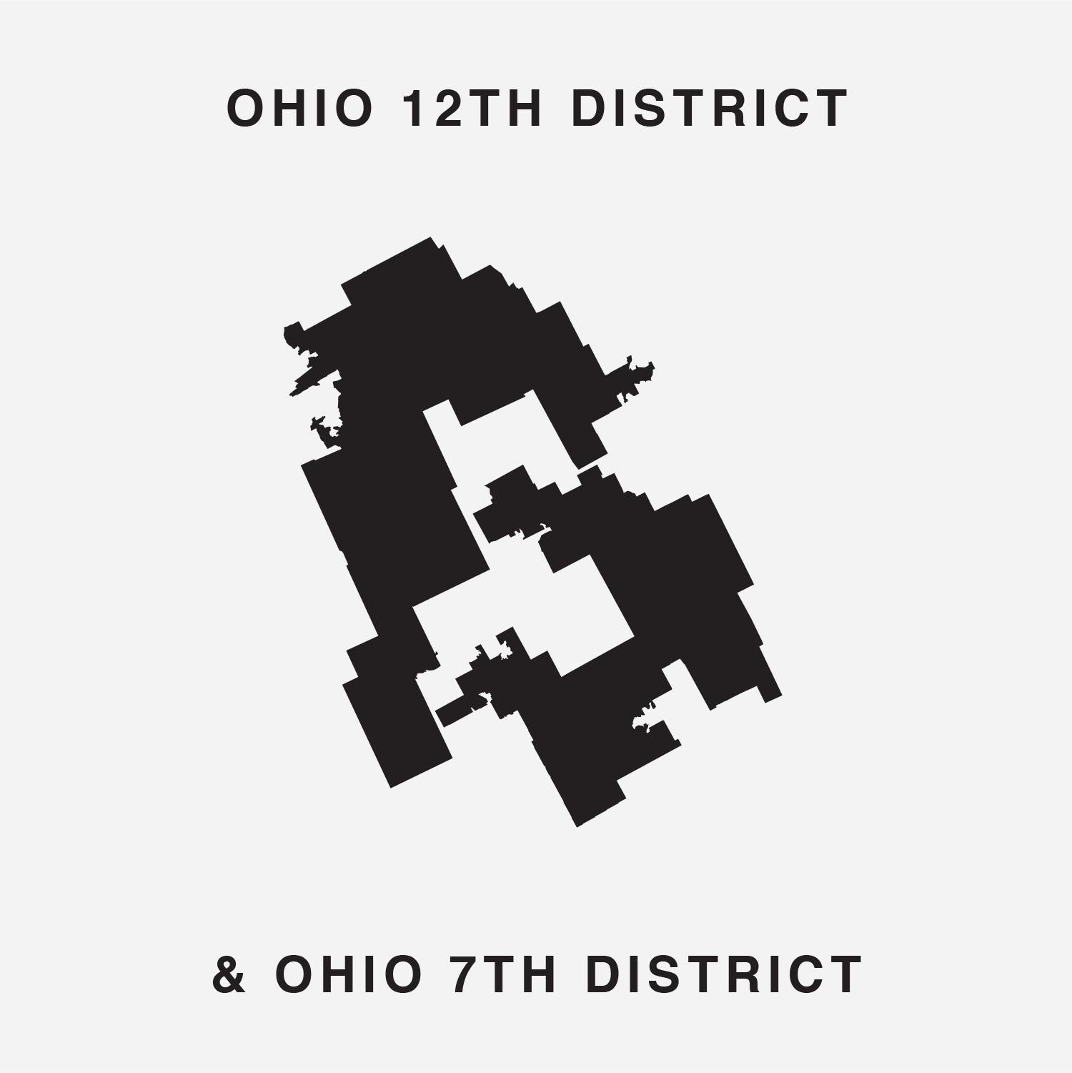
It's fitting then that the ugly process has lead to the creation of an ugly font. Created by Ben Doessel and James Lee, Ugly Gerry uses the shape of gerrymandered US districts to form letters. Check out some of the letters in the gallery below.
Article continues below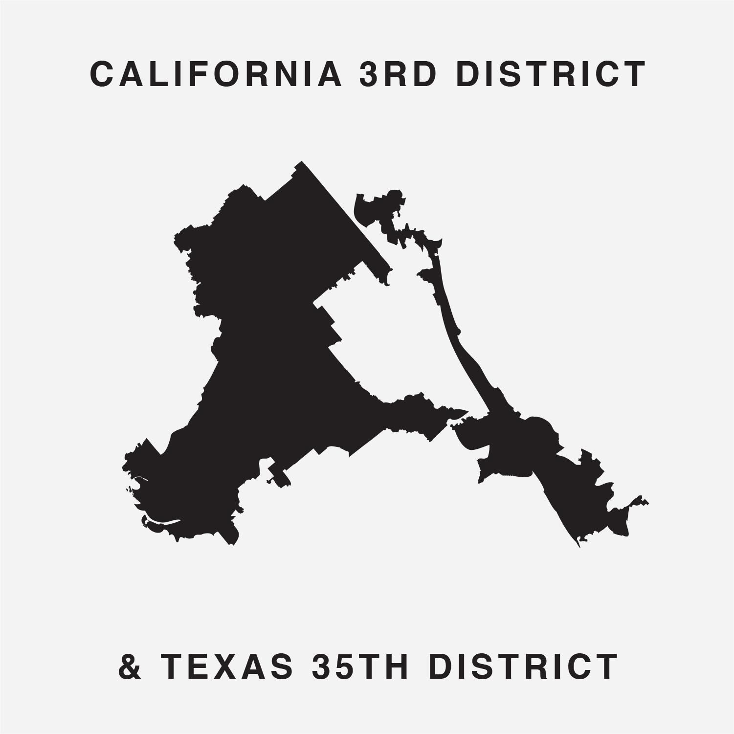
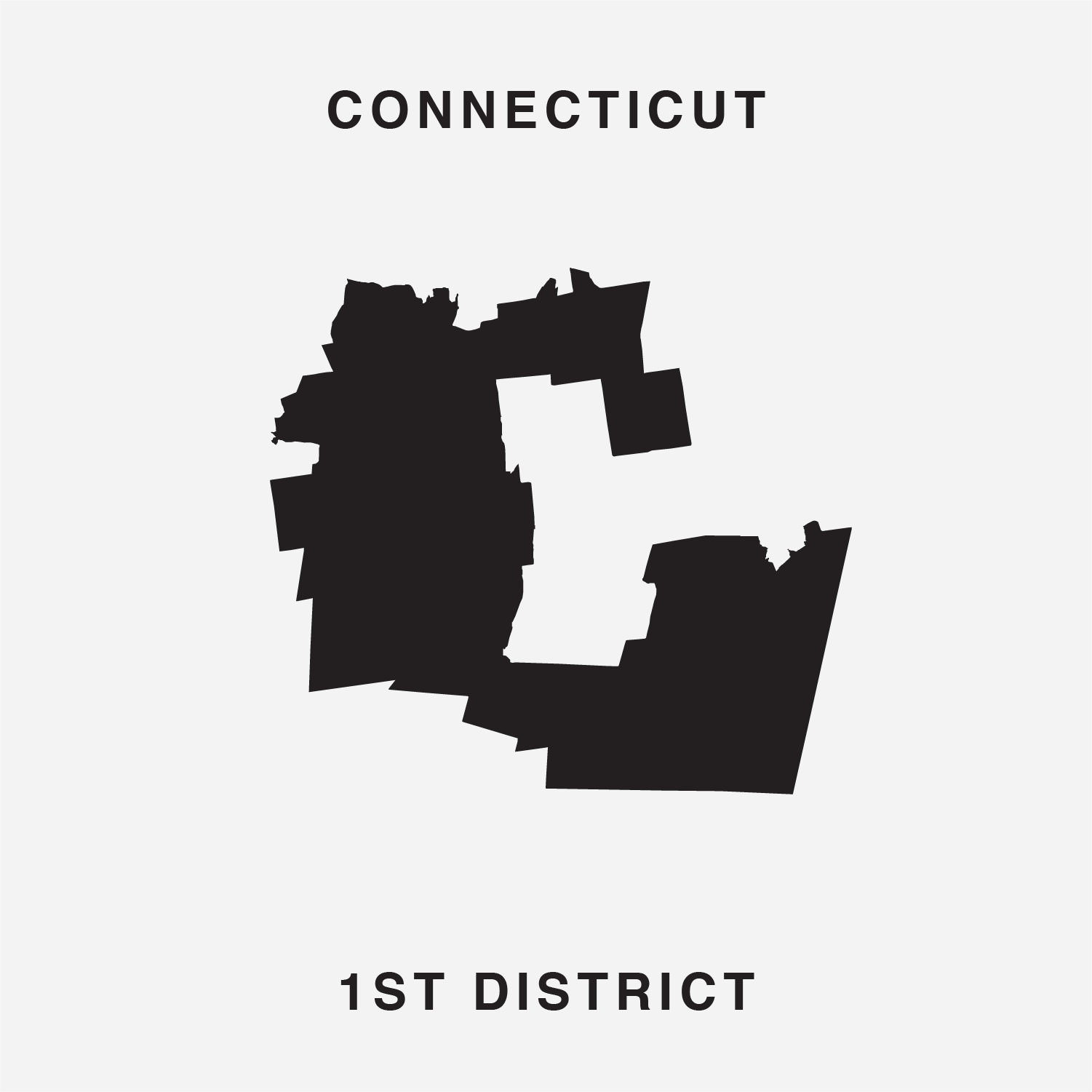
"After seeing how janky our Illinois 4th district had become, we became interested in this issue,” said the Ugly Gerry team in a press statement.
"We noticed our district's vague, but shaky U-shape, then after seeing other letters on the map, the idea hit us, let's create a typeface so our districts can become digital graffiti that voters and politicians can’t ignore."
Not all of the letters were easy to create. For some, Doessel and Lee were forced to combine two different districts, although this seems weirdly in-keeping with the boundary-blurring political process they're attacking.
So while Ugly Gerry might not be the most attractive font you'll ever see, it does highlight a problematic issue beautifully. Its creators also explain in the font's Twitter bio that they want people to use Ugly Gerry to tell congress "how happy you are your vote doesn't matter". If this sounds like something you want to get involved with, you can download Ugly Gerry for free, and tweet your representatives about it for good measure.
Sign up to Creative Bloq's daily newsletter, which brings you the latest news and inspiration from the worlds of art, design and technology.
Related articles:

Dom Carter is a freelance writer who specialises in art and design. Formerly a staff writer for Creative Bloq, his work has also appeared on Creative Boom and in the pages of ImagineFX, Computer Arts, 3D World, and .net. He has been a D&AD New Blood judge, and has a particular interest in picture books.
