Delightful ice-cream packaging is a design treat
Ice cream-maker Subisú's new branding by Futura will make you yearn for the summer.
Sign up to Creative Bloq's daily newsletter, which brings you the latest news and inspiration from the worlds of art, design and technology.
You are now subscribed
Your newsletter sign-up was successful
Want to add more newsletters?
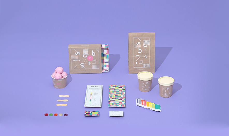
Lots of things can influence the style of certain branding; with specific products linked to particular colours or characters, it can be hard to be inventive with a new project. When it comes to ice cream, it can be all-too-easy to head in the same direction as previous offerings, but Mexican agency Futura have done something different.
Discover 21 oustanding uses of colour in branding
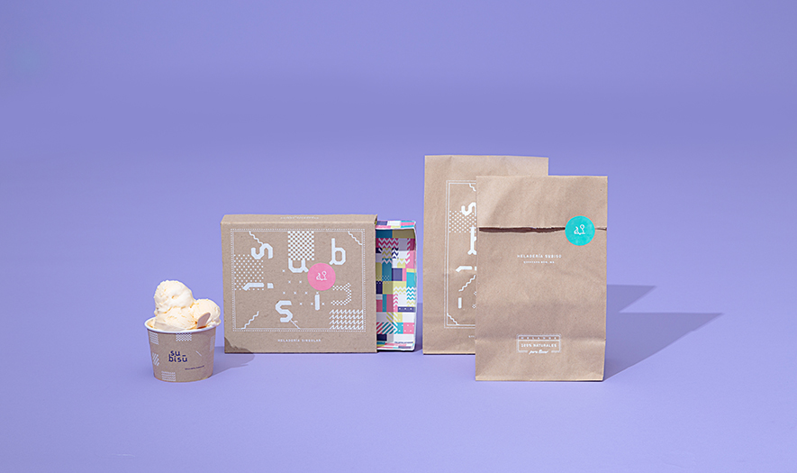
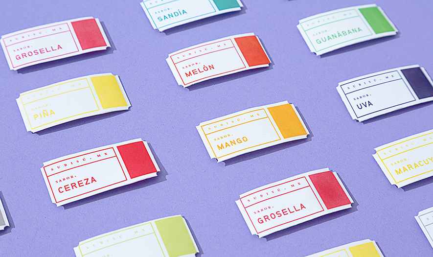
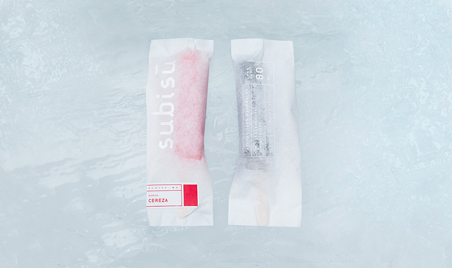
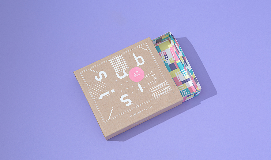
Mixing in bright colours, futuristic typography and an almost pixelated pattern, the branding is an absolute delight. The little touches – such as the stripped-back ice-lolly packaging or the simple sticker designs – makes the whole project come together under one, inspirational roof.
As the winter months begin to close in, let's be thankful we still have beautiful and bright branding such as this from Futura to remind us that summer will roll around once again. Take a look at some of the features up-close below.
Like this? Read these!
- The beer branding revolution of 2015
- The power of colour in branding
- Why brands must reinvent themselves
Sign up to Creative Bloq's daily newsletter, which brings you the latest news and inspiration from the worlds of art, design and technology.

Sammy Maine was a founding member of the Creative Bloq team way back in the early 2010s, working as a Commissioning Editor. Her interests cover graphic design in music and film, illustration and animation. Since departing, Sammy has written for The Guardian, VICE, The Independent & Metro, and currently co-edits the quarterly music journal Gold Flake Paint.
