7 pro tips for creating a self-promotional brochure
Using a beautifully crafted brochure as a mini-portfolio can help you to stand out in a crowded job market, as Simon Tilbrook explains.
Sign up to Creative Bloq's daily newsletter, which brings you the latest news and inspiration from the worlds of art, design and technology.
You are now subscribed
Your newsletter sign-up was successful
Want to add more newsletters?
Five times a week
CreativeBloq
Sign up to Creative Bloq's daily newsletter, which brings you the latest news and inspiration from the worlds of art, design and technology.
Once a week
By Design
Sign up to Creative Bloq's daily newsletter, which brings you the latest news and inspiration from the worlds of art, design and technology.
Once a week
State of the Art
Sign up to Creative Bloq's daily newsletter, which brings you the latest news and inspiration from the worlds of art, design and technology.
Seasonal (around events)
Brand Impact Awards
Sign up to Creative Bloq's daily newsletter, which brings you the latest news and inspiration from the worlds of art, design and technology.
So you're looking for a new job. You want to present yourself as someone creative, with a mind of your own and a song to sing, and you need to stand out from the crowd. As you're a creative kind of person, a regular CV simply isn't going to cut it. But perhaps a self-promotional brochure might.
Okay, you might not call it a brochure. You might instead refer to it as a 'piece', a 'leaflet', a 'mailer', a 'flyer', a 'resume', even a 'mini portfolio'. For ease, let's just call it a brochure. You know what I mean - it's that bit inside that (usually) needs text and images.
01. Bells and whistles

Let's cut to the chase. You need this brochure to work, and you're up against some pretty tough competition, so you're going to want to pull out all the stops. Wonderfully textured paper, vibrant colours, stunning typography, embossing, foiling, die-cutting, packaging it in an coolly understated and environmentally friendly cardboard box, having it arrive by helicopter or be hand-delivered by Brad Pitt/Angelina Jolie (delete as appropriate). Yes, of course. All that. But what about the brochure itself? Because once the employer of your dreams opens that box, you don't want your design or the quality of your brochure printing to disappoint.
02. Consistency
Although you're a multi-faceted person with a wide array of interests and talents, your brochure needs to pull out all the elements of your personality, your experience and skills and bring them together in one cohesive place. This is far from an easy task and there are a few ways in which you might choose to go about this.
One option is to divide your brochure up into a series of chapters. Perhaps each of them will have a particular colour, theme or style. Maybe they will be printed on different paper or have tabs to separate them from their neighbours. Using the same typefaces or the same grid layout will help to ensure they blend and feel right together.
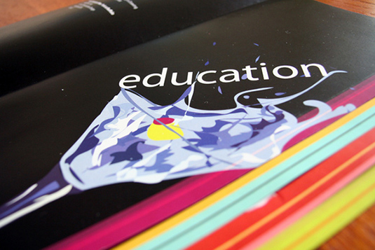
An alternative would be to create several smaller or thinner brochures, all housed within one box or folder. You might decide to make each slightly different, with just a subtle change of colour or a logical number/title progression.
The important thing to ensure is that overall, your personal branding and the quality of your brochure printing remains consistent.
Sign up to Creative Bloq's daily newsletter, which brings you the latest news and inspiration from the worlds of art, design and technology.
03. Words
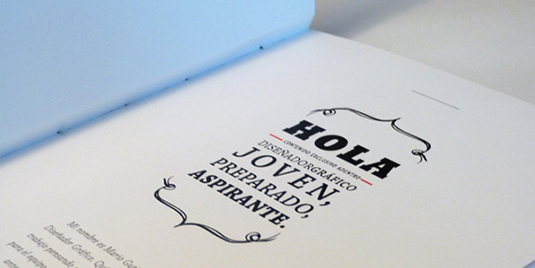
It is absolutely vital not to underestimate the power of the written content in your brochure. Spelling and grammar mistakes are an absolute no-no and again, consistency in style and language is a must. You should aim to write in a fresh, personal style, whilst maintaining professionalism at all times. Keep your text succinct - short and sweet wins out over dreary waffle any day.
04. Images
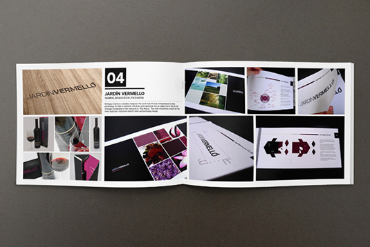
Choose your images wisely and don't overburden the reader with a visual mish-mash. You'll need to select a range of images that showcase yourself and your skills and that create the impression you want.
Images in a brochure serve to reinforce your message. Make sure that you've got the exclusive rights to all images and illustrations, and give credit to any other photographers or illustrators where necessary.
Make absolutely sure that the images you choose are the best you can find, and then improve them wherever you can. Use Photoshop relentlessly! Here's an example of some carefully chosen images in a self-promotional brochure from Juan Alfonso Solís (above).
05. White space
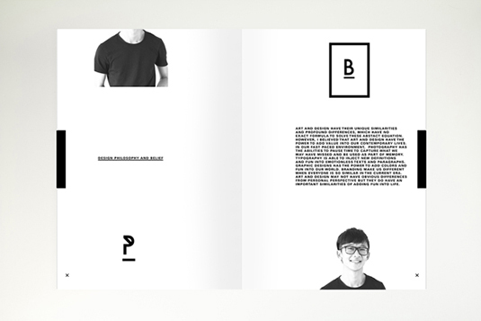
I know that you know this, so I'm not going to go on about it. White space. Use some.
06. Specific brochure printing techniques
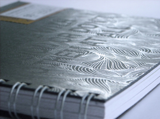
Knowing how the brochure printing process works can actually add a lot to your design. Incorporating letterpress, die-cutting, varnishing, thermography, metallic inks and so on can add real depth (sometimes quite literally) to your design and transform your brochure into something really special. Talk to your printer upfront about what they can offer and it might give you some inspiration that takes your design in a completely different direction.
07. Printing specs
Well before you begin your design, it's important to think about the brochure printing process and make sure that you talk to your printer about their particular specifications at the outset. Choose your paper stocks and chat about any special finishes you require. Ask to see samples and compare prices. The more you know about the process, the more effective your choices will be.
Once you've finished designing, but before you send your beautiful brochure to the printer, double check that your page sizes, bleed settings, margins, gutter areas, etc are correct, and that you've provided the crop marks that your printer needs.
For brochure printing, all images should be high-resolution (i.e. 300 dpi or higher at final output size) and CMYK. Your fonts should all be embedded and if you're printing digitally, you shouldn't use 'Rich Black' (ask your printer whether they have a particular black they recommend if you're unsure about this).
To conclude
Whilst bells and whistles are lovely, it's equally or even more important to create a high-quality brochure that will make that all-important first impression last long enough to secure you a personal interview. By using your existing design skills, together with some knowledge of brochure printing techniques and that vital splash of creative pizazz, there's no reason why you can't get your foot in the door of your dream job.
Words: Simon Tilbrook
Simon Tilbrook is the owner of Swallowtail Print, a premium brochure printing and design firm focused on delivering maximum value to their clients. Further bio on Simon can be found here, and for more design and printing tips connect on Google+.
Liked this? Read these!
- Free graffiti font selection
- Illustrator tutorials: amazing ideas to try today!
- Free Photoshop actions to create stunning effects
- The ultimate guide to designing the best logos
Have you seen a great example of brochure printing and design? Let us know in the comments below!

The Creative Bloq team is made up of a group of art and design enthusiasts, and has changed and evolved since Creative Bloq began back in 2012. The current website team consists of eight full-time members of staff: Editor Georgia Coggan, Deputy Editor Rosie Hilder, Ecommerce Editor Beren Neale, Senior News Editor Daniel Piper, Editor, Digital Art and 3D Ian Dean, Tech Reviews Editor Erlingur Einarsson, Ecommerce Writer Beth Nicholls and Staff Writer Natalie Fear, as well as a roster of freelancers from around the world. The ImagineFX magazine team also pitch in, ensuring that content from leading digital art publication ImagineFX is represented on Creative Bloq.
