Monolithic bottle designs aim to bring people together
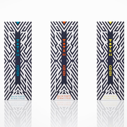
Totem pole fragrance bottles bring together a new tribe of modern life.
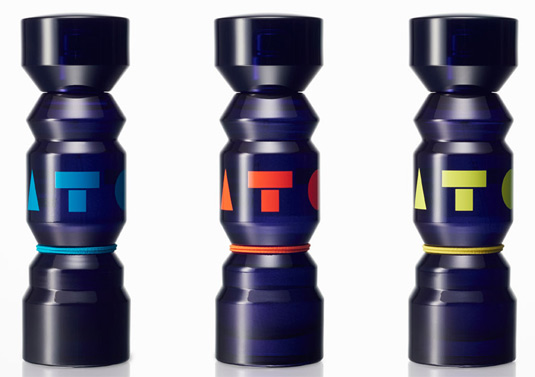
With a product like perfume, it's difficult not to fall back on cliché design choices that are guaranteed to appeal to different genders and age groups. But the tiny totem poll bottles made for Kenzo fashion house aim to bring everyone together.
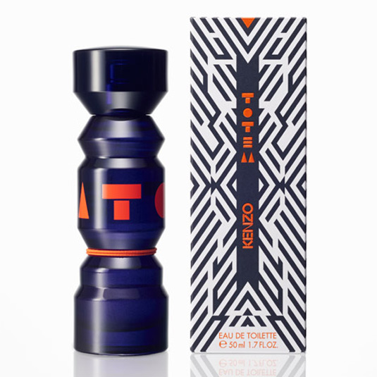
Designed and created by Japanese studio Nendo, these bottles will hold Kenzo Parfums' new Totem unisex fragrence.
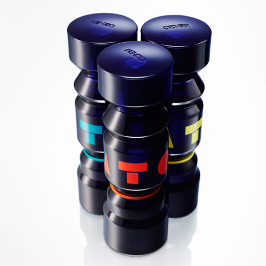
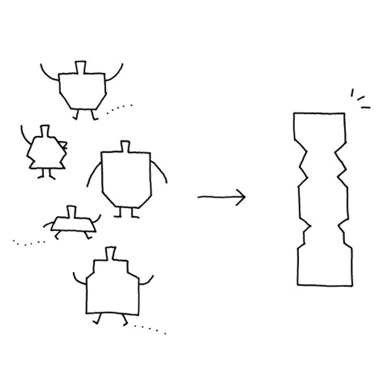
Composed of different-shaped elements stacked into one unified tower, the totem poll symbolises how everyone is now connected through technology and globalisation.
"This simplistic and bold design is a highly symbol-oriented attempt to capture and blend the primal with the transnational; two defining essences of the generation at which this new fragrance is aimed," Nendo explains.
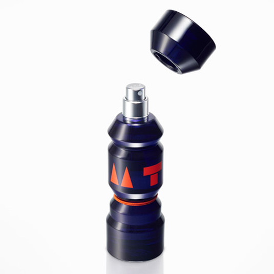
Made from dark purple glass with a neutral logo palette, browse the imges below to see how the totem's monolithic design will unite users.
Liked this? Read these!
- When whisky packaging meets album artwork
- Get started with food packaging design
- 12 top packaging design resources
Sign up to Creative Bloq's daily newsletter, which brings you the latest news and inspiration from the worlds of art, design and technology.

Dom Carter is a freelance writer who specialises in art and design. Formerly a staff writer for Creative Bloq, his work has also appeared on Creative Boom and in the pages of ImagineFX, Computer Arts, 3D World, and .net. He has been a D&AD New Blood judge, and has a particular interest in picture books.
