Get started with food packaging design
Lisa Hassell extracts some insightful packaging design tips from six top industry pros.
In the days before advertising, the concept of packaging design was virtually unknown. Today, FMCG (fast moving consumer goods) is a massive, lucrative industry with billions of pounds spent on packaging that plays on our tastes, lifestyles, emotions and aspirations to sell products.
From the luxurious brands that line up Selfridges Food Hall, to the supermarket own brands that promise quality food at unbeatable prices, it is often the way the packaging looks that persuades the shopper to buy the product inside it.
For designers keen to see their artwork 'on-shelf' there are seemingly endless possibilities for getting creative with this medium. There are no set rules to follow when designing for product packaging and there are many options in the layout, size, shape, colour palette and more. Understanding the market, and the consumer is however, more of a challenge – and as our experts reveal, the process can be more complicated than it looks.
All-female New Zealand outfit Brothers Design believe that today's consumers are attracted to something that's a little bit different. "It has to be fresh, inspiring, clever, beautiful, charming…" says creative lead, Paula Bunny. "This attraction starts to connect and engage, and it applies even with everyday basic items." Established in 2007, the seven strong team are best known for their work with leading New Zealand FMCG brand Pams. Bursting with a distinct, own-able personality and style, Brothers pride themselves on their deliberately non-formulaic approach.
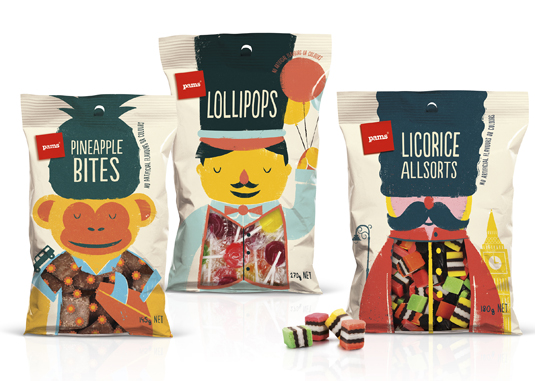
"We try to stay clear of any expected, generic or corporate look," stresses Bunny. "It's one important reason why Pams has been so successful and attracted global attention." Each brief demands a fresh idea, whilst staying true to the Pams brand essence of 'Simple, everyday pleasures' and core philosophy of being 'for the love of food', continues Bunny. "The way we ensure the brand remains recognisable is through consistent personality and an underlying style aesthetic: clean and modern, friendly and down to earth."
For each new project, the studio begin by visiting supermarkets and researching the category, taking shots for reference, observing new trends, brand looks or personalities, harnessed with their drive to create something fresh and exciting to shake things up. Our working relationship with Foodstuffs is very collaborative," says Bunny, who reveals that this has come as a result of years of tweaking and refining their process and developing the Pams brand. "There is a lot of trust. We get the opportunity to be clever and brave on every brief."
Irish illustrator Steve Simpson agrees that it's a fantastic and unique time to be working in packaging design. "In the past the only illustrators who had their names on products were book and editorial illustrators – it was very rare for the general public to know who the packaging designers/illustrators were."
Sign up to Creative Bloq's daily newsletter, which brings you the latest news and inspiration from the worlds of art, design and technology.
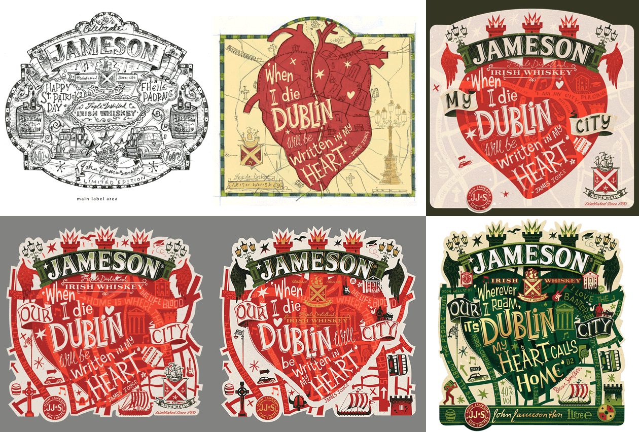
Simpson's portfolio features a range of illustrated labels for small and larger brands as diverse as El Mariachi, Chilly Moo, Mic's Chilli and Jameson. "Nowadays I think clients are very much aware of this. It's become more and more common for clients to ask me to add my name to my labels – it's so great."
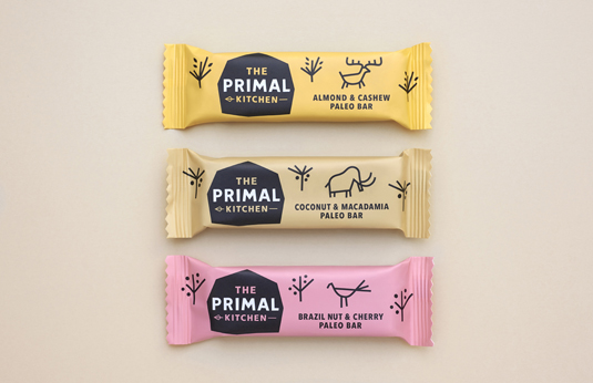
Observing that consumers now look at food and beverage brands as accessories to their lifestyles, London studio Midday recently created the identity for new health food brand The Primal Kitchen, designing the packaging for the UK's first Paleo snack bar.
As with every project, concepts were only penned after the team fully immersed themselves in the brand, which included taking a trip to The Natural History Museum to learn about the lifestyle of prehistoric man, as Vecchio explains. "The origins of the Paleo lifestyle are 2 million years old, so we had to get creative with our research. We developed a cave painting style of illustration which was used on pack to communicate product ingredients and convey the core Paleo message."
The packaging features prehistoric herbivores of the era whom themselves were also consumers of the ingredients contained within each of the products, using colour to differentiate flavor. "We purposely only ever used two colours to create the effect of a more primal style of printing," continues Vecchio. The results are visually striking and tasty. "The modern day consumer is more aware and concerned with making the right choices. Brands need to appeal to their aspirations."
In the same way that you can determine a lot about a person from the clothing labels they wear, the same is true of the brands they drink or the snacks on their desk." Specialising in branding from identity through to packaging, printed comms and digital media, Midday was set up by former Pearlfisher colleagues Claudio Vecchio & Will Gladden in 2012. "Our vision is to create beautifully crafted work with integrity and originality for brands and organisations alike," says creative partner Claudio Vecchio. "We aim not to restrict creativity to one particular field but to welcome diversity and apply critical thought to any type of design challenge."
Re-defining the food and beverage category to create a niche of their own, Brazilian creative Isabela Rodrigues launched Sweety Branding Studio three years ago to represent her thoughtful and refined work, further developing her passion for tactile design and illustration. Attracting attention for bright, playful icons, characters and branding for Illegal Burger, FROO.IT and Juice Meds amongst others, SBS aspired to elevate design to a 'collectable level' creating packaging that appeals on an emotional level.
One of their latest branding projects, for food company Goovi oozes personality and energy, making use of vibrant colours to create a youthful brand. "Our goal is to draw attention with creative, intelligent and awesome packaging," reveals founder and creative director Isabela Rodrigues. "The first step is to understand the project, prepare the team and perceive the customer needs," explains Rodrigues, whose team routinely brain storm together before the they begin the design process. "The market is constantly changing – we need to be aware of what already exists and to run away from it."
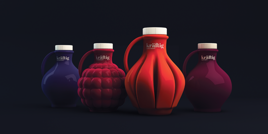
Claudio Vecchio argues that its no longer good enough just to have a great product on shelf, it also needs to be visually desirable or appealing to a particular persons needs and sense of style. "Today consumers expect more from the brands they choose, in this connected age consumers are much more visually aware and savy than they used to be. Consumers have higher standards and as a basic requirement brands need to look the part."
With a penchant towards hand drawn typography and traditional drawing, multi-disciplined designer and illustrator Steve Simpson was commissioned by Jameson Irish Whisky to create the fifth limited edition bottle design. "We went through a lot of sketches and tweaks but they were very sensitive to my original idea," says Simpson of his working process. "They asked me to just come up with something that embodied how I felt about my home town of Dublin. In the end it still had to look and feel like a Jameson label but they also wanted it to look and feel like a Steve Simpson one too."
Undertaking five or six major design changes during the process, the resulting bottle hit the shelves earlier this year in time for St Patrick's Day. "Projects are usually either design or illustration lead and it's difficult to get the two disciplines to blend into a single design sometimes," says Simpson, whose first foray into packaging design was illustrating a label for Mic's Chilli's. "I still see myself as an illustrator, it just so happens that I am illustrating on 3D objects like bottles, books, coffee cups and board games... everything is hand drawn."
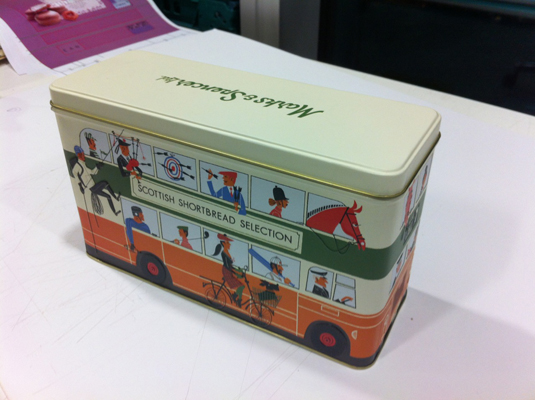
Swedish illustrator Klas Fahlén, whose whimsical illustrations have appeared on packaging for Marks & Spencer and chocolatier Åhléns has also observed the shift. "The industry appears to be moving in a more hand-made graphic design direction in recent years – it has become more important for brands to give sense of smaller locally cultivated products through packaging."
Represented by Agent Bauer and with more than 20 years experience under his belt, Fahlén has taken on every kind of assignment imaginable from small requests to big jobs. "I've done editorials, packaging, books, adverts and design – they all start with a piece of empty white paper you have to fill with something."
Whilst freelance designers and illustrators are starting to get more involved in the packaging design area, it remains difficult to get this type of work unless you already have samples in your portfolio. To stand out amongst the crowd the first thing anyone needs to do is try to be original, says Claudio Vecchio of Midday, who often gets approached by freelancers and illustrators. "Set yourself a self initiated project to demonstrate creativity and your ability to work to the parameters of a brief."
Irish illustrator Simpson also supports this approach. "The advice I usually give is to go to your local farmer's market and find a product you really like in need of good packaging. Quite often there is little money available for these projects but this is usually balanced out by the more creative freedom you get."
For those already working in design and keen to move into packaging, Bunny advises a flexible approach. "It's about having a positive, keen attitude and a willingness to learn, even if it's not where you ultimately want to be. You never know what opportunities will come from it."
Words: Lisa Hassell
Liked this? Read these!
- Up your publishing skills with these brilliant InDesign tutorials
- How to design a poster
- Useful and inspiring flyer templates

The Creative Bloq team is made up of a group of art and design enthusiasts, and has changed and evolved since Creative Bloq began back in 2012. The current website team consists of eight full-time members of staff: Editor Georgia Coggan, Deputy Editor Rosie Hilder, Ecommerce Editor Beren Neale, Senior News Editor Daniel Piper, Editor, Digital Art and 3D Ian Dean, Tech Reviews Editor Erlingur Einarsson, Ecommerce Writer Beth Nicholls and Staff Writer Natalie Fear, as well as a roster of freelancers from around the world. The ImagineFX magazine team also pitch in, ensuring that content from leading digital art publication ImagineFX is represented on Creative Bloq.

