Our Verdict
Fascinating facts and a playful layout make this a worthy tribute to the font that always manages to look modern. The book itself is a thing of beauty, too.
For
- Surprising facts
- Playful layout
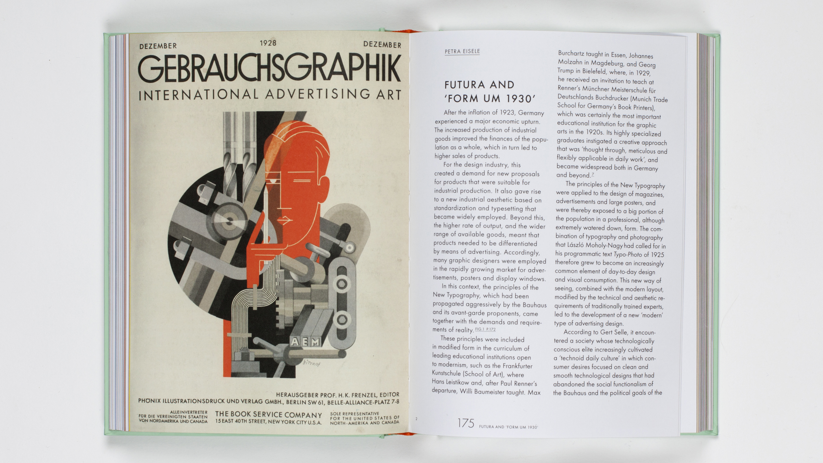
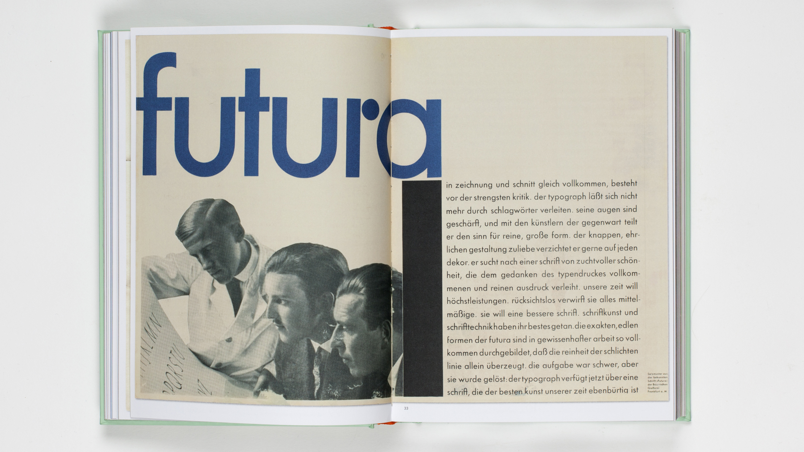
- Historical photographs add context
- Luxurious cover treatment
Against
- That's quite a price tag
Why you can trust Creative Bloq
Futura: The Typeface, by Petra Eisele, Annette Ludwig and Isabel Naegele, is a vast and rather beautiful celebration of Futura, launched to celebrate the typeface’s 90th birthday (published by Laurence King Publishing with an RRP $65/£45). And, as a testament to its superb design, Futura really does look as fresh today as it did back in the 1927.
It's easy to assume that it would be tricky to create an entire book about Futura. But it turns out there’s a lot of mileage in this perennially trendy typeface. Who knew, for instance, that it was the first typeface on the moon? Or that it was Stanley Kubrick's favourite font? Or, in less positive associations, that it was assailed by the Nazis in World War II, used across the party’s propaganda?

Futura, as readers of the book will learn, was created by Paul Renner, a typographer and designer "rooted in the design traditions of the liberal humanist bourgeoisie", as well as a leading member of the Deutscher-Werkbund association of architects, artists, designers and industrialists.
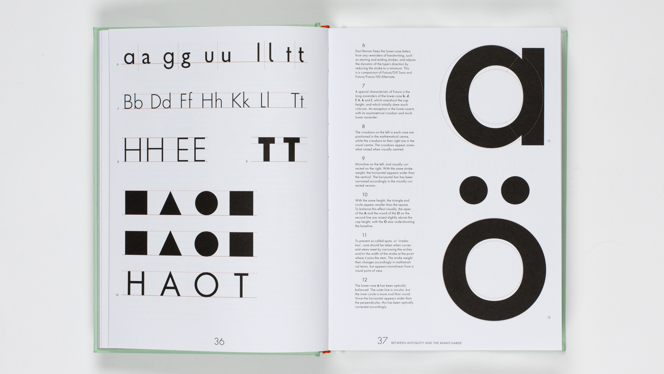
Rather than basing his design – dubbed "the typeface of our time" – on existing sans serifs that were, in that era, deemed inferior to their serifed peers, he looked to antique inspirations for inspiration while simultaneously creating a modern geometric typeface.

As a reference to this sense of geometry, the sections in the book (and sometimes, the text itself) is divided using simple black shapes – circles, triangles and squares are dotted throughout, adding a playful feel to a book that offers a lot in terms of the technical detailing and history of Futura.
The historical photographs bring a superb sense of place and context to the typeface: we see 1920s Frankfurt, Futura’s birthplace, and get a wider understanding of the letterforms’ cohesion with wider ideas around architecture and the meaning of 'modernity' at the time.
Futura, as these pages prove, manages to always feel modern – hence its use on Robert McCall’s poster design for Kubrick’s 2001: A Space Odyssey from 1968 (Futura Extra Bold, to be precise). And as the recommended typeface in the 1976 NASA graphics standards manual for its 'technical character'.
Sign up to Creative Bloq's daily newsletter, which brings you the latest news and inspiration from the worlds of art, design and technology.

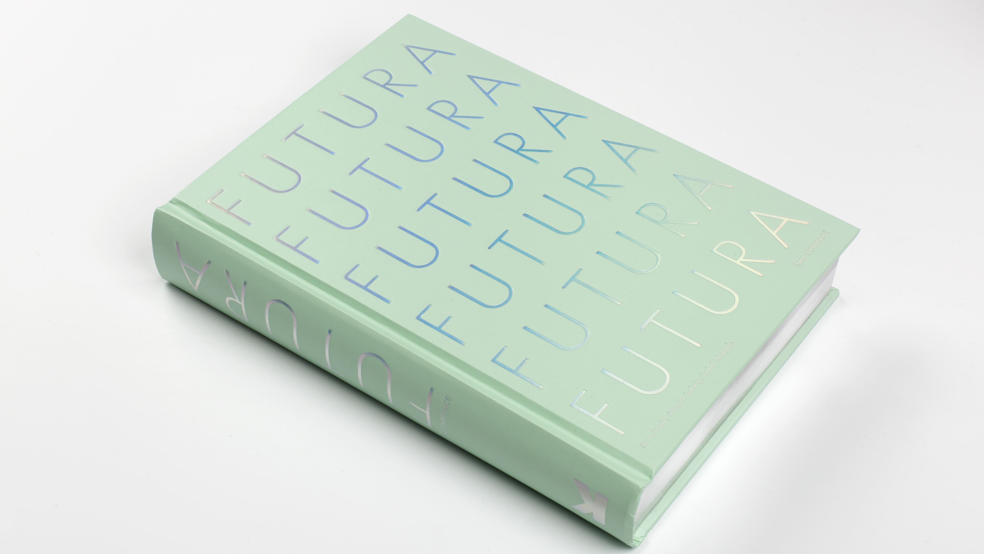
Aside from its contents, the book itself is truly a thing of beauty: the pale turquoise hardback cover is set off by luxuriously embossed silvery type that shimmers like mother of pearl, and reflective silver edging. It’s a modern and reverent look for a thoroughly modern and revered typeface.
Related articles:
- 20 perfect font pairings
- 5 creative uses for fonts you may not have thought of
- 26 books every graphic designer should read
out of 10
Fascinating facts and a playful layout make this a worthy tribute to the font that always manages to look modern. The book itself is a thing of beauty, too.

Emily Gosling is a freelance art and design journalist currently writing for titles including Creative Review, Eye on Design, Creative Boom and People of Print. She’s previously worked at Elephant magazine, It’s Nice That and Design Week, and was editor of Type Notes magazine. Her book Creative Minds Don’t Think Alike was published by Ilex Press in 2018, and she also plays bass as one-quarter of the eight-titted beast, Superstation Twatville.

