Striking cycling posters for Tour de France
Celebrate the end of the sporting event with these gorgeous posters packed full of typographic inspiration.
Sign up to Creative Bloq's daily newsletter, which brings you the latest news and inspiration from the worlds of art, design and technology.
You are now subscribed
Your newsletter sign-up was successful
Want to add more newsletters?
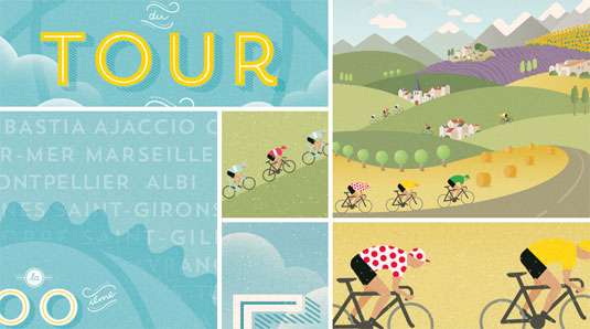
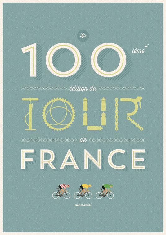
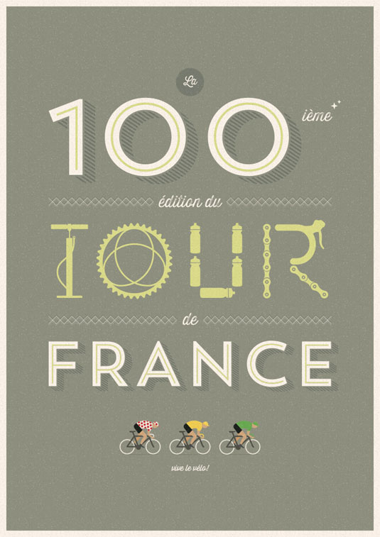
This year marks the 100th edition of the Tour of France. This special anniversary inspired designer Veerle Pieters to design a poster, based on the infographic she had already created for the sporting event.
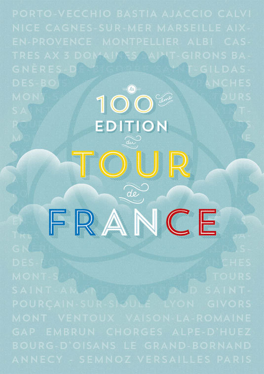
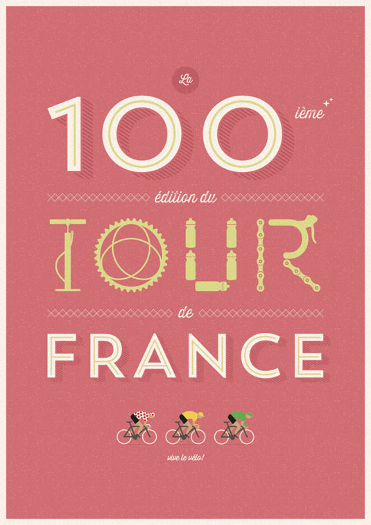
Using the French landscape as a starting point, she slightly changed the composition from landscape to portrait, by moving and rearranging fields and other elements. Using the typefaces Trend and Thirsty Rough, the smaller words such as la, ième and du were drawn manually based on Trend Ornaments.
Keeping things 100% vector-based, the posters are resizable to any possible size without quality loss. This gives Pieters the best flexibility, keeping the file size low as well and don't having to worry about dpi or resolution.
Article continues below 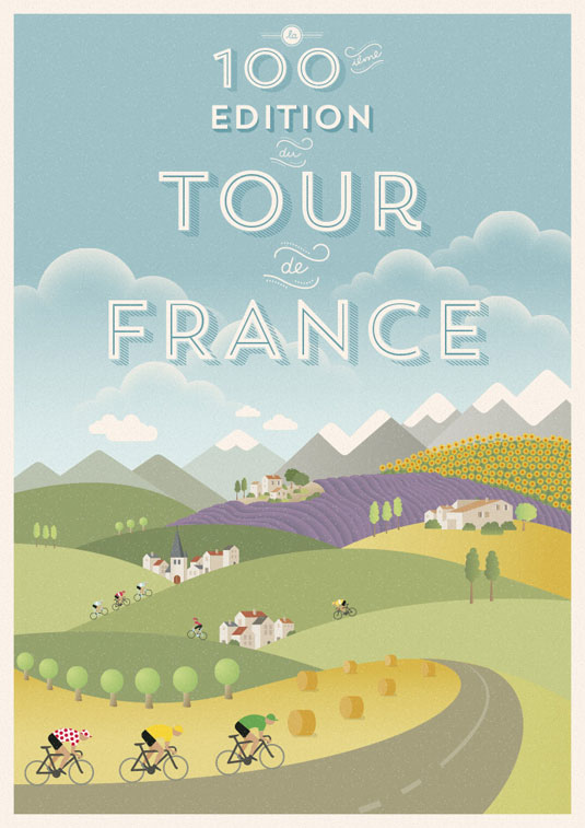
See more inspiring work over on the Veerle Pieters website.
Like this? Read these!
- Free graffiti font selection
- Illustrator tutorials: amazing ideas to try today!
- Great examples of doodle art
Have you seen an inspiring Tour de France poster series? Let us know in the comments box below!
Sign up to Creative Bloq's daily newsletter, which brings you the latest news and inspiration from the worlds of art, design and technology.

The Creative Bloq team is made up of a group of art and design enthusiasts, and has changed and evolved since Creative Bloq began back in 2012. The current website team consists of eight full-time members of staff: Editor Georgia Coggan, Deputy Editor Rosie Hilder, Ecommerce Editor Beren Neale, Senior News Editor Daniel Piper, Editor, Digital Art and 3D Ian Dean, Tech Reviews Editor Erlingur Einarsson, Ecommerce Writer Beth Nicholls and Staff Writer Natalie Fear, as well as a roster of freelancers from around the world. The ImagineFX magazine team also pitch in, ensuring that content from leading digital art publication ImagineFX is represented on Creative Bloq.
