Abstract typography gets to the heart of letterforms
Tim Fishlock delves into symbology, icons from another era, and abstracting letterforms in his latest typography project Shapeset.
Sign up to Creative Bloq's daily newsletter, which brings you the latest news and inspiration from the worlds of art, design and technology.
You are now subscribed
Your newsletter sign-up was successful
Want to add more newsletters?
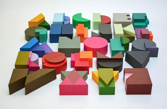
London-based designer, publisher and artist Tim Fishlock is the man behind beautiful 3D typography project Shapeset. "I've been experimenting with designing alphabets and letterforms for the last six or seven years," he says. "The fact that most of the letters in the Roman alphabet began as pictures - icons from another era - has always interested me.
I'm fascinated by symbology and the idea of a pictorial shorthand
"I'm fascinated by symbology and the idea of a pictorial shorthand. I also like the idea of abstracting letterforms to the point where, taken out of the context of the letters that surround them in an alphabet, they become lovely objects in themselves.
"This was something I explored in three dimensions with my Alphabet Relief piece. Encouraged by that, I decided to apply the same construction technique to my best known alphabet, Shapeset."
Article continues below 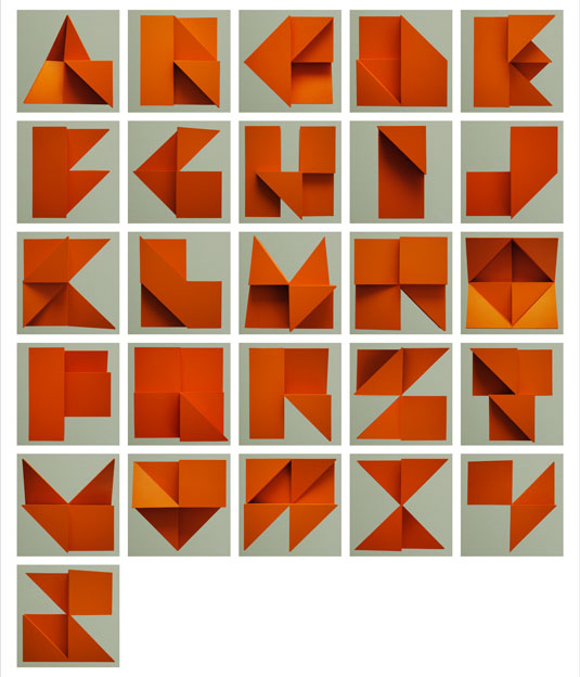
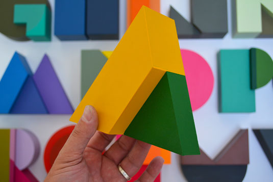
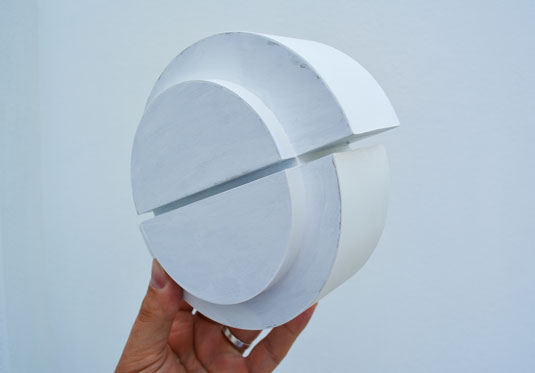
Working on the project on and off for over a month, Fishlock created each letter in the Shapeset alphabet from sections of mount board glued together before hand painting them in acrylic.
"The appeal of the original 2D version of Shapeset is in the semi-transparency of the overlapping colours," Fishlock comments. "The challenge was to reproduce this effect in solid 3D shapes, something I think works surprisingly well."

Like this? Read these!
- Free graffiti font selection
- Illustrator tutorials: amazing ideas to try today!
- Great examples of doodle art
Have you seen any cool typography projects recently? Let us know in the comments below!
Sign up to Creative Bloq's daily newsletter, which brings you the latest news and inspiration from the worlds of art, design and technology.

The Creative Bloq team is made up of a group of art and design enthusiasts, and has changed and evolved since Creative Bloq began back in 2012. The current website team consists of eight full-time members of staff: Editor Georgia Coggan, Deputy Editor Rosie Hilder, Ecommerce Editor Beren Neale, Senior News Editor Daniel Piper, Editor, Digital Art and 3D Ian Dean, Tech Reviews Editor Erlingur Einarsson, Ecommerce Writer Beth Nicholls and Staff Writer Natalie Fear, as well as a roster of freelancers from around the world. The ImagineFX magazine team also pitch in, ensuring that content from leading digital art publication ImagineFX is represented on Creative Bloq.
