The best typography tutorials used to be littered across the web in their thousands, and all for free. But recently, that's changed. Nowadays, they're mostly made as part of paid-for courses, on platforms such as Skillshare. Which makes sense, because good content costs time and effort to make.
But if you want to learn the fundamentals of typography, or boost your skills, and you don't have money to spend, what can you do? To help you out, we've scoured the web to find the best typography tutorials that are actually free.
01. What is typography?

Totally new to typography? Then you'll need to get your head round the basics before you go any further. Our article what is typography? Plus key type concepts you need to know will get you started. We've also got a typography glossary to help you get your head round all the typography lingo (there's a lot of it).
02. The ultimate guide to basic typography

If you're getting started with type, this guide to basic typography will set you on the right course by teaching you the essential terms, clarifying a few terms that tend to get misused, explaining different types of font files, figures and symbols, and even going through some useful typesetting terminology.
03. Typography basics explained
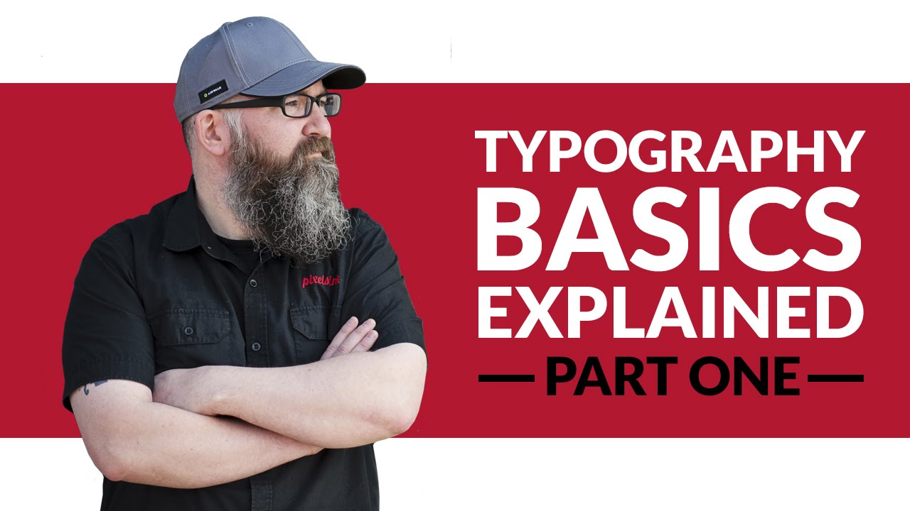
Not sure exactly what typography terms mean? This video gives you a short and snappy overview of the six most important terms, namely typography, body copy, display type, hierarchy, kerning and leading.
Six further terms (tracking, widows and orphans, serif fonts, sans-serif fonts and script & cursive fonts) are explained in part two, which you can watch here.
04. Beginning graphic design: typograhy
This quick cartoon video from Learn.org, complete with a jaunty elevator-music soundtrack, runs through the basics of typography including the different types of fonts and common typography terms. If you don't want to watch a video, there's also a text version of the tutorial.
05. A crash course in typography: The basics of type

It's probably wise to get back to basics before you go running off into the typography sunset. In A Crash Course in Typography: The Basics of Type, Cameron Chapman gives you the lowdown on everything from fonts to displays.
06. 10 rules to help you rule type

This three-and-a-half minute typography tutorial video introduces 10 golden rules to help you improve your type skills and improve your graphic design layouts. Yes, the same text could have just been written as a standard tutorial, but hey, this is just a little more fun.
07. Typography manual critique

One of the best ways to improve your typography is to follow an in-depth critique of what other designers have done when it comes to their use of type. This analysis of the Futur Typography Manual with Molly Drill is full of amazing insights about what to do (and not to do) when it comes to print typography.
08. How to kern type
Kerning is the process of adjusting the spacing between letters to achieve a visually pleasing result. It's one of the most important typography skills you need to learn, so follow Meryem Meg and Brian Hoff's advice about how to get it right in our article 10 top tips for kerning type.
09. Typography design & art direction

This video tutorial investigates a little-discussed but very important topic: how to approach art directing another designer when it comes to typography. The critique focuses around the launch of a new newspaper magazine focused on the business of design, and includes some fascinating insights into its layouts.
10. How to add fonts in Photoshop
Knowing how to add fonts in Photoshop is vital for designers, as it remains the industry standard software for raster graphics editing, and you'll probably be expected to use it as part of your work. In this Creative Bloq tutorial, how to add fonts in Photoshop we explain how to go about it.
11. How to create custom typography in Illustrator

In this Adobe Illustrator tutorial, Dom Designs shows you how to create a custom typography design. He explains how to use tools such as the type tool, how to download and install fonts from Adobe Cloud, use the Pathfinder, Pen Tool and how to add shadows to your text.
12. How to create custom script type in Illustrator

Usually custom typography pieces would be drawn by hand, but in this video Chris Spooner outlines how you can create trendy lettering by customising ready-made fonts in Adobe Illustrator.
13. Create stunning 3D typography in Blender

In this hands-on tutorial, you'll learn to create captivating 3D typography using Blender. Presenter Siri guides you through crafting individual letters to understanding their integration into a 3D space. This tutorial covers creating and refining letterforms using subdivision surface modifiers, setting up realistic lighting like a photography studio, and applying materials for a metal-like finish.
14. Variable fonts explained

Variable fonts can make a world of difference to your designs by giving you precise control over width, weight and line spacing. In our Creative Bloq article variable fonts explained, we explain what they are, how they work, and how to get started with them.
15. How to get started with variable fonts

Want to get started with variable fonts? This four-minute video will give you a brief introduction to the topic, explore where you can find variable fonts that contain a specific axis, and look at how to apply variable fonts using CSS.
16. Kinetic typography in After Effects

Ready to be a kinetic type master? This three part series teaches you everything you need to know to start creating your own kinetic typography masterpieces. In part one, you'll start your kinetic type animation by covering things like precomposing elements for re-use, synching up audio to animation, using layer markers intelligently, and working with complex camera moves.
17. A complete guide to font licensing for designers

Understanding font licensing is crucial to avoid issues with the delivery of a design project. In this Creative Bloq article, a complete guide to font licensing for designers, we provide a quick primer on the basics of font licenses.

