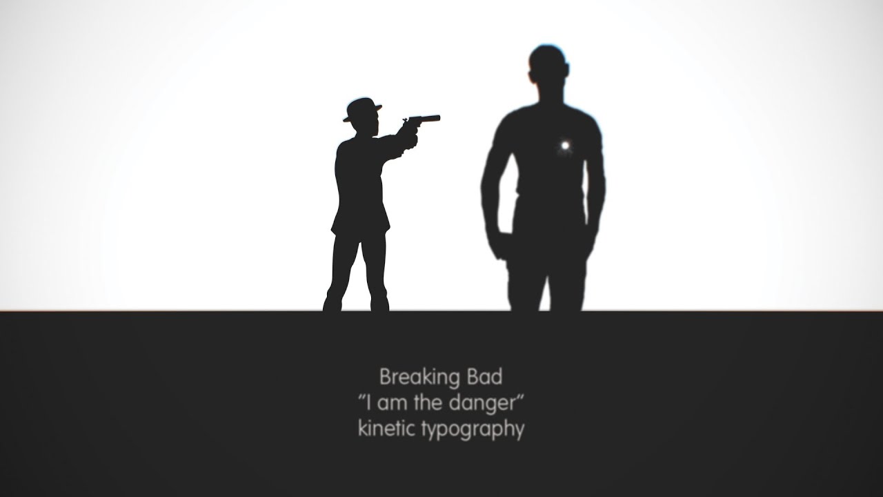
American TV show Breaking Bad has won multiple awards since it first aired back in 2008. Which is hardly surprising when it includes brilliant monologues like 'I am the danger', in which school teacher-turned-criminal Walter White convinces his wife that he's a dangerous man, capable of striking fear into hardened criminals.
Powerful dialogue
Cooper visualises the intense scene through a series of black and white illustrations and text, all cleverly timed to each character's lines. "I chose this particular scene (from season 4, episode 6 "cornered") because of how powerful the dialogue is - and how iconic a speech it was for Breaking Bad as a show. Being a fan of the show, this scene really stuck out for me, it was captivating television and really lent itself to being animated.
"A lot of kinetic typography videos are quite bold, in your face and sometimes hard to read - I wanted to do the opposite here, keeping the text animations quite simple, but interacting with the environment it was placed in. The font, Futura Rounded was a nice companion to the particles, which at times exploded out of text, or at other times gently drfited from the page.
"I kept the colours to a simple black and white pallete as it lent itself to the dialogue - two people who were engaged in a contrasting argument, using two colours to decipher between the two. Anything else would have confused and broken the flow of animation."
Like this? Read these!
- Must-see examples of kinetic typography
- Inspirational examples of packaging design
- Awe-inspiring flip books
Have you seen any cool examples of kinetic typography recently? Let us know in the comments!

