Greatest fonts countdown: 48 – Cooper Black
We're counting down the 100 greatest typefaces in existence. Here's number 48...
Sign up to Creative Bloq's daily newsletter, which brings you the latest news and inspiration from the worlds of art, design and technology.
You are now subscribed
Your newsletter sign-up was successful
Want to add more newsletters?
FontShop AG, the renowned type foundry, conducted a survey based on historical relevance, sales at FontShop.com, and aesthetic quality. With a few additions from the experts at Creative Bloq and Computer Arts magazine, the best fonts ever were selected for the new book, 100 Best Typefaces Ever.
Here we are counting down the 100 greatest fonts, but you can read interviews with some of the typefaces' creators, a brief history of type, the anatomy of a font, and much, much more in the book – find out how to get your copy in print or digital formats at the foot of this post.
But without further ado, here's the 48th best typeface…
48. Cooper Black

- Oswald B. Cooper, 1922
In the advertising heartland of Chicago in 1899, 20-year-old Oswald B. Cooper, the son of a graphic artist, was accepted at the Frank Holme School of Illustration (a school set up by renowned illustrator Frank Holme in the Fine Arts Building on Michigan Ave). Among the classes that Cooper attended there were the writing courses of Frederic Goudy (other teachers included W. W. Denslow, best known for illustrating the first edition of the Wizard of Oz). Five years on, Cooper and his friend Fred Bertsch founded the advertising agency Bertsch & Cooper.
It was here, in 1921, 'Oz' (as he had become known) designed a bold typeface with rounded serifs for a poster, and subsequently released the font in 1922 to Barnhart Brothers & Spindler.
Cooper Black was consistent with the spirit of advertising at that time: simple, friendly and ultimately, robust. It became so incredibly successful that Monotype commissioned a copy – rather ironically from Cooper's teacher Goudy – that was released in 1925 as Goudy Heavyface.

In early 1930, Cooper attempted to protect his font by means of a patent. The case went through three levels of jurisdiction before a judge ruled in 1931 that some of the Cooper Black characters had been taken from a brand logo known prior to 1920. And thus the first attempt to protect the form of a typeface failed.
Sign up to Creative Bloq's daily newsletter, which brings you the latest news and inspiration from the worlds of art, design and technology.
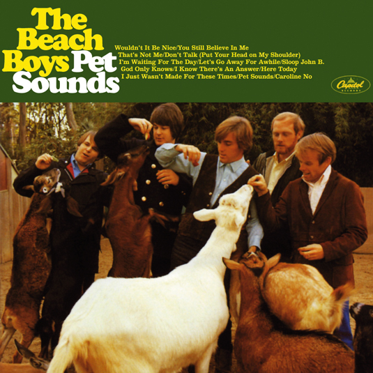
The Beach Boys’ 1966 album Pet Sounds is often credited with the resurgence of the typeface.
This is an extract from The 100 Best Typefaces Ever, the definitive guide to the greatest fonts ever created, in association with FontShop AG.

The Creative Bloq team is made up of a group of art and design enthusiasts, and has changed and evolved since Creative Bloq began back in 2012. The current website team consists of eight full-time members of staff: Editor Georgia Coggan, Deputy Editor Rosie Hilder, Ecommerce Editor Beren Neale, Senior News Editor Daniel Piper, Editor, Digital Art and 3D Ian Dean, Tech Reviews Editor Erlingur Einarsson, Ecommerce Writer Beth Nicholls and Staff Writer Natalie Fear, as well as a roster of freelancers from around the world. The ImagineFX magazine team also pitch in, ensuring that content from leading digital art publication ImagineFX is represented on Creative Bloq.
