
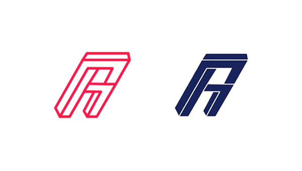
Considering that fonts are usually designed to make words easy to understand, it's surprising to learn that typography doesn't have to be readable. This new impossible typeface design is the latest to push legibility to its limits.
Created by French Art Director Robin Gillet, the geometric design behind the Impossible Font was based on a famous optical illusion called the impossible triangle. Just like the triangle, this font only works as a graphic and is impossible to realise in real life.
Gillet explains that the font is designed to be used mainly as a drop cap, or a header accompanied by a clearer sub-heading underneath. Due to be released for download soon, you can get a preview of the font with the images below.


Liked this? Read these!
- This book will improve your web typography
- Typography is made easy with this free app
- Web trends 2015-2016: dramatic typography

