Jessica Hische gives MailChimp a typography revamp
Giving the MailChimp logo a facelift, typographer Jessica Hische once again showcases her skills.
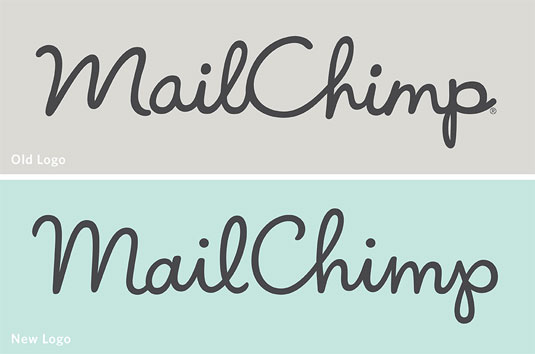
Jessica Hische has many fans amongst lovers of typography and the leading designer was recently asked to tackle a logo redesign for popular email newsletter platform MailChimp.
"They didn’t want to do a massive overhaul," Hische explains, "they just wanted to give their current mark a facelift."
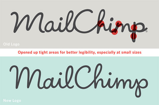
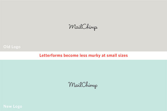
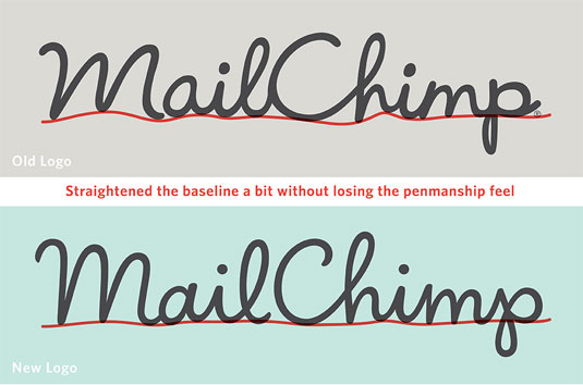
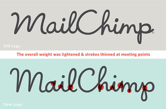
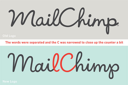
Hische lightened the weight of the logo overall and improved the vector drawing, with the letterforms revised for legibility, especially at small sizes. The end result is a more refined, refreshed look whilst still portraying MailChimp's playful ethos.
Article continues belowWhilst the changes may not be so obvious to those who aren't typography junkies, the annotated images below show exactly how things have been tightened up and improved.
You can see more typography treats over on Hische's website.
Like this? Read these!
- Free graffiti font selection
- Illustrator tutorials: amazing ideas to try today!
- Great examples of doodle art
What do you think of MailChimp's new look logo? Let us know in the comments box below!
Sign up to Creative Bloq's daily newsletter, which brings you the latest news and inspiration from the worlds of art, design and technology.

The Creative Bloq team is made up of a group of art and design enthusiasts, and has changed and evolved since Creative Bloq began back in 2012. The current website team consists of eight full-time members of staff: Editor Georgia Coggan, Deputy Editor Rosie Hilder, Ecommerce Editor Beren Neale, Senior News Editor Daniel Piper, Editor, Digital Art and 3D Ian Dean, Tech Reviews Editor Erlingur Einarsson, Ecommerce Writer Beth Nicholls and Staff Writer Natalie Fear, as well as a roster of freelancers from around the world. The ImagineFX magazine team also pitch in, ensuring that content from leading digital art publication ImagineFX is represented on Creative Bloq.
