Tarot cards get a typography makeover
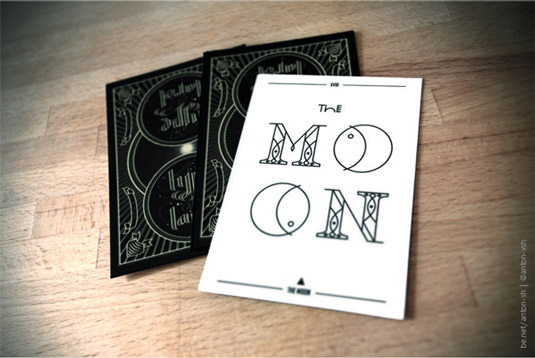
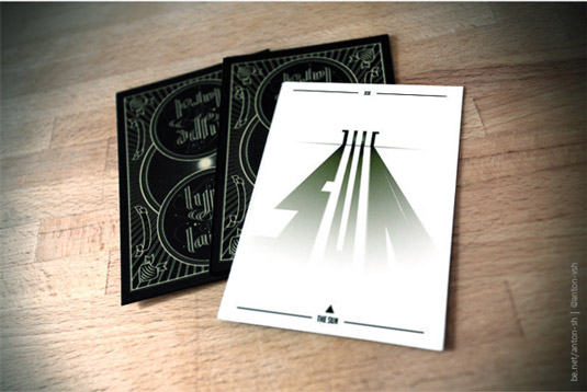
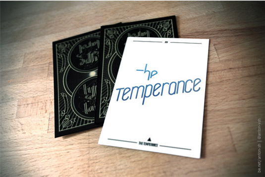
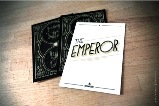
Russian designer Anton Shlyonkin reimagines the ancient art of tarot through typography alone.
Sign up to Creative Bloq's daily newsletter, which brings you the latest news and inspiration from the worlds of art, design and technology.
You are now subscribed
Your newsletter sign-up was successful
Want to add more newsletters?
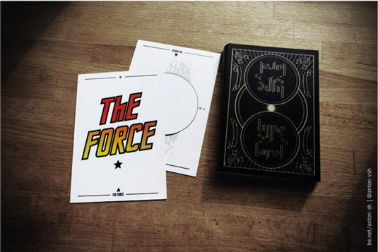
Tarot cards have been in use since the mid-15th century. A way of reading spiritual pathways, they usually feature intricate illustrations that depict their meaning.
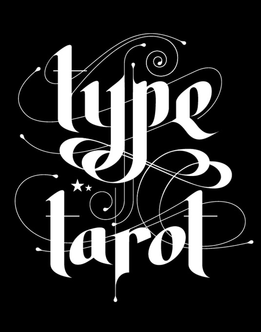
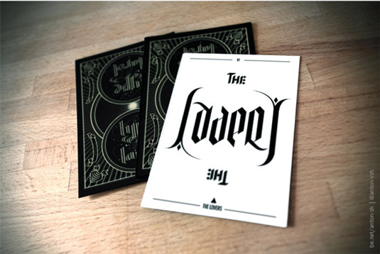
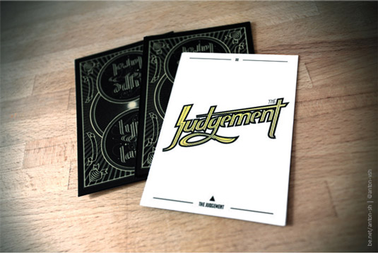
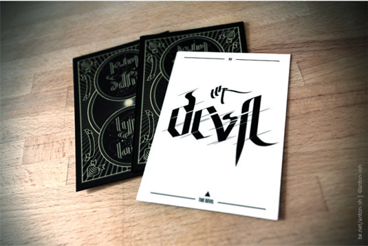
Inspired by his love of type, Russian designer Anton Shlyonkin recently set himself the challenge of redesigning a number of tarot cards using typography alone.
Symbolic compositions
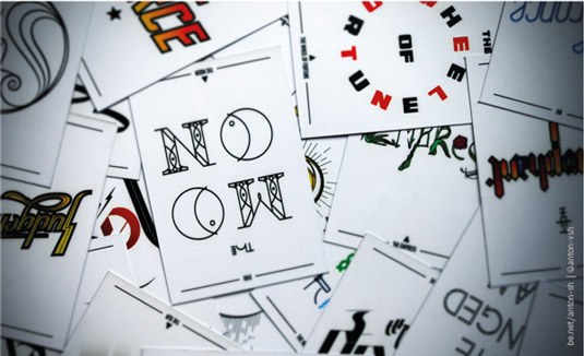
"Classic tarot decks are very symbolic, so it was kind of a challenge to translate these symbols into type compositions," Shlyonkin explains. "Most cards still have some core meanings, though. For example, the Lovers is a Gemini ruling card, so to express its dual nature, I made an ambigram.
Article continues below"The Moon is a card ruled by Pisces, and you still can see its symbol in 'O' letters. But some cards just represent my impression of their meaning. For example, the Force - this word gives me some '80s sci-fi movies feeling, which is reflected in the type."
This is a really cool concept, although we think some of Shlyonkin's designs work better than others - the Sun and Fool typography being our particular favourites.

Liked this? Read these!
- Free tattoo fonts for designers
- Free Photoshop actions to create stunning effects
- Create a perfect mood board with these pro tips
What do you think of these new-look tarot cards? Let us know in the comments below...
Sign up to Creative Bloq's daily newsletter, which brings you the latest news and inspiration from the worlds of art, design and technology.

The Creative Bloq team is made up of a group of art and design enthusiasts, and has changed and evolved since Creative Bloq began back in 2012. The current website team consists of eight full-time members of staff: Editor Georgia Coggan, Deputy Editor Rosie Hilder, Ecommerce Editor Beren Neale, Senior News Editor Daniel Piper, Editor, Digital Art and 3D Ian Dean, Tech Reviews Editor Erlingur Einarsson, Ecommerce Writer Beth Nicholls and Staff Writer Natalie Fear, as well as a roster of freelancers from around the world. The ImagineFX magazine team also pitch in, ensuring that content from leading digital art publication ImagineFX is represented on Creative Bloq.
