How to create type effects with InDesign
The first of a two-part series on creating type effects in Adobe's tools looks at InDesign.
I'm writing this on the heels of Adobe releasing their latest wave of powerful new Creative Cloud applications onto the the creative community. Obviously each release adds more features and capability to our applications, and when that happens, sometimes we see duplication of features from one program to another.
This is not a bad thing. So for example, the modern Photoshop is far more type-savvy than it used to be. Illustrator is a bit more pixel savvy than it used to be. And InDesign is far more everything than Quark used to be.
Before this overlap, there were things that just had to be done in one program, since the others didn't do it. Now with more flexibility, typographic treatments and effects can be done in InDesign, Illustrator and Photoshop. In this two-part series, I'll examine what each has to offer, starting today in InDesign.
Article continues belowA tale of three tools
Just so we're all on the same page: Photoshop's main thrust is image work on pixel based images, something not done by either Illustrator or InDesign. However, PS has had so many tools added over the years that it can now also do many things the other two programs can do. Maybe not as smoothly, but it can get it done. For example, PS has some pretty hefty type tools, as well as very powerful bezier pen tools.
Adobe Illustrator is the king of the bezier line tool. It is also the king of the high-end treatment and even creation of both typography, as well as design of the typefaces themselves.
Generally speaking, though, if you are a typographer, designer or art director, you are likely to gravitate to working mostly in InDesign. And if you are working with a good amount of text, or creating multiple page documents, then certainly InDesign is your package of choice.
Let's create a project
The best way to explain something is to show it. So let's take a project on that involves creating an eye-catching headline. And let's use a simple phrase that could maybe even be the title of this article: 'Powerful Typography'. I started the project in ID, because frankly, if I can get away with designing and producing a headline there, life will move along smoother.
Sign up to Creative Bloq's daily newsletter, which brings you the latest news and inspiration from the worlds of art, design and technology.
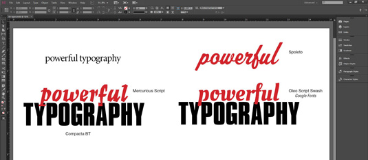
You can see in the screen shot that I went through a few quick iterations. The basic line of text first, upper left. But I quickly had an idea of what I wanted, and just below you see the words put into the Mercurious Script and Compacta BT faces, and an offset color applied so the two lines can overlap and still be read. It instantly has a nice strong graphical look, but I wasn't happy with Mercurious as it looked a bit too Halloween styped.
I rattled through my typefaces on the computer and found one that was rather close, Spoleto, as seen in the top right of the screen-grab. This is a nice face, and I liked its linked letters script quality. But at the same time, script linkage lines can be a pain in getting the tracking (letter spacing) just the way you want it. I also wasn't sure about the descender on the 'F', which being a sizable loop, might distract from the word below it.
I finally found the face 'Oleo Script Swash Caps', on Google Fonts, and decided on that. Not that I realized this at the time of choosing, but oddly, it has some stylistic qualities of the two other faces I had looked at before, almost a cross between them.
Tweaking and effects
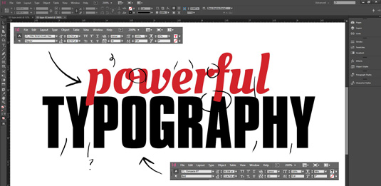
In the screenshot above (click on the image to download the PSD), you can see the type I have decided to work with shown larger. I've put in grabs of the specs on each line, so you can see I have already done a few tweaks. Then I went in and made some type change marks. Note that these are my own marks to myself. It has been years since I worked in a type house and handed off to others, so most of the ticks just mean I should play with some letter-spacing at those spots.
One of the first type effects most people think of is the basic STROKE function, which is available in most programs. As you can see in the screen shot, ID has a nice set of controls for this in it Stroke Tool Pallet.
- You can set the stroke to lay along the inside, center or outside of the typeface perimeter. Each of these has its pros and cons, and each renders a very different final look. This is especially true as the rule is made thicker and more obvious.
- Generally speaking, inside strokes are not very appealing as they torture the shape of the typeface too much. They are less damaging when used with low-contrast faces, without major thick/thin designs.
- Center strokes are something of a compromise and a safer option, again, as long as the stroke is not too thick. The outer stroke is the one most often used for great graphic effect, and is often used with very thick strokes. The nice thing about the outer stroke is that it will not deform the typeface's shape.
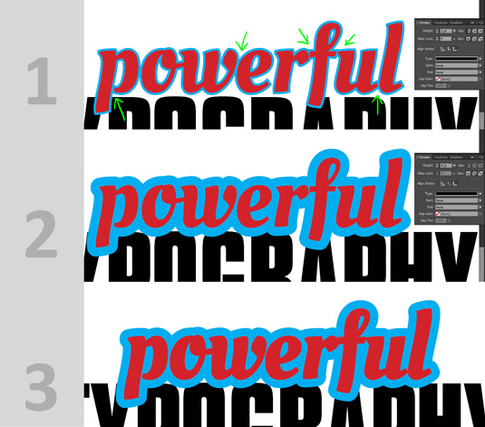
In the next set of grouped screen-grabs you can see what a 2-point outside stroke looks like (grab #1), and also note some of the problem issues I marked in green. (Problems like these are beginning to be the domain of Adobe Illustrator, more on that later.) In grab #2 I upped it to an 8-point outside stroke. Not only is this more graphically powerful, but it also kind of eliminates some of the problems we had in grab #1. Also note that I changed the 'Miter Limit' option to 'Round Joint' selection, to smooth the corners.
You will notice though the original face itself is looking a bit weak and thin by comparison. We can fix this by duplicating the layer of text and adding a thin stroke in the same color of the face. In this case I used a 0.75 point stroke, you can see the results in grab #3.
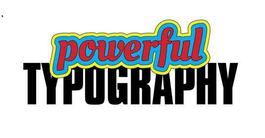
Finally, we can take this simple technique and use it to make big-bad-eye-catching graphics, like the one seen in the next image. I kept duplicating the layers and adding an extra point to create the rules between the broader colored strokes.
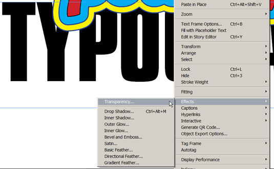
InDesign also has a range of canned effects that can be applied to text. You can access them through the fx pallet, or the properties bar across the top. Though I prefer to just right-click on the text and select 'Effects' in the contextual menu.
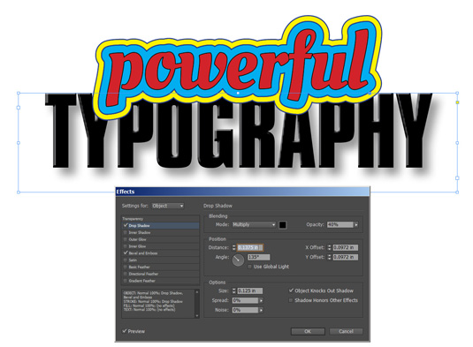
You will find a range of effects you may be familiar with from Photoshop, like drop shadow, inner/outer glow, bevel, etc.
Here's one last thing about ID many people don't know about. If you select type and then go to the menu command Type>Create Outlines, it will convert your type into vector art.
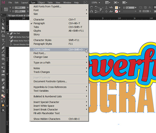
This will then free you up to use the vector art pen tools to modify the shapes of the typefaces. Note that this is a one-way trip, you can't then re-convert the art back to type.
Now read part two
In part two, we move on to type effects in Illustrator and Photoshop...
Words: Lance Evans
Lance Evans is creative director of Graphlink Media.

The Creative Bloq team is made up of a group of art and design enthusiasts, and has changed and evolved since Creative Bloq began back in 2012. The current website team consists of eight full-time members of staff: Editor Georgia Coggan, Deputy Editor Rosie Hilder, Ecommerce Editor Beren Neale, Senior News Editor Daniel Piper, Editor, Digital Art and 3D Ian Dean, Tech Reviews Editor Erlingur Einarsson, Ecommerce Writer Beth Nicholls and Staff Writer Natalie Fear, as well as a roster of freelancers from around the world. The ImagineFX magazine team also pitch in, ensuring that content from leading digital art publication ImagineFX is represented on Creative Bloq.
