How to create type effects in Illustrator and Photoshop
The second of a two-part series on creating type effects in Adobe's tools looks at Illustrator and Photoshop.
In part one of this two-part series of articles, I walked through how to create type effects in InDesign. One might justifiably think that everything you want to do with vectors can now be done in InDesign CC, so why use Illustrator CC?
There are many tools and capabilities that Illustrator has that make it very worthwhile. Its toolset is quite different and geared towards different work. While it can be used as such, it is not a page layout tool.
Export options
There are many ways to bring items over from InDesign to Illustrator, various exports such as EPS and PDF. But unless the clipboard won't support what you have created (which can happened sometimes), the easiest thing to do is just copy the items in InDesign and paste them into the document in Illustrator.
Article continues belowWhen you do this you should look for an extra item that was probably loaded. With the Direct Selection tool, find any extra bounding box and delete them. Or locate them in the Layers Pallet.
Here are a couple of quick effects that would have been harder or impossible in InDesign.
01. A gradient step and repeat
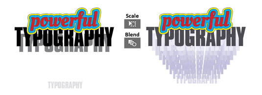
This is rather quickly accomplished by first duplicating and scaling the 'Typography' text (to 35%), changing its colour to 10% gray, and moving it down below. I copied the line once more, moved it down just a bit, scaled it (95%), and changed the colour to 90% gray.
You may need to play with layering a bit, but then simply use the Blend tool to click the first and then the second item, and we have the results. The overall colours were then changed all together to a bluish hue.
Sign up to Creative Bloq's daily newsletter, which brings you the latest news and inspiration from the worlds of art, design and technology.
02. Powerful and organic stroke tools
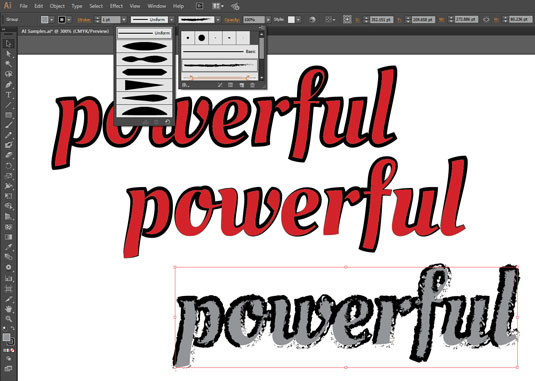
You can quickly stroke a string of text and with a few controls change it to look like it was created with a wide range of organic effects (see above). And by tapping into Illustrator's large list of built in brush libraries, the visual options are extensive. Just make sure the text can be read!
Let's take a quick look at strokes in Illustrator, as it gets a bit convoluted. If you have text, you can only do a center stroke, as far as I know. No inside/center/outside options for text. But there is another way around this: Use the menu Effect>Path>Offset Path..., which will give you a dialog that allows the stroke to be offset in positive or negative directions, in values of a fraction of a point. Some samples are shown below:
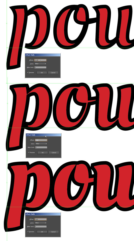
However, once you convert the type to an outline, Type>Create Outlines or right-click, then you get the options for in/center/out. So let's make the text into an outline and do something that granted we could have done in InDesign, but is easier and comes with more controls in Illustrator.
Fine correction
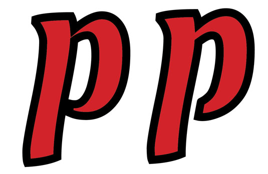
Let's correct some of the finer points of the typeface that end up looking poorly when we add a stroke. In the next image we see the default after adding a stroke, and then on the right we see how cleaning it up makes for a much more professional look.
Granted, I went further away from the original design here, so you make your own artistic decisions.
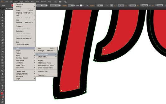
One last thing: Select a stroked object (non-type) and then Object>Path>Outline Stroke and you convert a stroke into a piece of actual art with its own bezier controls on both sides of the line. Ultimate control!
Photoshop: doing it all
Photoshop can be used to generate absolutely huge images with razor sharp edges. But since it also has bezier and type, it can do almost anything you may want. Wait, there's more – because Photoshop also has a robust 3D system in it. Phew!
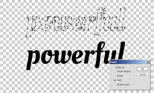
Pasting the headline into Photoshop from Illustrator gives us options of Smart Object, Pixels, Path and Shape Layer.
The quick and dirty solution is to convert to hi-res pixels. But we really want the Path or Shape Layer option. But that requires prepping in Illustrator so that everything is a vector – no type, strokes, or those bounding boxes we already removed.
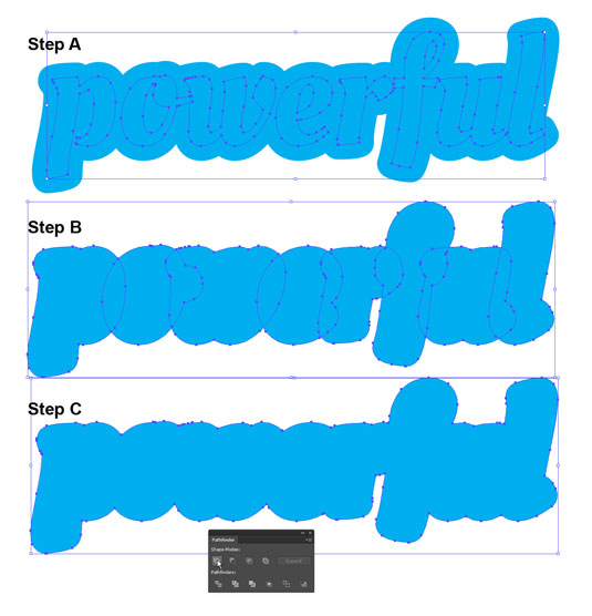
Converting the text is easy, we did that before. We also converted strokes before, right (see below, step B)? But here we will also have to boolean JOIN the converted strokes using the Pathfinder pallet (see below, step C).
The final layers are just highlighted and coped, and pasted into Photoshop. Then the results are separated into different layers, if needed. I converted an abbreviated version of the file: you can see the results in Photoshop as Shape Layers, already separated and coloured.
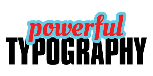
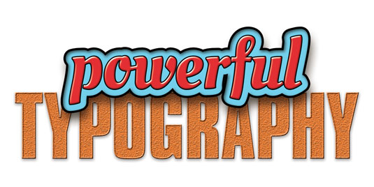
The next image shows a sample of what can be done with relative ease in Photoshop. Though there is really no end in what can be done. The first example shows the shape layers with a range of Blending Options... effects applied. Starting with the plain shape layers file, this treatment took under 10 minutes to create. Er, maybe 12 with some fussing.
And we begin our last example by starting with the basic Shape Layers file again, convert it to RGB, and use it to create a 3D image.
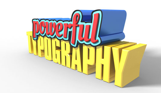
3D layers can be embellished many ways, and then combined with 2D layers for added effects. We are in Photoshop, so anything can be re-tweaked, touched up, and have filters applied.
Back to InDesign
Once you have finished your work in Photoshop, you may very well find that it is then time to save the file and bring it back into InDesign once again. Remember, this type started in InDesign (see part 1) – we've gone full circle!
Now, it's not that you are going to need to take the path we did here on all your projects, at least I hope not. But I also hope this gives you a look into the unique typographic and design tools that each of these three powerhouse applications give us, and how they can be used together.
Words: Lance Evans
Lance Evans is creative director of Graphlink Media.

The Creative Bloq team is made up of a group of art and design enthusiasts, and has changed and evolved since Creative Bloq began back in 2012. The current website team consists of eight full-time members of staff: Editor Georgia Coggan, Deputy Editor Rosie Hilder, Ecommerce Editor Beren Neale, Senior News Editor Daniel Piper, Editor, Digital Art and 3D Ian Dean, Tech Reviews Editor Erlingur Einarsson, Ecommerce Writer Beth Nicholls and Staff Writer Natalie Fear, as well as a roster of freelancers from around the world. The ImagineFX magazine team also pitch in, ensuring that content from leading digital art publication ImagineFX is represented on Creative Bloq.
