7 tips to help designers work better with coders
How can UX designers ensure their vision translates into a website that works? Jerry Cao offers his tips.
Sign up to Creative Bloq's daily newsletter, which brings you the latest news and inspiration from the worlds of art, design and technology.
You are now subscribed
Your newsletter sign-up was successful
Want to add more newsletters?
It's not always easy to see mockups from a developer's perspective — but it is always useful.
Your duty is not just to create usable interfaces, but also to explain how they work to the people building them. This article will explain how to design collaborative mockups that developers will be able to understand. That means "big picture" design tips, but also some tools and external resources.
01. Learns something about code
You don't need to learn code languages you'll never use, but a designer with basic knowledge of development always has an innate advantage.
An architect knows the relevant properties of the different types of materials, even if they've never hammered a single nail. And that's what coding is to the designer: the materials that bring their designs to life.
Designers don't need to know how exactly to write code, but knowing the basics lets them design for code, meaning designs that are transcribable to code.
If, for example, a designer knows the CSS box model, they'll be able to tailor mockups and convey them in a light developers understand.
Coding is a dedicated practice and learning it takes time and effort. Learn the basic principles, and if you find it interesting or useful, you can always further your study later.
Sign up to Creative Bloq's daily newsletter, which brings you the latest news and inspiration from the worlds of art, design and technology.
02. Get a developer's eye view of mockups
The goal is to understand mockups from a developer's perspective. When you place an input field in the mockup, you should be aware that an input field is created using an HTML tag and styled with CSS. You don't need to know how to write this code, but it pays off to have an idea form inputs are built.
Ask the developer themselves if you have any questions about more complex aspects. This is the heart of collaboration: it will help you understand each other's fields, strengthen your relationship, and create a better product.
Consider these fundamentals as a basic requirement for what you should know, and you can even use them as talking points during your next discussion with the developer"
- How CSS differs from HTML
- How CSS creates effects (like box shadows)
- What can be created in CSS alone, and what requires images
- How HTML tags are nested and rendered in the browser
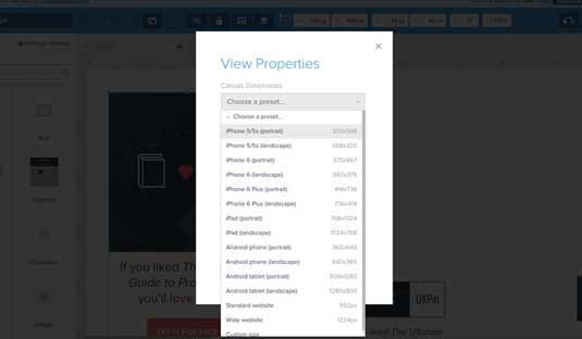
- How responsive breakpoints work
For UX design specifically, it's worth knowing the basics of JavaScript as well. You don't need to understand how to write variables or functions, but you should know a little about how JavaScript interacts with HTML elements on the page.
03. Describe ideas in a practical manner
A large source of the designer-developer confusion is the different thought processes. So you need to describe your ideas in a practical manner so developers can better understand.
Brad Frost's method of atomic web design (broken into 5 tiers, from atoms to complete pages) simplifies each interface into logical building blocks. Using Frost's terms, you can explain how users should interact with each individual block, and how these interactions affect others elements on the page.

Live examples also eliminate ambiguity and misinterpretation. Seeing how elements should behave lets developers visualize how the final product should behave. They also tend to leave a more lasting impression, and act as a reference that can be drawn on later.
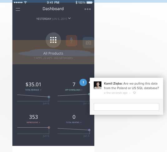
UXPin's preview link, for example, lets you share your prototype with developers in the form of comments. From there, you can conduct a quick feedback session in-person to clear up any further questions.
For even more specific tips on communicating with developers, check out this Smashing Magazine piece.
04. Use style guides
Style guides are useful for enhancing communication at any stage in the production process, but especially for mockups since this phase connects design to development.
For designers, style guides show how to create reusable UI patterns, even down to the atomic components like button treatments and labels. For developers, they offer a quick visual checklist and sometimes even a quick-reference resource for code snippets.
Specific ideas can be expanded upon at length to codify design choices. The best style guides won't just show a tab-based page and scroll-based page, they'll also explain the proper context for both. For example, Jawbone uses a scroll-based page for storytelling and a tab-based page for product customization.
One company might include a 12-page section on the use of their logo, while another might have only a paragraph (or another might forego the logo section entirely).
Still, style guides tend to follow similar trends and patterns. Below are some of the common sections found in most style guides:
- Typography – It's hard to keep track of which typefaces to use where, so a typography section is one of the most common. List out font choices, styles, and sizes for every relevant aspect, such as body text or heading text. Fonts that require licensing should include links to online font foundries.
- Layouts – Like typography, it's difficult to remember the specific values for spacing and layout arrangements. Most style guides have sample templates for grids, margins, and compositions.
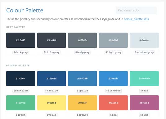
- Color Schemes – It's always useful to include the specific color codes in RGB, CMYK, or Pantone®, along with where the colors are used.
- Reusable Code – Code doesn't have to be an individual section; it can be attached as snippets in the relevant sections. Developers appreciate a format where they can copy and paste what they need. Include both CSS classes and IDs in the snippet samples.
- Graphics – Icons, buttons, symbols, favicons, tileable backgrounds, and artwork all have their own guidelines. Describe the details of execution, such as alignment, positioning, how to overlay text on images, etc. It's also useful to mention where the actual PSD/AI files are located in the cloud or server database.
- Navigation – Mention any project-specific rules for navigation, such as the use of search boxes, sidebars, links (if not covered in the typography section), and menus and drop-downs (i.e., what is the appropriate range of items to include).
- Logo Styles – While some companies create separate branding style guides, if they rules are slight they can be included in their own section within the overall style guide. These list the proper size, colors, placement, white space, and positioning of the logo, as well as alternate designs and icons/brand mascots.
- Design Philosophy (optional) - For companies with strong personalities, style guides can include details regarding voice and tone of the copy, the design persona, and other driving factors behind the overall emotional goal behind the design.
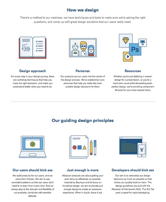
The larger your product team, the more detailed your style guide should be. Style guides are a rallying point for designers and developers who don't often communicate, and may not even work in the same cities.
05. Create a live style guide
Web/mobile UI projects typically choose the HTML route because it's much easier to update and they feel more natural to developers. An HTML front-end style guide can easily become a live style guide that actively updates your site's code when it's modified. Live style guides feel and act less like a separate document that requires maintenance.
Below are some examples of HTML style guides available for reference online:
- MailChimp – A happy medium between the needs of designers and developers, with live examples and code snippets that accentuate the free-flowing nature of this guide's content hierarchy.
- Lonely Planet – A technically elegant version of a live style guide that updates the site via API call.
- WooThemes – This style guide unifies all its content by placing it on a single page.
- Primer CSS – The vertical menu makes this heavily structured style guide quick and easy to navigate.
- Disqus – Using dynamic hover effects, this style guide condenses its information into a single page for quick searchability.
- Mapbox – A thorough style guide that covers everything from CSS styles to animation to writing page copy.
You can find more examples of style guides at StyleGuides.io, which showcases a large gallery of web-based guides (both traditional HTML style guides and more cutting edge live style guides).
06. Follow these best practices
Taken from our Web UI Design Best Practices, here's a small list of best practices that nurture a collaborative environment.
- Organize individual resources into folders — This lets developers know where to find items like icons and font files. Outside of web-based resources, also include HEX codes for colors/gradients and possibly demo content with actual text (no Lorem Ipsum).
- Using naming systems — Graphics, tiles, icons, and photos should be appropriately named and put in the right place. It's easier for designers to format these files on the go than developers having to also manage resources.
- Describe interactions and animations — Unless you're integrating your PS/Sketch files into an interactive format, certain interactions and animations such as hover states aren't self-evident. Describe these as clearly as possible, whether in a quick over-the-shoulder meeting, or as notes affixed to early wireframes.
- Explain links — Create diagrams and/or storyboards to convey where each link leads.
- Pay attention to fonts — Label each font family and include third party files for any webfonts. It doesn't hurt to double-check that all paid fonts also have proper licenses for web use.
07. Use these handy tools
You're not the only one with difficulty communicating with developers, and those that came before have left a score of tools to help. Here, I've included the ones I found useful in bridging that gap.
- Trello - Considered by many the best free task management tool. Set schedules, share responsibilities, leave notes, and manage project files all within the same dashboard, and for free.
- Asana - Like Trello, but more detailed. Their platform integrates with all smartphones and includes support for multiple teams with multiple projects.
- Google Drawings - A plugin that allows the simultaneous organization of visual notes and ideas, and ties into Google Drive. While it runs in Chrome, it can also work offline without Internet access.
- UXPin - Create low-fi or high-fi designs, wireframes or prototypes, in the same tool, with easy conversion between them. The tool also integrates with Photoshop and Sketch, supports in-app usability testing, and improves collaboration with comments and presentation modes.
- Cage App - This in-depth dashboard app provides everything for smooth project management. Teams can share files and comments during every stage of the process while staying up-to-date with the latest changes.
- Conceptboard - Conceptboard provides interactive workspaces with draggable elements and multi-user commentary — an online scratch board for taking notes. It's great for everything from early brainstorming to final presentations.
- Slack - A large communication tool for large teams. Built around 21st century communication among creative teams, all chat logs are saved and searchable from the web dashboard and proprietary mobile apps.
Conclusion
The project team is a team in more than name alone. Everyone is working together to achieve the same goal, and the level of collaboration determines how efficiently the different parts become one.
Designers and developers who understand each others' crafts work better together, and therefore produce better products. Hopefully these tips and resources will help your team members work together in unison with greater focus on each phase of a creative project.
For more tips on collaborating with developers, check out the free Designer's Guide to Collaborating With Developers. In over 70 pages, you'll get expert advice on collaborating not just on mockups, but the entire design process: planning features, wireframing, prototyping, and testing.
Liked this? Read these!
- 6 ways designers and developers can work together better
- 5 things web developers can teach web designers
- The best free web fonts for designers

The Creative Bloq team is made up of a group of art and design enthusiasts, and has changed and evolved since Creative Bloq began back in 2012. The current website team consists of eight full-time members of staff: Editor Georgia Coggan, Deputy Editor Rosie Hilder, Ecommerce Editor Beren Neale, Senior News Editor Daniel Piper, Editor, Digital Art and 3D Ian Dean, Tech Reviews Editor Erlingur Einarsson, Ecommerce Writer Beth Nicholls and Staff Writer Natalie Fear, as well as a roster of freelancers from around the world. The ImagineFX magazine team also pitch in, ensuring that content from leading digital art publication ImagineFX is represented on Creative Bloq.
