Design a prototype for a responsive web app
Brandon Arnold demonstrates how to mock up a fully responsive web app layout using ZURB’s Foundation for Apps framework.
Over the past several years, the web has changed. We're racing away from an advertising web that discusses things, to a web of doing and creating things. We're transitioning to a more app-centric web. People want to build fullscreen, immersive experiences in the browser, and they want these apps to work on any device.
This is why we at ZURB created Foundation for Apps, the first frontend framework created for developing fully responsive web apps. Over the course of this tutorial I'll show how to use our new grid to create an app layout that responds for every device. We'll prototype Angular routes and use our motion classes to add slick animations to our views. From there it's easy to take this prototype and load in live data.
Planning the app
We'll be creating a prototype of a simple news aggregator app that could eventually pull in articles from things like Designer News, Hacker News and Product Hunt. Each source will live in its own view, but will share a common header.
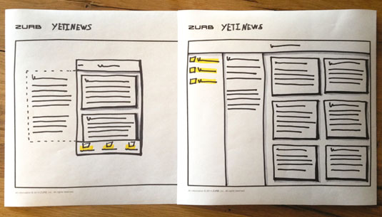
We'll start with a simple sketch for a mobile and desktop view (top right). We can see that on mobile our app will follow a common theme, with tabs at the bottom that enable the user to swap between each news source, a list of the most popular articles, and some information about that news source in a side panel. In contrast, on the desktop version this aggregator will feature the navigation along the left side, the popular articles along the right, and the content on the panel in-between the two.
It would be difficult to accomplish this distinction between desktop and mobile using a traditional grid system. However, Foundation for Apps was created to solve these types of problems easily.
Creating a new project
The Foundation CLI makes it easy to install new Foundation for Apps (F4A) projects, and will make it even simpler to update when patches and upgrades arrive. You'll install the CLI once, then you can create hundreds of new projects with one simple command. You'll need to ensure you have Ruby, Node.js and Git installed on your machine. For information on installing the CLI, visit this page.
Once the CLI is installed, creating a new app is as easy as entering a single command. Let's call our app 'yetinews'.
Daily design news, reviews, how-tos and more, as picked by the editors.
foundation-apps new yetinewsYou'll be greeted by ZURB's yeti, who will spin up a new project for you. This can take anywhere from 30 seconds to a couple of minutes, so sit tight and wait for the yeti to tell you he's all finished. Once your app has been created we'll cd into that directory:
cd yetiNewsThen we'll start our app:
foundation-apps watchThis runs our gulp task, creates some routes and starts up a server on your machine. You can view our new app by visiting localhost:8080/.
Coding mobile-first
When we open our newly created project, we can see several files and folders in the base directory. Let's head straight over the 'client' folder and take a look at what we've got there.

If you're already a Foundation user you'll see some familiar things – like 'app.scss' and 'app.js' , where you put all your custom Sass and JavaScript. There's the '_settings.scss' where you can change nearly every style in the framework, and some template pages and the 'index.html'. Let's start by opening 'index.html'.
F4A supplies a sample page for your new project, but since we're learning how to build an app, we'll start by nuking everything between the body tags. After the body tag we'll create the grid-frame. This contains the entire app and, by setting a defined width (100 per cent) and a defined height (100VH), it allows us to easily carve the screen up vertically.
<body>
    <div class="grid-frame">
    </div>
</body>
Now we'll create the header and main content area of our app. We'll introduce grid-blocks, grid-content, the vertical grid and the shrink class.
<div class="grid-frame vertical">
    <div class="grid-content shrink">
    </div>
    <div class="grid-block">
    </div>
</div>
Let's break down these new elements:
- vertical: This can be applied to grid-frames and grid-blocks to force their direct children to be displayed vertically as opposed to horizontally
- shrink: By default, flex-box wants to spread elements out evenly across the available space. The shrink class tells the element to only be as large as it needs to be. Items without a shrink class will take up the remainder of the space
- grid-block: These are roughly analogous to rows, but unlike rows they can be sized. Mainly, they are items set to flex, allowing every item inside of them to be aligned without floats
- grid-content: This is used when you want to put regular content (<p>, <h1> and so on) in your app. They can be sized or not sized. In the case of the latter, the grid will attempt to fit the content inside of them evenly across their parent
We need to name our app, as well as including some actions at the top of the page. We'll add a title-bar to the app to quickly create a simple header:
<div class="grid-frame vertical">
    <div class="grid-content shrink">
        <div class="primary title-bar">
            <div class="center title">Yeti News</div>
            <span zf-toggle="info" class="left hide-for-large"><a href="#">info</a></span>
        </div>
    </div>
    <div class="grid-block">
    <!-- main-content -->
    </div>
</div>
This creates a basic header, with a link titled 'info' that we'll use to toggle an info panel. Foundation uses zf-toggle to call panels, modals or off-canvas menus based on their id. When the user clicks this on smaller screens, we want our info panel to pop out. On larger screens, we'll need to hide this panel, as its contents will already be displayed.
We now have the basic header for our app, so let's build out the content area and navigation. We'll start by creating our info panel, then a series of cards that will act as our news articles, and finally the navigation.
We'll start inside the block we created underneath our header:
<div class="grid-block vertical">
    <!-- main content -->
    <div class="grid-block">
        <div zf-panel position="left" id="info">
            <div class="grid-content">
                    <h1>Designer News</h1>
                    <p>Lorem ipsum dolor sit amet, consectetur adipiscing elit. Nullam in dui mauris. Vivamus hendrerit arcu sed erat molestie vehicula.</p>
            </div>
        </div>
        <div class="small-12 large-9 grid-content">
            <!-- our feed -->
        </div>
    </div>
    <div class="grid-block shrink">
        <!-- our navigation-->
    </div>
</div>
As our block is vertical, we can stack our content and navigation on top of each other. Here, we have added a panel into our app using zf-panel – the F4A Panel Directive – and given it the position it will animate from.
Next let's add our content blocks in cards:
<div class="grid-block vertical">
    <!-- main content -->
    <div class="grid-block">
        <div zf-panel position="left" id="info">
            ...
        </div>
        <div class="small-12 grid-content feeds">
            <div class="grid-block small-up-1">
                    <div class="grid-content">
                        <div class="card">
                            <div class="card-section">
                                <h4>This is a title</h4>
                                <p>This is really great article content. It's not dynamic now, but could be later.</p>
                            </div>
                        </div>
                    </div>
                <!-- more cards -->
            </div>
        </div>
    </div>
    <div class="grid-block shrink">
        <!-- our navigation-->
    </div>
</div>
To size our feed we've used the parent sizing grid, and to style individual items in the grid we've used our card components. Parent sizing allows us to declare the size of direct child elements on the parent when we know how many items we want in each row.
Here we add small-up-1, because on small screens we only want to display one item in each row, but on larger screens we'll want more. We then use the card component to create clean-looking box dividers that hold our article title and description.
Next we'll add our navigation:
<div class="grid-block vertical">
    <!-- main content -->
    <div class="grid-block">
        ...
    </div>
    <div class="grid-block shrink">
        <ul class="menu-bar icon-top dark">
                    <li><a><img zf-iconic="" data-src="assets/img/iconic/person.svg"> Designer</a></li>
                    <li><a><img zf-iconic="" data-src="assets/img/iconic/cog.svg"> Hacker</a></li>
                    <li><a><img zf-iconic="" data-src="assets/img/iconic/star.svg"> Product</a></li>
            </ul>
    </div>
</div>
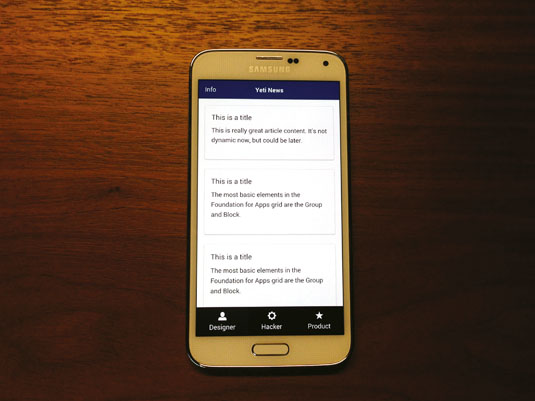
We used the menu-bar component to make a tab list for our app, and added some iconic icons to make it feel more like an app tab bar. The menu-bar has tons of customised options. By default it's horizontal, but it can also become vertical.
This gives us the main layout for our app on a mobile screen. Next we'll take a look at how to adapt this layout on a desktop screen.
Adapting for Desktop
We've created the layout for our mobile site, but we want it to display differently on a desktop. We'll make the following changes to our code to get it to properly match the sketch we created earlier. Here are some areas we'll change to make our layout match:
<div class="grid-block vertical medium-horizontal">
    <!-- main content -->
    <div class="grid-block medium-order-2">
        <div zf-panel position="left" id="info" class="large-3 large-grid-content">
            <div class="grid-content">
                    ...
            </div>
        </div>
        <div class="small-12 large-9 grid-content">
            <div class="grid-block small-up-1 medium-up-2 large-up-3">
                    ...
            </div>
        </div>
    </div>
    <div class="grid-block shrink medium-order-1">
        <ul class="menu-bar icon-top dark">
                    ...
            </ul>
    </div>
</div>
We have introduced a few new classes to help make our layout adapt to large screens – things such as medium-horizontal, large-grid-content and medium-order-1.
Let's take a look at these:
- [size]-horizontal: The same way we can tell a grid to be vertical, we can also tell it to go back to being horizontal at a certain breakpoint. In this case we're telling the grid to be vertical, but on medium screens and larger, we want it to switch and become horizontal
- [size]-grid-content: There's a panel that is off-screen on small devices, but on larger screens we want that panel to be in line with the content. By adding a class to the panel to tell it when to be large-grid-content, we're able to make it part of the grid on large screens
- [size]-order-x: We knew we wanted the navigation to be on the bottom on mobile devices, but on the left of the screen on medium devices and above. To achieve this we'll use F4A's source ordering classes, which let us declare which items will display first on screen, regardless of what order they sit in the code. We used medium-order-1 on our navigation to tell it to come first on screens above a medium size, and medium-order-2 to tell our content to come second
Now we have a unique layout that works on all size devices, takes advantage of the extra space on larger screen and uses the same markup for all.
Angular routing and views
So far all our content lives on 'index.html'. However, we're creating a single-page web app, so we want to make the navigation bring up different content in the main content area.

A basic website is a collection of HTML files connected by links. Single-page apps work slightly differently – all your site's logic is handled on one file: 'index.html'. This contains the core elements of your app, such as the header, navigation and footer. The individual pages are stored as separate HTML files in a templates folder.
Now, let's put together a view for our app. Earlier, we created a grid-block for our main content area. Let's use that block as the container for our view.
<!-- main content -->
<div class="grid-block medium-order-2" ui-view>
...
</div>
We have added a ui-view to our div. This will tell Angular which area of the page should be swapped out. We'll need to take all the content inside that div and move it to a separate file, so cut that code and we'll use it in a second.
In our 'templates' folder we already have a file named 'home'. We'll use that file as the basis of this view. In F4A we've created a system for creating routes that doesn't require the user to know Angular or UI-Router. We use Front-matter at the top of our template files and then our gulp task parses that out as a route.
In our 'home.html' file we'll keep everything within the dashes, but replace the HTML under it with the HTML we just cut from the previous page.
Next we'll look at the Front-matter.
---
name: designer-news
url: /
animationIn: hingeInFromLeft
---
The Name is how we'll reference our app, and the URL is what the '/' in our URL will turn into. While those are the only two required parameters to make the views work, we'll also add an animationIn option to animate the view as it comes in.
For this app we'll call this view 'designer-news' , with just a slash for the URL (because we want this to be the default view) and a hingeInFromLeft class from F4A's motion UI. We can create more pages in the 'templates' folder, give them their own names and their own URLs.
Lastly, let's link our views to our navigation. We'll use ui-sref as opposed to hrefs and call the links by the names we gave them in each template.
<ul class="menu-bar icon-top dark">
    <li><a ui-sref="designer-news"><img zf-iconic="" data-src="assets/img/iconic/person.svg"> Designer</a></li>
    <li><a ui-sref="hacker-news"><img zf-iconic="" data-src="assets/img/iconic/cog.svg"> Hacker</a></li>
    <li><a ui-sref="product-hunt"><img zf-iconic="" data-src="assets/img/iconic/star.svg"> Product</a></li>
</ul>
There we have it – a complete prototype for our news app. We have looked at swapping from a vertical grid to a horizontal one, and featuring a slide-in panel content that becomes inline on larger screens. While this app is pretty basic, it has many of the same principles of a more complex one, and would be ready for you or a backend dev to hook up dynamic data.
This article originally appeared in issue 266 of net magazine.
Words: Brandon Arnold
Brandon Arnold is design lead at ZURB.
Liked this? Read these!
- Build responsive sites with Foundation
- Hands-on review: Adobe Illustrator CC
- Photoshop tips, tricks and fixes to try today

The Creative Bloq team is made up of a group of art and design enthusiasts, and has changed and evolved since Creative Bloq began back in 2012. The current website team consists of eight full-time members of staff: Editor Georgia Coggan, Deputy Editor Rosie Hilder, Ecommerce Editor Beren Neale, Senior News Editor Daniel Piper, Editor, Digital Art and 3D Ian Dean, Tech Reviews Editor Erlingur Einarsson, Ecommerce Writer Beth Nicholls and Staff Writer Natalie Fear, as well as a roster of freelancers from around the world. The ImagineFX magazine team also pitch in, ensuring that content from leading digital art publication ImagineFX is represented on Creative Bloq.
