Behind the scenes of Sony's campaign website
As part of the launch of Sony’s 'Connected World' campaign, Fi created a companion website. Here's how they went about it.
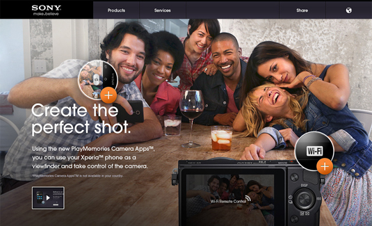
The tech industry moves quickly, and even leading brands like Sony need to constantly refresh their advertising and branding to keep existing customers on board and attract new ones. For their latest campaign, Sony Connected World, it asked international design agency Fi to create the website - and they've done a mighty fine job.
Debuting at consumer electronics show IFA in Berlin, and then expanded for the main launch at CES 2013 in Las Vegas, the site comes complete with entertaining product demos and information that served as proof points to the campaign.
The concept stage of planning the site centred around one key aim: 'Tell a simple story and showcase easy to understand examples on how to connect across all Sony devices.' The example sketches and styleframes demonstrate Fi's basic thinking in how to convey this:
Article continues below 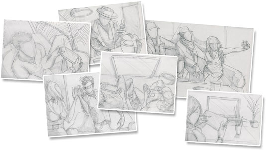
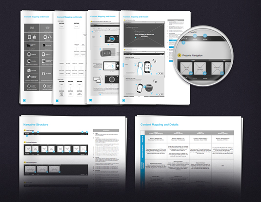
Fi followed this preparatory stage with a detailed handoff to the design team, with carefully constructed wireframes ensuring the well-laid plans would meet full fruition.
Hitting on a design theme that served both classic and modern styles took several rounds of iteration. Eventually, Fi's design team settled on a muted palette, with bold accent colours to highlight the different sections on the website.
Media queries
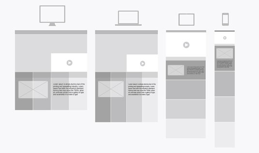
Responsive web design was at the forefront of the site build, which was based on a multi-column layout with fluid grids and images that would scale from large screens down to small mobile sizes by stacking columns vertically.
The approach was to control the fluid layout by using CSS3 Media Queries and making the site adaptive by setting appropriate break points. Respond.js was used for browsers that did not support CSS3 Media Queries.
Sign up to Creative Bloq's daily newsletter, which brings you the latest news and inspiration from the worlds of art, design and technology.
To enhance the site experience, Fi used CSS3 transitions on all the interactive modules. For the product spins, the developers wrote custom JavaScript to create versions of the spinner with the content and markup. The mobile version was optimized using hardware accelerated CSS3.
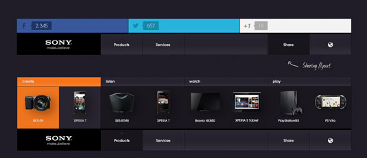
This immersive site enables the user to view the Sony product features from all perspectives, while the colour-coded navigation makes for ease of use and understanding.
All in all, Fi has created a polished experience with this web design that proves simple navigation, colour coding and great photography can often make all the difference.
Like this? Read these!
- Brilliant Wordpress tutorial selection
- Free tattoo fonts for designers
- Free Photoshop actions to create stunning effects
What do you make of the Sony site's design? Let us know in the comments box below!

The Creative Bloq team is made up of a group of art and design enthusiasts, and has changed and evolved since Creative Bloq began back in 2012. The current website team consists of eight full-time members of staff: Editor Georgia Coggan, Deputy Editor Rosie Hilder, Ecommerce Editor Beren Neale, Senior News Editor Daniel Piper, Editor, Digital Art and 3D Ian Dean, Tech Reviews Editor Erlingur Einarsson, Ecommerce Writer Beth Nicholls and Staff Writer Natalie Fear, as well as a roster of freelancers from around the world. The ImagineFX magazine team also pitch in, ensuring that content from leading digital art publication ImagineFX is represented on Creative Bloq.
