How to build a material design app
Google’s Rob Dodson explains how to build your first material design app with Polymer 1.0.
Sign up to Creative Bloq's daily newsletter, which brings you the latest news and inspiration from the worlds of art, design and technology.
You are now subscribed
Your newsletter sign-up was successful
Want to add more newsletters?
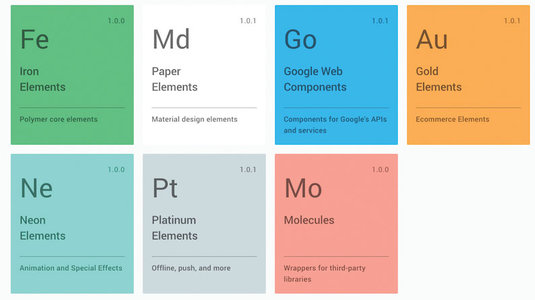
At this year's Google I/O, the Polymer team announced the release of Polymer 1.0. At a third of the size of previous versions, and running up to five times faster, the 1.0 release is a signal that it's time for us to start using Polymer in production. And getting started with the library has never been easier, thanks to the new Polymer Starter Kit (PSK), an opinionated scaffold for building Polymer apps.
In this tutorial I'll walk you through how to create a simple to-do list using PSK, highlighting some of the amazing goodies that come with it.
Getting set up
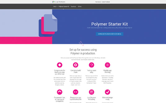
As a prerequisite, make sure you have a current version of Node installed, as you'll be using npm in a few spots. Next, grab the starter kit from the official site, or if you're into Yeoman, you can install the Polymer generator which uses the starter kit.
npm install yo generator-polymer -gIf you're downloading PSK from the official site, I recommend going for the 'Intermediate - Advanced users' version, as it comes with its own gulp server and Browsersync for rapid testing. The Yeoman generator outputs this version by default.
Once you've downloaded the zip, unarchive it and cd into the directory from your terminal. You'll need to install your package dependencies, so from the root of the starter kit execute the following command in your terminal:
npm install && bower installNext, fire up the gulp server to preview the app in your browser.
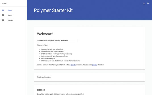
gulp serveOut of the box, PSK comes with a layout based on the material design spec for adaptive UI, as well as an already configured client-side router. Try clicking some of the items in the menu on the left-hand side and you'll notice that the page changes, as does the URL in the address bar.
Sign up to Creative Bloq's daily newsletter, which brings you the latest news and inspiration from the worlds of art, design and technology.
PSK also ships with a few material design custom elements. For the documentation for these elements, and to browse the entire catalogue of what's available, go to elements.polymer-project.org.
Create a to-do item
Let's start by creating a new Polymer element for our to-do items. Create a new folder in the 'app/elements' directory called 'todo-item' and place a 'todo-item.html' file inside.
Every element's definition will begin with a list of imports at the top of the file. These ensure that any dependencies are loaded before the element attempts to boot up. Add the following imports to the top of your 'todo-item.html' folder:
<link rel="import" href="../../bower_components/polymer/polymer.html">
<link rel="import" href="../../bower_components/paper-checkbox/paper-checkbox.html">
Next comes a <dom-module> element. This is used to tell Polymer where to look for your element's template. Make sure to give your dom-module an ID that matches the tag name you're creating – in this case it will be todo-item.
Inside the <dom-module> tag, create a <style> element followed by a <template>. These two form the UI for your element. Add the following markup to 'todo-item.html':
<dom-module id="todo-item">
<style>
:host {
display: block;
}
</style>
<template>
<paper-checkbox checked="{{completed}}">
<content></content>
</paper-checkbox>
</template>
</dom-module>
The :host CSS selector indicates that this element should be display: block (instead of the default for all custom elements, which is display: inline). Within the template you have a paper-checkbox with a data binding on its checked attribute. This binding will enable you to toggle the state of the checked attribute based on data being passed into the component at runtime.
Finally, the <content> element allows anyone using our tag to pass in their own text content to act as the checkbox's label. For example, if someone were to write:
<todo-item>Buy some milk</todo-item>On screen it would render a checkbox, followed by the words 'Buy some milk'. This is known as distribution and it's one of the cooler features of web components.
Now you need to give your element a prototype. Add a <script> tag after the <template> with the following content:
Polymer({<br />
is: 'todo-item',<br />
properties: {<br />
completed: {<br />
type: Boolean,<br />
value: false,<br />
notify: true<br />
}<br />
}<br />
});The is property tells Polymer what tag name to use when it registers the element with the document. You want to make sure it matches the ID you used on your <dom-module>.
The properties object (as the name implies) is used to define properties on your element. Here I'm specifying one property, named completed, and telling Polymer that it's a Boolean, its default value is false, and it should notify the outside world when it changes.
What this means is that any time the completed property is updated, it will automatically dispatch a completed-changed event. Doing so makes this property two-way bindable, hence the following line in our template:
<paper-checkbox checked="{{completed}}">This means the outside world may pass in a value for the completed property on this element. If it is true, the checkbox will be checked, and if it is false, the checkbox will be unchecked. Because the binding is two-way, if the completed state ever changes (in other words, if someone checks the checkbox), the original data provider will be notified.
Create a to-do list
Now we have an element for to-do items, we can batch them together into a list. In the 'app/elements' directory create a new folder called 'todo-list' with a 'todo-list.html' file inside of it. At the top of the file, include imports for polymer.html as well as todo-item.html:
<link rel="import" href="../../bower_components/polymer/polymer.html">
<link rel="import" href="../todo-item/todo-item.html">
Then create a <dom-module> with a <template> inside. Within the <template> you'll nest another <template>, but this time give it the attribute is="dom-repeat". This signifies the element is a type extension custom element, so rather than just a plain old template, it's supercharged with the power of Polymer.
You can use a dom-repeat template to iterate over a collection and stamp out elements for each item it finds
<template is="dom-repeat" items="{{todos}}">
<todo-item completed="{{item.isComplete}}">
<span>{{item.title}}</span>
</todo-item>
</template>
Normally you would want the todos collection to come from an external data provider, but for the sake of brevity we'll hard-code it into our todo-list. Similar to the todo-item, you'll need to create a <script> tag that calls the Polymer constructor, passing in a tag name and properties object. Add the following lines to your properties object:
properties: {<br />
todos: {<br />
type: Array,<br />
value: function() {<br />
return [<br />
{title: 'Buy some milk', isComplete: false},<br />
{title: 'Take out trash', isComplete: true},<br />
{title: 'Walk the dog', isComplete: false}<br />
];<br />
}<br />
}<br />
}To actually display the todo-list , open the 'app/elements/elements.html' file and add an import to the bottom.
<link rel="import" href="todo-list/todo-list.html"> 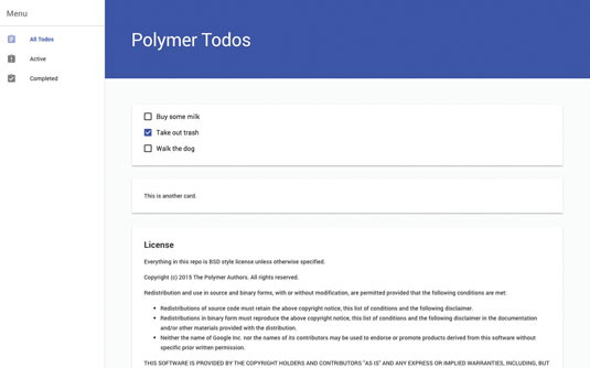
Finally in the 'index.html' file, find the <section data-route="home"> element and replace its content with <todo-list>. You should now see something that looks like the image above.
Just getting started
You've created a few Polymer elements, and your first material design app is shaping up, but there's so much more to do! Be sure to check out the GitHub repo accompanying this article for a more complete example, including how to add and remove to-dos.
Finally, if you've built something cool with Polymer, or just want to ask questions, join the Polymer Slack channel. I hope you enjoyed this lesson. Have fun hacking on Polymer!
Words: Rob Dodson
Rob Dodson is a developer advocate at Google. This article originally appeared in issue 271 of net magazine.
Liked this? Read these!
- How to build an app: try these great tutorials
- Free graphic design software available to you right now!
- Download the best free fonts

The Creative Bloq team is made up of a group of art and design enthusiasts, and has changed and evolved since Creative Bloq began back in 2012. The current website team consists of eight full-time members of staff: Editor Georgia Coggan, Deputy Editor Rosie Hilder, Ecommerce Editor Beren Neale, Senior News Editor Daniel Piper, Editor, Digital Art and 3D Ian Dean, Tech Reviews Editor Erlingur Einarsson, Ecommerce Writer Beth Nicholls and Staff Writer Natalie Fear, as well as a roster of freelancers from around the world. The ImagineFX magazine team also pitch in, ensuring that content from leading digital art publication ImagineFX is represented on Creative Bloq.
