Responsive web design tips from BBC News
Is the diversity of mobile devices blowing your mind? John Cleveley and Tom Maslen explain how BBC News keeps its browser support future-friendly for all.
Sign up to Creative Bloq's daily newsletter, which brings you the latest news and inspiration from the worlds of art, design and technology.
You are now subscribed
Your newsletter sign-up was successful
Want to add more newsletters?
Boom! Did you hear that? That was the iPhone landing in 2007, starting the device explosion. When we first saw the iPhone we didn't immediately get it: we saw a really expensive (but cool) phone. But we were wrong. What we were looking at was actually a really cheap computer with a mobile internet connection that could be taken anywhere.
It didn't take long for the rest of the mobile industry to follow suit. Before we could get used to having three classes of phones (dumb, feature and smart), suddenly every new phone wanted to be a smartphone. For example, the Nokia C3 budget phone has a touchscreen, apps and a decent web browser with Wi-Fi access.
The continuing explosion
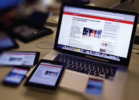
But the explosion didn't gradually die out; it kept going. We got an entirely new type of device: the tablet. Then something even crazier happened: the explosion continued. We now have small tablets, phablets, laptops that think they are tablets, tablets that want to be laptops and internet-enabled Smart TVs.
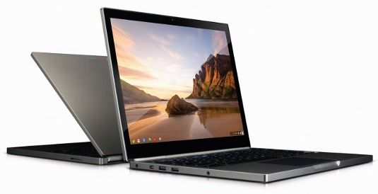
Article continues belowGoogle announced the Chromebook Pixel in February, which is higher definition than the MacBook Retina with a touchscreen, touch pad and keyboard, and a mobile internet connection.
We were kidding ourselves this whole time. There was only ever one device type: web.
But it works on my computer!
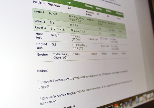
The BBC, like any other large organisation, has a standards document to tell you how to support web browsers. The instructions are out of date (they were last updated 27 August 2010), but the ethos of the document is still very relevant to all of us in the industry.
The section 'Objectives of browser support' sets out the theory:
Sign up to Creative Bloq's daily newsletter, which brings you the latest news and inspiration from the worlds of art, design and technology.
- Licence fee payers use a variety of web browsers. The BBC aims to provide the best possible experience to the largest possible number of people.
- All licence fee payers are considered valuable.
- Some fee payers don't have the choice of using a popular, modern web browser.
The document then organises browsers into three groups:
- LEVEL 1: Full, premium, pixel perfect experience
- LEVEL 2: Core content must be usable, JS and rendering errors acceptable
- LEVEL 3: These are browsers that we no longer support
This way of making things (of creating a premium experience that gracefully degrades onto older devices and not testing on devices with a small percentage of traffic) had worked really well for us up until now.
Sure, we had 13 or so browsers in the 'level 1' category, but they were all mostly testable from your own machine. These browsers are also freely available for you to download so it didn't cost you any more than the initial purchase of the computer.
But the best thing about this way of development was the way you developed and tested on these browsers – clicking on an icon in the desktop and then using the browser – was exactly the same for your users.
But then BOOOOM...
Since the device explosion, this way of supporting browsers doesn't work anymore. If we look at BBC News non-desktop traffic, a smidgen over 50 per cent of it comes from four devices: iPhone 4S, iPhone 5, Samsung Galaxy S2 and the Samsung Galaxy S3. These four devices' browsers should definitely be in the 'level 1' list. However, buying all of them SIM-free is going to set you back more than £1,500.
If money is no obstacle to you, then there are still two issues: bandwidth and processing power. Imagine a premium experience that has to work across every browser and makes up more than two per cent of your traffic. One of those browsers is going to be Opera Mini.
Opera Mini can be installed onto top-end devices, but it's installed by default on many low-end devices. These devices typically have poor processing power and poor mobile connection speeds. So, you need to build a premium experience using as little code as possible, a premium experience that works both on a Macbook Pro via broadband and a Nokia C3 while travelling on a bus.
Impossible task?
When you take into account all the different browsers; five different internet connection types (broadband, GPRS, Edge, 3G and 4G); different screen sizes and pixel resolutions; and touch gestures, mouse and keyboard interactions, building a premium experience that's the same across all these different variants becomes impossible, unless you build web pages that are too large to load in a reasonable time.
The answer to this problem is responsive web design (RWD). But RWD may not mean the same thing to you as it does to me. The terms 'RWD' and 'mobile-first' describe techniques that the industry is still trying to define. The terms have come under fire by people claiming these techniques require the creation of multiple websites within a single one and doing so creates pages that are as heavy, if not more so, as using classical web development.

These people are getting the technique mixed up with other implementations of the technique. As people explore RWD, they're bound to take ideas with them that previously worked, such as designing a premium experience that degrades onto less capable browsers.
Reverse the paradigm
We chose not to do that. Instead we turned the browser support paradigm on its head. Rather than create a premium experience for the 'level one' group of browsers, we would first build a basic core experience for all browsers. The experience is a very basic and simple design with barely any functionality. A JavaScript application is then conditionally loaded, enhancing the basic web page into a premium experience.
We call this implementation of RWD 'cutting the mustard'. The core experience is for all browsers, but the JS application is only for browsers that we deem modern enough for us to create a premium experience using as little code as possible.
No magic bullet
It's not a magic bullet and doesn't allow you to use any of the latest CSS techniques you read about in .net without worrying of the consequences. However, it does cut a very large part of the browser support tail off, enabling you to wipe the client-side development slate clean and start afresh. 'Cutting the mustard' means your lowest common denominator is no longer IE6/7.
We've found it very useful to describe browsers that don't cut the mustard as HTML4 browsers and those that do pass the test, as HTML5 browsers. Although I normally frown upon the use of buzzwords, I often find it hard to explain the benefits of progressive enhancement to management within IT. These same people, who look at you with a bewildered expression when you mention progressive enhancement to them, will react completely different to you when you say, 'But this feature only works in a HTML5 browser'.
Are you still with me? We'll now take you through a very simplified example of building a BBC News section page using the implementation described above.
Step 1: Build a core experience for all browsers
The first step is to build the core experience. This will be available to all browsers and is very similar to the mobile-first approach of responsive web design, except that we're also taking into consideration old desktop browsers. This core experience needs to be really simple, so we will do the following:
- Use a single column design
- Only add core content into the page
- Add hyperlinks to other pages that contain secondary content
- Avoid using any JavaScript
- Use very simple CSS
We define the content into two groups: primary and secondary. Primary content is what your user has come to the page for. For example, the primary content on the technology section of the BBC News site are the technology stories. Everything else is secondary.
There's a link at the top of the screen to the navigation. This is an internal link that will anchor the user to the actual navigation at the bottom of the screen.
The tabbed interface just below the header won't be interactive. The tab for the most-read stories will be a link that takes the user to a small page with just a list of the most read stories from the site for that day.
Style your basic content with classical CSS
We now need to style this very basic web page. In order to ensure that the core experience works in everything from old Nokia and Blackberry devices to IE7 (and dare I say IE6), we need to use very basic CSS. All we're going to do with the CSS is the following:
- Apply a CSS reset
- Set a base font size
- Set up the main column
- Apply spacing and separation styling
Here, we make use of the standard XHTML tags within the HTML. Even though the markup has HTML5 elements within it, we do not reference them.
<section>
  <div class="group">
    <article>
      <div class="group-item">
        <a href="story.html">...</a>
        <p>...</p>
      </div>
    </article>
  </div>
</section>
Now for the CSS:
.group {
  clear: both;
  padding: 10px 5px 5px;
}
.group-item {
  border-top: 1px solid gainsboro;
  margin-top: 10px;
  margin-top: 1.0rem;
  padding: 10px 0;
  padding: 1.0rem 0;
  a {
    display: block;
  }
  p {
    fontsize: 10px;
    fontsize: 1.0rem;
  }
}
Step 2: conditionally load a JS app
The core experience is for all browsers. On top of it, we conditionally load a JavaScript app, changing our simple web page. The page loads additional CSS to improve the interface and adds functionality. In this next step we will:
- Asynchronously load in the JavaScript application
- Change the navigation to an interactive element
- Make the tabs work by loading the secondary content into the page
To accomplish this, we conditionally load in the JavaScript application. We detect three specific features within the browser to decide whether or not to load it. The detection test looks like this:
if (
  'querySelector' in document &&
  'localStorage' in window &&
  'addEventListener' in window
) {
  // load JS app
  // Add second CSS file
}
If the browser passes this test then it cuts the mustard and loads the JavaScript app asynchronously. This means JS files are added into the page in a way that doesn't block the rendering of the web page. The user can immediately start using the core experience. A few moments later, the JavaScript app kicks in and improves the site.
Enhance content on the page
Now that we have a JavaScript application, we can start enhancing the page. We can improve the navigation by changing the default behaviour of the section button, which takes the user to the bottom of the page where the navigation options are, to being a drop-down navigation element. There are loads of great navigation patterns for RWD. You need to look at the options available to you and decide which one works best for your site. BBC News changes the link into a button. When clicked, the navigation will appear directly below it.
// Move the navigation element from the
// bottom of the page next to the nav link
$('.nav_holder').insertAfter('.nav_button');
// Toggle a class hook for us to show/hide the nav
$('.nav_button').on('click', function() {
  $(nav_holder).toggleClass('nav_holder__open');
});
Ajax load in secondary content
Secondary content in the core experience lives on separate web pages and is linked to from our example page. With the JavaScript application we want to improve the core experience.
We can use Ajax to grab those individual pieces of content and add them into the web page. The process of placing one hypertext document into another has a very exciting and sexy name: transclusion.

There are a couple of different ways you can do this, you can either explicitly load each one in your code by adding a JS command for every document you know you want, or you can automate the process by adding a specific class name to all the links you want to go and fetch into the document.
// HTML
<a href="most-read.html" class="jstransclude">Most Read</a>
// JS
$('.js-transclude').each(function(this) {
  var elm = this;
  $.ajax(elm.attr('href'), {
    success: function(response) {
      elm.html(response);
    }
  });
});
Transclusion is a nice technique for keeping your core experience small. Ideally the initial load (before the JS app is included) should be below 100kB (so it loads within 10 seconds on a GPRS/EDGE mobile connection). But take care with how many transclude requests you make. The more HTTP requests made, the slower your page becomes. You need to use transclusion carefully to avoid penalising your 'enhanced experience' users.
At BBC News, we've started to do 'batch transclusion' by requesting multiple fragments of secondary content via one HTTP request and then splitting it into its constituent parts before adding them into the correct places in the DOM.
Step 3: Style enhanced experience
The JS application loads an additional style sheet for you to improve the core experience. Because only 'HTML5' browsers load the JavaScript application, this additional styling can use more advanced CSS features without having to worry about whether older browsers are able to support the feature.
Generally speaking, the cut-off occurs with the browsers IE8, Android 1.6, Blackberry OS5 - and all their older versions. Here's a list of some CSS features you can now use with confidence (warning: this is not an excuse to make the page look like it belongs on GeoCities):
- Attribute selectors (such as "a[id='nav']")
- Pseudo elements ("a:before", "div:after")
- Pseudo selectors ("div:nth-child", "body:first-child")
- Sibling selectors ("h2 + div")
- Media queries
- Border-radius property
- Box-model property
- CSS counters
- "inline-block" value for display property ("display: inline-block")
- Min/max-width/height properties
- Opacity property
- PNG alpha transparency
- RGB colour support (for instance "background: rgba(255,255,0, 0.5)")
- "table" value for display property (eg "display: table")
- Text-overflow property
As we're creating a mobile first-like experience, the use of media queries becomes really useful. Media queries are supported by all browsers that cut the mustard, so we can use them liberally throughout our code.
The end of the beginning
The device explosion is still mushrooming out beyond us. 'Cutting the mustard' is a strategy to help you deal with the tidal wave of devices that your code is now expected to work with. It's currently the best way we think you can implement responsive web design without penalising users on slow internet connections.
Essentially, everything with the web comes down to speed. There are many studies out there that say the faster a site is, the more traffic and conversions it will make - and the performance of your website is ultimately measured by how many kB it's made up of. People always ask me: 'What's the limit? What file size can we go up to?'. My answer is this: 'It depends. How fast is the competition?'
Words: Tom Maslen
Tom Maslen is technical lead at BBC News. He likes current affairs, HTMl5, biscuits and spicy Monster Munch. John Cleveley is also technical lead at BBC News, currently migrating the news site to a dynamic platform. Additional contributions by David Blooman and Julian Kirby.
This article originally appeared in .net magazine issue 243.
Liked this? Read these!
- Our favourite web fonts - and they don't cost a penny
- Brilliant examples of landing page design
- Check out these impressive parallax scrolling websites

The Creative Bloq team is made up of a group of art and design enthusiasts, and has changed and evolved since Creative Bloq began back in 2012. The current website team consists of eight full-time members of staff: Editor Georgia Coggan, Deputy Editor Rosie Hilder, Ecommerce Editor Beren Neale, Senior News Editor Daniel Piper, Editor, Digital Art and 3D Ian Dean, Tech Reviews Editor Erlingur Einarsson, Ecommerce Writer Beth Nicholls and Staff Writer Natalie Fear, as well as a roster of freelancers from around the world. The ImagineFX magazine team also pitch in, ensuring that content from leading digital art publication ImagineFX is represented on Creative Bloq.
