Studio site is a black and white delight
The monochrome masters at British creative studio dn&co show just how beautiful grayscale can be.
Sign up to Creative Bloq's daily newsletter, which brings you the latest news and inspiration from the worlds of art, design and technology.
You are now subscribed
Your newsletter sign-up was successful
Want to add more newsletters?
dn&co is a creative studio based in London, working across branding, print, digital and exhibitions. It has very stripped back, neutral branding scheme, which predominantly uses black and white and Helvetica Neue.
Check out these 11 killer UI designs
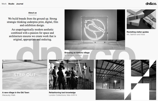
The studio's site is visually very striking. It is completely greyscale, with the only addition of colour coming from hover states and case study photography. This contrast creates an attractive dischord for the user as they browse.
Article continues belowThe site has an unapologetically large, fixed background image of dn&co's logo. I love this brash branding as it shows confidence in the brand. The dynamic application of the grid gives the site flexibility and variety, and allows the site's overall structure to be curated around the content.
dn&co's site is a perfect example of how to use cross-medium content effectively. GIFs and interactive elements sit comfortably alongside static portfolio photography, keeping the user's eye engaged as they scroll to find out more.
The case studies focus purely on the studio's work, again offering a flexible grid which allows the focus to remain on the art direction and body of work.


Words: Chris Allwood
Sign up to Creative Bloq's daily newsletter, which brings you the latest news and inspiration from the worlds of art, design and technology.
Chris Allwood is a digital designer and co-organiser of grassroots event Second Wednesday. He works at Studio Output in Nottingham, UK.
Like this? Read these!
- The UK's top 50 graphic design studios revealed
- Brilliant Wordpress tutorial selection
- The ultimate guide to logo design

The Creative Bloq team is made up of a group of art and design enthusiasts, and has changed and evolved since Creative Bloq began back in 2012. The current website team consists of eight full-time members of staff: Editor Georgia Coggan, Deputy Editor Rosie Hilder, Ecommerce Editor Beren Neale, Senior News Editor Daniel Piper, Editor, Digital Art and 3D Ian Dean, Tech Reviews Editor Erlingur Einarsson, Ecommerce Writer Beth Nicholls and Staff Writer Natalie Fear, as well as a roster of freelancers from around the world. The ImagineFX magazine team also pitch in, ensuring that content from leading digital art publication ImagineFX is represented on Creative Bloq.
