
When I decided to be a part-time freelance illustrator and caricaturist a few years back, I had plenty of painting programs to choose from. Obviously there was Photoshop CC that I used every day at work, but it comes with so many unnecessary features and the licence isn’t cheap, so I began looking around for an alternative.
I then remembered another paint app that a friend had shown me a while back. It had a clear, intuitive interface, it seemed to work pretty smoothly, and the price point was appealing. So I decided to give it a try and bought ArtRage Studio Pro.
It took a while to get used to ArtRage's tools, which work much like traditional media brushes, but I managed to find the settings that suited me and I'm now really happy with the choice I made. I've since upgraded to ArtRage 4, which comes with even more interesting features.
To create a good caricature, you need to know the anatomy basics, especially the ideal proportions of the face. You can use those as references or create your own ideal proportions, which would be even better. Then, when looking at your chosen subject, you have to understand what makes them unique. It'll help if you identify facial features that are smaller or bigger than usual, and then emphasise them. Noticing how asymmetrical the face is can also help you in your task.
Download the resources for this tutorial here
01. The right references

I spend time looking for good references of my subject: Margaery Tyrell, as played by Natalie Dormer. Various angles photos make it possible for me to better understand the face volumes of the actor. I also look for specific expression and lighting. I sometimes have to combine several references to achieve the right result, but this is what makes an original piece.
02. Sketching stage

Most artists do their sketching on paper and then scan it. Because I'm only able to draw during my lunch and I can't bring my traditional tools to work, I sketch with the tablet. The ArtRage pencil is perfect for this. I use it at 200 per cent Size (you can increase the maximum size for each tool up to 500 per cent), 38 per cent Pressure, 50 per cent Softness and no Tilt Angle.
03. Establish your colour palette

Import the sketch image by clicking the bottom left button in the References panel, then open the Color Samples panel (Ctrl+Alt+W). Select your colour with the Color Sampler and store it by pressing + or Add Sample in the Sample panel. You can then save it by exporting your samples.
04. Colouring your flats

I add a new layer, then drag it down to switch my layer order so that the sketch is on top. I start colouring with the Airbrush tool set at the biggest size and Hardness at 100 per cent. I add two more layers for the hair and background. I pick the mid-tones and loosely paint the skin, hair, clothes and background.
05. Make lighting choices

You can develop different moods and atmosphere depending on how you light your character. The main reference didn't have an interesting lighting scheme so I keep looking for other pictures and stumble across one that shows Natalie Dormer being lit by two light sources: a cold and a warm one. I then decide to render her this way.
06. First pass on volumes

To add more values I change the Airbrush Opacity to around 50 per cent, the Softness to roughly 90 per cent and reduce the Brush size to 100 per cent. I then pick the lighter and darker tones from the Color Sample panel and work on the main volumes. Those settings enable me to mix the different values and create pleasing-looking gradients.
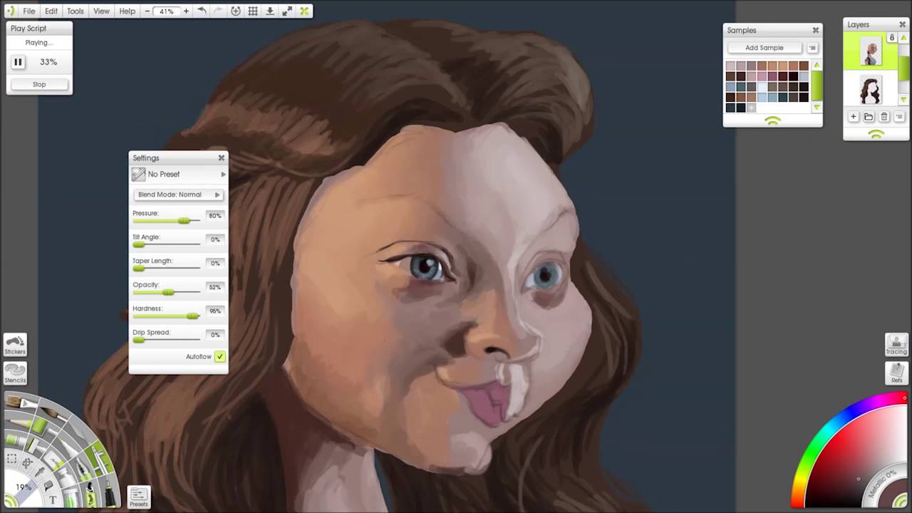
07. Get the eyes right

I set the Brush Size at about 20 per cent and I'm starting detailing the eyes. It's important to get this right because they're the most expressive feature and usually what the viewer notices first when looking at somebody. You should be able to recognise the caricature just by looking at the eyes. If the results aren’t good enough, there’s no point continuing.
08. Working on the face

I set the sketch layer's Opacity to 50 per cent and refine the volumes of the face while smoothing out the gradients. I then refine the other features of the face and pay attention to lighting, to increase the realism. Once this is done I hide the sketch layer.
09. Detailing the body

At this point I zoom out to make my painting look like a thumbnail. At this size the character should still be recognisable; If not, changes should be made. There's no need to be as precise with the render of the neck, chest and arm compared with the face, so I use a bigger brush to get it done faster. However, I pay attention to the subtle change of values of the flesh tones.
10. Depicting the clothing

Rendering clothing isn't straightforward, and the task is made more difficult when it's embroidered cloth that a lot of Game of Thrones characters wear. The trick here is to work on the volume first and add the details afterwards with a low Opacity brush. This ensures that the embroidery and patterns will blend smoothly with the general volume of the clothing.
11. Painting the hair

A common mistake is trying to render hairs one by one. Instead, first render the strands of hair as simple volumes. I use a medium-sized brush and roughly paint the shadows and highlights. Then set the Hardness to 50 per cent. Notice how individual hairs behave on the reference pictures, especially on the curves of the head, and then try to recreate this.
12. The background

I used to stay close to my references when it came to painting the background, but lately I’ve decided to keep my caricature backgrounds simple. In my opinion, my choice helps to maintain the focus on the character, and gives it a more painted look. I paint the background with the Oil Brush tool on these settings: Pressure, 50; Thinners, 50; Loading, between 3 and 8 depending on the brush size; Aspect, 100; Rotation, 0; and Stiffness, 99.
13. Adding a blending layer

Once I've finished painting the background of the caricature, I create a new layer on top of all the others that will help me blend everything together. I then work on the meeting point between the hair and skin, and fix minor details.
14. Final details pass

I zoom out once again and take a look at the nearly finished piece. I polish it where necessary, and then try out a few different background options. The original blue was okay, but I wanted more contrast. After trying four different colours I decide to stick with the green version. Finally, I sign my work and call the piece finished.
This article originally appeared in ImagineFX issue 139; buy it here.
