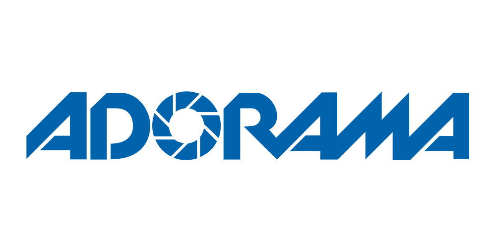
Adorama ditches its aperture 'O' in radical rebrand
Photography store's dramatic new look misses the mark.
NYC photography store Adorama has ditched its clunky, spiky old logo design in favour of a radical new look – but it's not entirely successful. The new wordmark makes overdue steps towards modernisation, but is coming under fire for everything from its stubby ascenders to its oddly speckled 'O'. Let's take a look at what the brand got right, and where it went wrong...

US readers might know Adorama from its bricks-and-mortar NYC store, but the photography brand is more widely known for its online shop (its competitive prices mean it often appears in our best camera buying guides). The old logo (above) was all focused around the distinctive 'O', which was styled like a camera shutter, the angles of which were reflected in the rest of the letters.
Not only was the jagged lettering looking rather dated from an aesthetic point of view, but the focus on the camera shutter also gave of a decidedly analogue vibe and failed to reflect the company's shift into digital products and services. So a redesign was certainly overdue.

We'll also applaud Adorama's confidence in maintaining some personality in its new look. We've seen far too many bland, identikit logo redesigns of late. However, other than that we're not too impressed by the new look.

Like the old logo, the 'O' is the focus here. The shutter design has been replaced by a dotty pattern, perhaps to suggest pixels. It makes sense for a company with a focus on digital image-making. However, the execution is sloppy. The dots don't relate to the shape of the letterform, instead being placed in a grid format that's jarring in context.
There's also a solid border around the perimeter of the counter, but none on the outer edge of the 'O', which again looks messy and illogical. Finally, Adorama has committed the cardinal sin of not creating a logo that scales well: at small sizes, the dots don't read well at all, looking more like a low-res design than an active style choice.
Elsewhere, the mix of rounded and non-rounded corners, and stubby ascenders create a design that lacks harmony. Commenters have suggested it looks more like a children's clothing or craft store than a cutting-edge photography business. What do you think of the new look? Let us know on Twitter or Facebook.
Daily design news, reviews, how-tos and more, as picked by the editors.
Read more:

Thank you for reading 5 articles this month* Join now for unlimited access
Enjoy your first month for just £1 / $1 / €1
*Read 5 free articles per month without a subscription

Join now for unlimited access
Try first month for just £1 / $1 / €1

Ruth spent a couple of years as Deputy Editor of Creative Bloq, and has also either worked on or written for almost all of the site's former and current design print titles, from Computer Arts to ImagineFX. She now spends her days reviewing small appliances as the Homes Editor at TechRadar, but still occasionally writes about design on a freelance basis in her spare time.
