The 10 hottest web design trends of 2013
We take a look back at the hottest design trends of the year on the web.
Sign up to Creative Bloq's daily newsletter, which brings you the latest news and inspiration from the worlds of art, design and technology.
You are now subscribed
Your newsletter sign-up was successful
Want to add more newsletters?
Forget luxury clothes and designer couture: the real battle ground for fashion statements is on the web. Unlike high-end real-world goods, however, the web is democratised, allowing individual designers to seize on a trend and create their own interpretation.
This means that design trends can develop quickly online, and equally can fade just as rapidly. The ability to adapt a website’s design almost daily makes it an incredibly versatile, if transient form of design expression, so it’s worthwhile taking a step back and looking at just what’s been hot this year. Next year the entire web may look very different!
Before we launch headfirst into the hottest trends in web design, you might be wondering what makes a design approach a trend, or what make it hot? Put simply, if there’s a particular design aesthetic that’s popping up widely across the web, we consider it to be a trend. The more a trend is adopted and used on the web, the hotter it is! Make sense? Great, let’s get on to the list!
Article continues below01. Responsive design
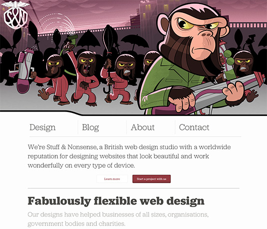
This was always going to be top of the list of hot web trends for 2013. In all likelihood, it will appear next year too as clients begin to actively ask for responsive design approaches.
Responsive design is an approach in which a website layout will repaginate to fit and suit different screen sizes, device profiles and, increasingly, user profiles. The idea is that a single codebase is used to display a website, with individual stylesheets (or qualified areas of a single stylesheet) handling layout for different devices. To see a responsive design react to different resolutions, simply grab your browser window and expand or collapse it.
The best responsive designs don’t simply juggle content around on the page, but also consider the navigation, display of images and content usage, including bringing more mobile-pertinent content to the fore when a design is squeezed into a smartphone-sized screen. This is becoming increasingly possible thanks to browser vendor’s adoption of new CSS3 modules, which is why we think this is one trend that will live on and on.
- Also read: 13 really useful responsive design tutorials
02. Flat design
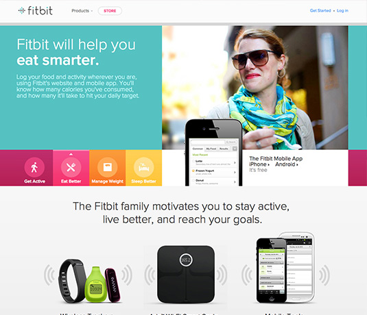
A few years back drop shadows were all the rage. As soon as browsers started to support CSS3 properties for box-shadow and text-shadow, their proliferation exploded. This pseudo 3D real-world effect wasn’t limited to simple shadow effects, however. Elaborate designs replicated all sorts of life-inspired environments from paper pads to roulette tables.
Sign up to Creative Bloq's daily newsletter, which brings you the latest news and inspiration from the worlds of art, design and technology.
All this changed in 2013, however. Even Apple, famous for its skeuomorphism-inspired app designs, eschewed the physical metaphor in favour of a digital approach to design, adopting simple flat colours and clean interfaces to iOS 7.
In truth this is a trend that has been long in the making, and Apple themselves were late to the party, but we can safely call flat design one of 2013’s hottest web trends when one of the world’s leading computer and consumer electronics companies adopts it in earnest.
- Also read: 10 examples of flat design
03. Static headers
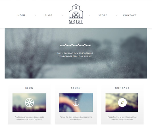
Static headers remain on screen as the user scrolls down a website, providing persistent navigation and access to the search field, while retaining the branding in clear sight at all times. This particular trend has come about largely because designers can finally use position: fixed, a part of the CSS2.1 specification, reliably without having to worry about whether a browser is likely t support the styling.
Why now? Simply because Internet Explorer has finally moved on, with the user base for IE6 at an almost insignificant percentage of market share. You can almost hear a sigh of relief!
04. Parallax
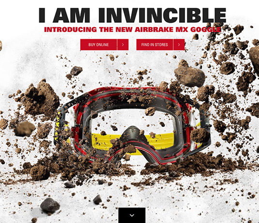
There’s been a huge surge in parallax scrolling effects during 2013. Parallax, for the uninitiated, is the effect you see when looking out a moving vehicle: objects closer to you appear to move more quickly than object farther away. On screen it’s a technique that was used to great effect in videogames during the 1980s and '90s, but during 2013 the parallax effect hit the web with style.
Used as a method to suggest a sense of depth and pseudo-3D, parallax moves different element planes at different speeds according to how close to the viewpoint those elements are supposed to appear. It’s extremely effective when executed well, and has been one of the biggest trends of web design in 2013, especially when used in conjunction with single-page or infinite-scrolling website designs.
05. Infinite scrolling websites
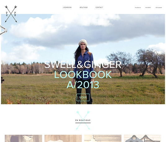
You can’t have failed to notice the move towards single-page websites that seem to scroll for ever. This approach to website navigation rejects the notion of separate pages for different bits of content, preferring to stack them vertically and consequently avoiding the need for a page load or refresh to access content.
It’s a really nice way of telling a story, showing off a product, or simply presenting all a company’s key information within a single page. You’ll often see this approach used in conjunction with parallax scrolling effects to create a coherent 'world' in which a product or service lives.
- Also read: Why the long page?
06. Support for HiDPI (Retina) displays
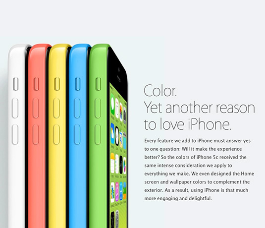
This trend has developed in direct response to the changing hardware market. With the launch of the Retina display for iPhone, it was inevitable that other devices would follow suit, and increasingly products are shipping with HiDPI displays capable of showing more than 200 pixels per inch.
This potentially presented problems for web designers, although Apple and its competitors developed software work-arounds to handle non-HiDPI-optimised content.
Increasingly though, web designers have started taking full advantage of the increased resolution offered by Retina displays, serving up a different version of an image for capable devices, making their wares seem all the more crisp, exciting and perfect!
07. Typographically-led designs
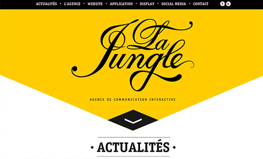
With the explosion in web fonts, and some of the major web font publishers pushing out desktop-sync services during 2013, it was almost inevitable that we’d see a surge in typography-led design on the web during this year.
These designs, also aided by Twitter’s Bootstrap framework which offers several layout modules featuring large type at the fore, typically feature a prominent headline rendered in a web font, followed by careful grid-aligned areas of exploratory text that often feature minimal imagery and beautiful typographical treatments.
This trend is a reflection of the web’s move towards more print-like layout capabilities, and we can’t see it dying out any time soon.
- Also read: The secrets of great web typography
08. Circular design elements
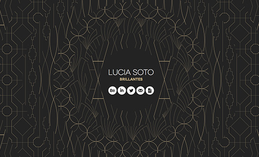
Largely thanks to support for the CSS3 border-radius property, 2013 has seen an increasing number of CSS-rendered circular design elements. You’ll spot them everywhere from simple badges encouraging you to buy now, to pull-quotes and image frames. Some designers have taken this to extremes, offering up clever circular-based designs that are displayed using only CSS.
Although it’s typically used as a flourish rather than the basis for a design treatment, circular elements have become common enough to make it onto our list for 2013.
09. CSS3 animations
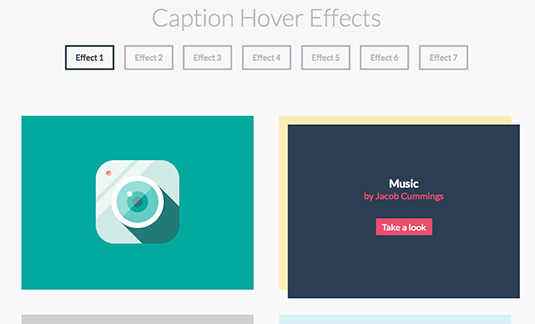
Again this is a technology-initiated innovation, and is entirely transparent to the end-user, but for the web designer there’s been a substantial shift in the way user interaction and element animation has been constructed during 2013.
Way back in the early 2000s, Flash was the king of sophisticated animation effects as it offered the only reliable and practical way to create fancy user interactions that offered more than a simple mouseover change. As JavaScript libraries such as jQuery developed, these became the de facto method for engineering similar treatments, supplanting Flash and becoming a core skill for designers.
2013 has seen CSS3 start to replace JavaScript as the principal tool for realising common animation effects, thanks in no small part to browser adoption of the keyframes and transitions properties found in the latest version of the CSS specification.
10. Supersized buttons
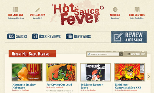
The final trend to make it on to our list of the hottest in web design for 2013 is… supersized buttons! When we say supersized, we don’t mean 'too big', simply larger than the traditional button you might find in a web layout. This is a really useful way of drawing attention to a particular call-to-action, and they’ve caught on in a big way.
Whether it’s highlighting a product tour, encouraging you to shell out your cash, or demanding your email address, the supersized button is now in widespread use and it’s so effective - so critical to effective marketing - that it’s unlikely to disappear any time soon.
Liked this? Read these!
- The designer's guide to special characters
- How to build an app
- Free graphic design software available to you right now!
- Download the best free fonts
- Our favourite web fonts - and they don't cost a penny
- Download these free iPhone apps for designers
Have you spotted a web design trend during 2013 that didn’t make our list? Let us know in the comments below!

The Creative Bloq team is made up of a group of art and design enthusiasts, and has changed and evolved since Creative Bloq began back in 2012. The current website team consists of eight full-time members of staff: Editor Georgia Coggan, Deputy Editor Rosie Hilder, Ecommerce Editor Beren Neale, Senior News Editor Daniel Piper, Editor, Digital Art and 3D Ian Dean, Tech Reviews Editor Erlingur Einarsson, Ecommerce Writer Beth Nicholls and Staff Writer Natalie Fear, as well as a roster of freelancers from around the world. The ImagineFX magazine team also pitch in, ensuring that content from leading digital art publication ImagineFX is represented on Creative Bloq.
