Create complex shades
Freelance illustrator Roya Hamburger walks you through a great shading technique that will add a stunning 3D effect to your artwork
Through effective shading it's possible to create a 3D effect in your work that really brings the different shapes to life.
One technique that I often use involves shading some parts of my images and leaving others, so that the contrast between 2D and 3D becomes visible. Each different shape responds to the next, and is distinguished by its shading from those around it.
I'm inspired by art from China, Japan and Africa, and decorative art from the 60s and 70s. In this tutorial the shapes are abstract, but if you look really carefully you'll see a Chinese dragon mask holding a spear. To follow the steps you'll need a pencil and paper, Illustrator and Photoshop.
Article continues below 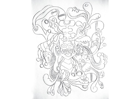
01 Start sketching a random, shape-based design on paper. For personal work like this, I prefer to have no idea what the final image will look like when it's finished, so start sketching with a blank mind. It can be harder to stay true to your own style when you've been commissioned by a client, but always aim to create your signature look - after all, that's why the client has chosen you.
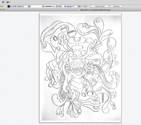
02 When you've finished your sketch, scan and import it into Illustrator. Now trace the lines with the Pen tool. At this point, size doesn't really matter. With vectors you can scale your image to any size, before importing it to Photoshop.
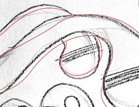
03 Practice makes perfect with the Pen tool. It's one of the key tools in Illustrator: you can't do without it. In my opinion it's not for drawing - sketching should be done with pencil and paper. It's more a tracing and shaping tool.
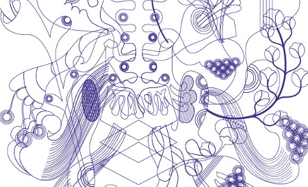
04 After you've traced the shapes, switch off the stroke and give each shape a different Fill colour so that it will be easy to select the shapes later in Photoshop. Now you're ready to import the Illustrator file into Photoshop. Select the image and make a copy, leaving the original paper sketch behind.
Sign up to Creative Bloq's daily newsletter, which brings you the latest news and inspiration from the worlds of art, design and technology.
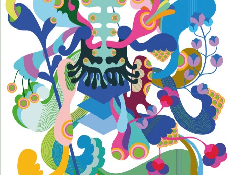
05 Paste the Illustrator file into Photoshop in pixels, and determine the image size. Now chose your colour palette. I opted to use a maximum of three basic colours; all colours in the image are therefore a derivative of these three. Using too many will make the image restless and incoherent.
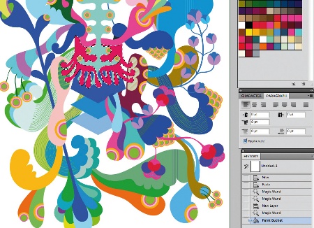
06 It's time to fine-tune the colours. Select each shape individually with the Magic Wand tool, and start experimenting with different options.
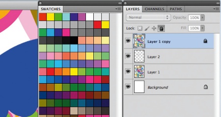
07 Keep a copy of the original imported file in a locked layer. This will make it easier to change aspects of your image if you need to, such as the colours. If you click on the lock icon you will lock that layer, but still be able to select shapes. The selection will work in all the layers.
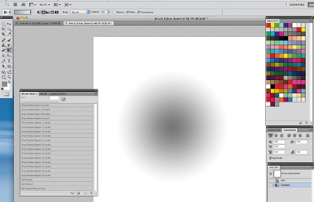
08 In order to begin the shading process, you'll need to make your own brush with a granular effect. To do this, use the Gradient tool and then select Radial Gradient.
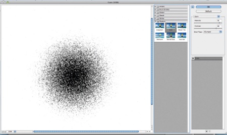
09 Next go to Filter, choose Texture, and select Grain. The brush is now ready. Go to Edit>Brush Presets, and save it.
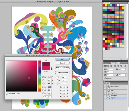
10 It's best to do the shading in a new layer. Select the area you want to work on, and choose a darker shade in the Color Picker. Start shading with the new brush, setting the Opacity to 3-12%. If you're using a Wacom tablet you need to reduce the pressure applied to help build up a smooth shade.
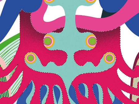
11 Select Linear Burn under the Mode options for the brush, so that you can make the shade as dark as you wish. The Linear Burn blending mode results in an effect similar to Multiply Mode, where lighter areas in the blend layer allow the bottom layers to show through, but it's a little different in that it actually darkens the bottom layer's colours.
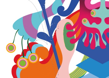
12 Make a selection of the shape you want to add a 3D effect to, and use the Magic Wand tool to drag it slightly outside of the original shape. You can press the Alt button to deselect any parts that you don't wish to shade.
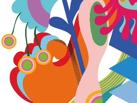
13 Select the new area and chose a darker tone with the Color Picker. Using the new brush, start shading with an Opacity of 3-12% again, applying a low pressure if you're using a Wacom tablet.
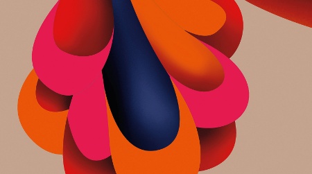
14 Don't add the effect to every shape. Leaving some areas unshaded will give the image an interesting mixture of 2D and 3D.
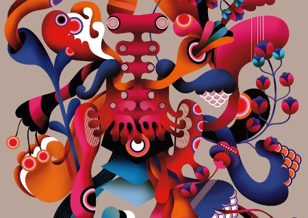
15 You're now finished. Before you merge the layers, save the layered file in your archive in case you decide you need to make amendments in the future.
Roya Hamburger
A freelance illustrator, artist and designer, Roya produces illustration and graphic designs for advertising agencies, publishers and art institutions, and boasts an international client base. You can view her work at www.royahamburger.net

The Creative Bloq team is made up of a group of art and design enthusiasts, and has changed and evolved since Creative Bloq began back in 2012. The current website team consists of eight full-time members of staff: Editor Georgia Coggan, Deputy Editor Rosie Hilder, Ecommerce Editor Beren Neale, Senior News Editor Daniel Piper, Editor, Digital Art and 3D Ian Dean, Tech Reviews Editor Erlingur Einarsson, Ecommerce Writer Beth Nicholls and Staff Writer Natalie Fear, as well as a roster of freelancers from around the world. The ImagineFX magazine team also pitch in, ensuring that content from leading digital art publication ImagineFX is represented on Creative Bloq.
