Shoot a stunning 3D set design
Shotopop explains how creative photography can make or break tactile illustration work, muddling the boundaries between creative disciplines.
Sign up to Creative Bloq's daily newsletter, which brings you the latest news and inspiration from the worlds of art, design and technology.
You are now subscribed
Your newsletter sign-up was successful
Want to add more newsletters?
Tactile illustration essentially involves capturing a real-life three-dimensional space as a 2D image.
You will need to play composer and sound engineer in this orchestra, formulating and devising the arrangement as well as recording the output in as pleasing a fashion as possible. In a world that's so technologically reliant, it can be really refreshing to revert to traditional methods of construction and image-making (of course, technology will still come into play: after all, it is there to streamline our workflow). Remember though that real tools, unlike the ones in Photoshop and Illustrator, can actually hurt you, so be careful.
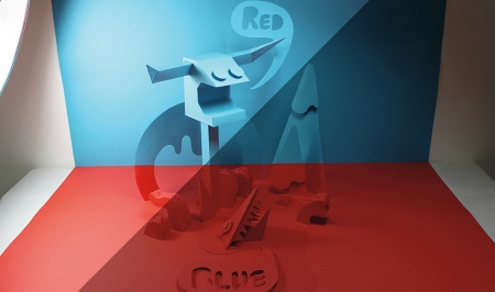
Here we'll explain how we created this scene, paying particular attention to the role that photography plays in the process. When viewed from a specific angle, the image is divided horizontally into two defined colour spaces (red and blue), but as you can see in the image on the right, this is an optical illusion.
Article continues below 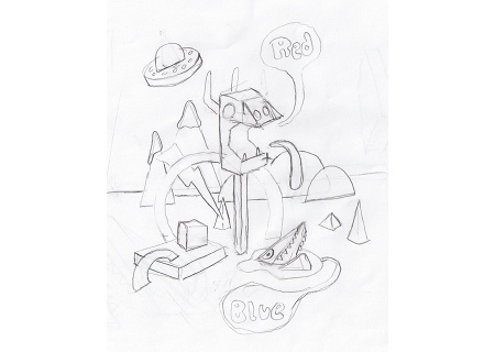
01 A good place to start is with a brainstorm, followed by a rough sketch. This doesn't have to define the exact layout, but will be useful for figuring out what elements you want to build, and how the whole thing will work in a three-dimensional space. We came up with the concept of splitting the illustration into two defined colour spaces (red and blue), created with an optical illusion using angles and camera positioning.
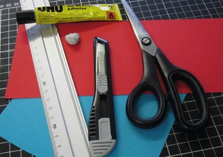
02 Decide which materials you want to use for construction; these could range from coloured cardboard to acetate to foamboard, depending on the desired effect. You'll also need the basic craft tools for construction, such as a cutting mat, scalpel, scissors, glue, tape and a metal ruler. We chose to build this illustration out of bright red and kingfisher blue card - quite thick - which is easy to cut but supportive enough to take the weight of the different elements.
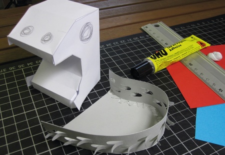
03 If you have complex elements, it can help to do a test build. This is also a good way to get the scale right and to figure out measurements. It might require a bit of trial and error, but will be useful later in creating slick objects that don't require many alterations in post-production. This process will also help you to know whether you need to build additional supports.
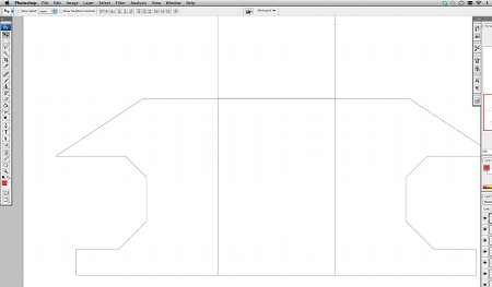
04 Once you've made your tests you can take them apart and build precise patterns in Illustrator or Photoshop. You might want to scan in the flattened test to trace. It's a good idea to use the rulers in either of these programs to make sure your patterns are precise. When making your pattern, use a very thin hairline, as this will help you fold more precisely.
Sign up to Creative Bloq's daily newsletter, which brings you the latest news and inspiration from the worlds of art, design and technology.
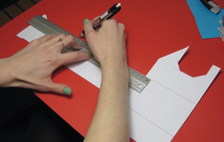
05 Print out the pattern onto cheap paper and cut it out neatly. Now get your coloured card and trace the pattern with a light pencil. Try to make as few marks as possible so you don't have to erase too much later. Cut the shape out with a scalpel or craft knife, making sure you don't cut off any marks that show where to fold.
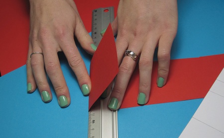
06 Using a ruler, push the paper up along the edge to make neat, sharp folds. If the card is quite thick it might be necessary to score the card first, by running a blade lightly over the fold line. Remember that you should score on the side that makes the outer edge of the fold, and be careful not to cut all the way through.
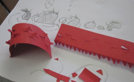
07 Glue flaps are very important elements of any three-dimensional build. They are generally quite easy to control on straight edges and you just need to remember to cut the sides at angles; if you're making a curve, however, the smaller the sections you make, the smoother the curve will come out. Be patient, as this can be a painstakingly slow process.
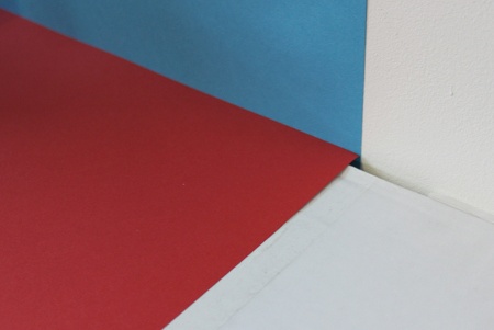
08 Now set up your space to photograph. We stuck a blue piece of card on a wall with tape and laid a red piece of card on a horizontal surface so that the two coloured surfaces touch to make a right-angled corner. We often build our sets on an infinity curve, but given the sharp horizontal angles we were working with, this particular project required a specific solution to suit its environment.
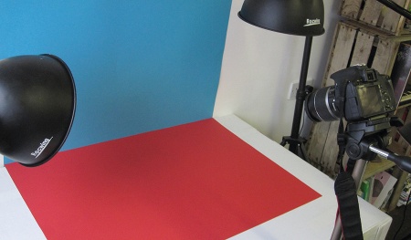
09 Because this specific tactile piece relies very heavily on the angle of the camera, the next step was to set the camera up on a tripod in such a way that the corner between the two colours intersects the viewfinder exactly in the centre. We used a reasonably high angle.
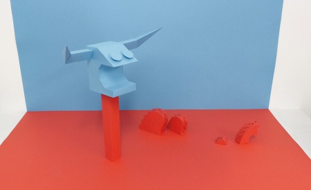
10 Now it's time to play set designer. Use all the elements you have built, and dress your set. We had to do this while we were building because the concept required us to split certain elements into two colours, and to align elements in the set relative to the camera's position. The camera essentially becomes your eyes in this step, because the positioning needs to correspond to the camera angle.
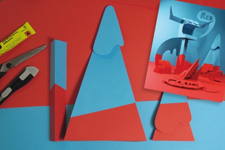
11 Build all the elements in their base colour first: here, we're starting with red. Add them to your composition, have a look through the camera, and then re-make their top parts with blue. Now you have to position them at exactly the right spot and angle for the red/blue divide to be a perfectly straight line - this will take a fair bit of trial and error, so take your time.
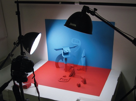
12 Add atmosphere and dimension with lighting. This is a key point in significantly increasing the value of your shot. Lay out your light sources and craft the way in which light and shadow fall on your elements to enhance them. You also want to make sure that the lighting doesn't flatten out the elements; you want to enhance their three-dimensionality.
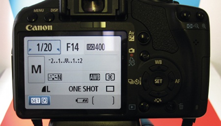
13 Before taking the photo, you have to play around with the setting to find the right balance on your camera settings. Start by setting your aperture. There is a simple relation between aperture and depth of field: the smaller the aperture, the more extensive the depth of field. So if your camera is close to the composition, you'll probably want a smaller aperture to keep the whole image in focus.
14 Adjust the shutter speed to get the exposure right. The slower the speed, the more exposed (brighter) your pic will be; faster shutter speeds will give darker images. The slower you go, the more chance you have of shaking the camera however, and if you're going for really slow (or have a wonky tripod), you might want to put a two-second time delay on the shutter release to aid stability.
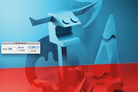
15 Open your photo in Photoshop. To ensure that the image is perfectly straight, select the Ruler tool (I, or Shift+I to cycle between the Eyedropper, Sampler and Ruler). Then click-and-drag a line along a horizontal edge in the photograph, and rotate the canvas as necessary (Image>Rotate Canvas>Arbitrary) to match up the line. This will rotate your image and widen your canvas so that no cropping occurs.
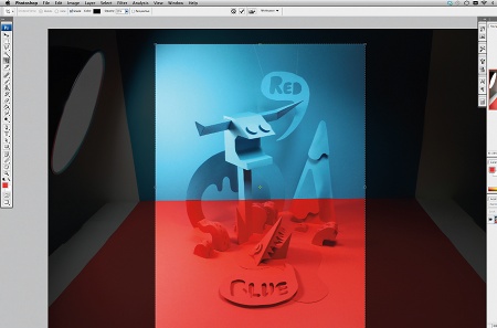
16 Recompose the image by using the Crop tool (C), or if you need a specific size output, adjust the Canvas Size (Ctrl/Cmnd+Alt/Opt+C). For this option ensure the layer isn't locked before resizing, to avoid deleting parts of the image. Photoshop will warn you that clipping may occur, but it is OK to proceed. You can now move your image layer around to get the desired framing.
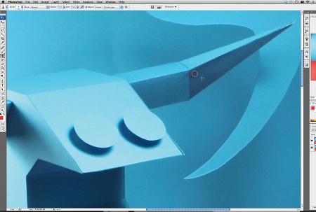
17 Retouch any blemishes using the Clone Stamp tool (S). First create a new layer, ensure that Current and Below are both selected in the Sample drop-down in the Options bar, and select a brush size. Use Alt/Opt-click to sample an area to use as your reference point, and then click and draw where you want the cloning to appear. We've removed some tape that was holding together some of the construction, for instance.
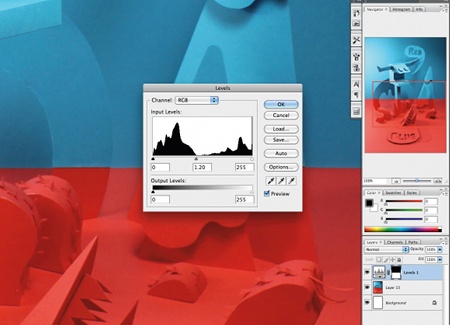
18 Your image might also need some colour correction to finish the project. Due to the distinct colour separations here, it was necessary to adjust the red as this area came out tonally darker than the blue area. Using the Lasso tool (L), make a selection around the area you want to adjust. Add a Levels adjustment layer, and alter the mid-tones to lighten the selection. That's it - you're done.
Shotopop
A proud purveyor of both tactile and digital illustration, London-based studio Shotopop designs for print, interactive media, motion graphics and everything that comes before, in between and after. www.shotopop.com

The Creative Bloq team is made up of a group of art and design enthusiasts, and has changed and evolved since Creative Bloq began back in 2012. The current website team consists of eight full-time members of staff: Editor Georgia Coggan, Deputy Editor Rosie Hilder, Ecommerce Editor Beren Neale, Senior News Editor Daniel Piper, Editor, Digital Art and 3D Ian Dean, Tech Reviews Editor Erlingur Einarsson, Ecommerce Writer Beth Nicholls and Staff Writer Natalie Fear, as well as a roster of freelancers from around the world. The ImagineFX magazine team also pitch in, ensuring that content from leading digital art publication ImagineFX is represented on Creative Bloq.
