Anagrama designs a sharp new identity for Tabarka Studio
Anagrama pull out all the stops in its high-end branding exercise for Tabarka Studio
Sign up to Creative Bloq's daily newsletter, which brings you the latest news and inspiration from the worlds of art, design and technology.
You are now subscribed
Your newsletter sign-up was successful
Want to add more newsletters?
Mexico-based branding firm Anagrama has designed a slick new identity for terra cotta tile manufacturer Tabarka Studio.
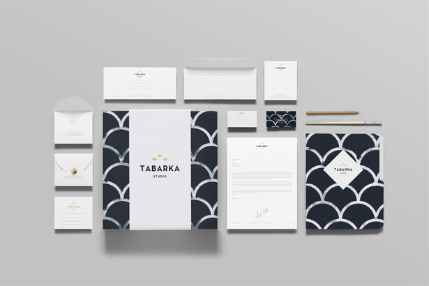
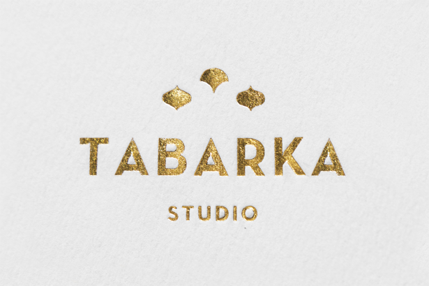
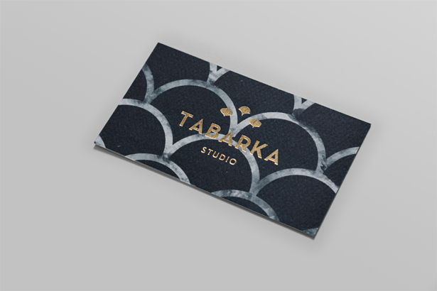
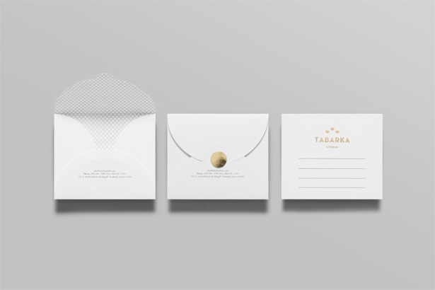
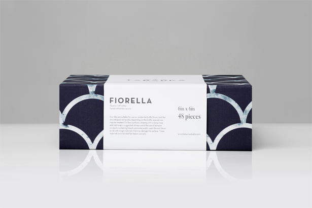
Briefed to help evolve the client from a manufacturer into “a new high-end life-style brand”, Anagrama took inspiration from Tabarka’s intricate hand-crafted titles for its logo design, before developing a classic visual language across the rest of the branding via a blue-and-white scale pattern.
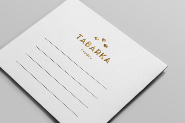
“To emphasise and project the tiles, the logotype's icon and the stationery's patterns are reminiscent of tile placing and patterns,” explains Anagrama art director Mike Herrera, adding that the porosity of the tiles is represented in the choice of heavy, porous paper for the stationery.
Article continues belowHand-drawn designs
Anagrama sketched out the initial branding designs on paper: “The computer presents so many creative limitations with ideas that flow so much better by hand,” says Herrera.
“The most challenging part of he project was finding the appropriate pattern for the stationery. We wanted something classic, simple and not very noisy. We love the printed pieces in their tactile form. The gold foil print finish, the thick porous paper – it all looks so lovely and so much better than on any screen.”
To see more of Anagrama’s branding work, head over to the studio’s website.
Sign up to Creative Bloq's daily newsletter, which brings you the latest news and inspiration from the worlds of art, design and technology.

The Creative Bloq team is made up of a group of art and design enthusiasts, and has changed and evolved since Creative Bloq began back in 2012. The current website team consists of eight full-time members of staff: Editor Georgia Coggan, Deputy Editor Rosie Hilder, Ecommerce Editor Beren Neale, Senior News Editor Daniel Piper, Editor, Digital Art and 3D Ian Dean, Tech Reviews Editor Erlingur Einarsson, Ecommerce Writer Beth Nicholls and Staff Writer Natalie Fear, as well as a roster of freelancers from around the world. The ImagineFX magazine team also pitch in, ensuring that content from leading digital art publication ImagineFX is represented on Creative Bloq.
