Bold beer branding packs a punch
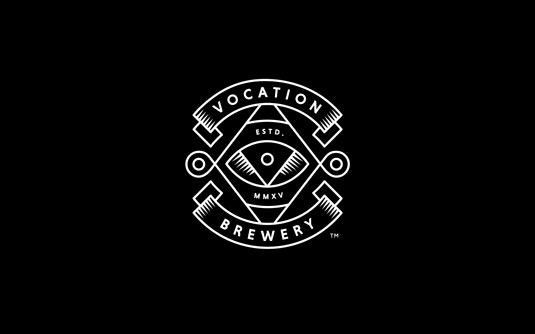
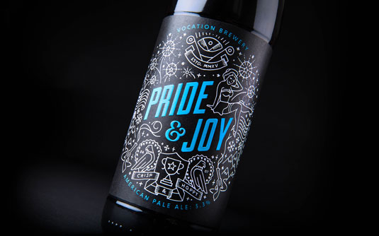
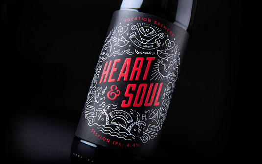
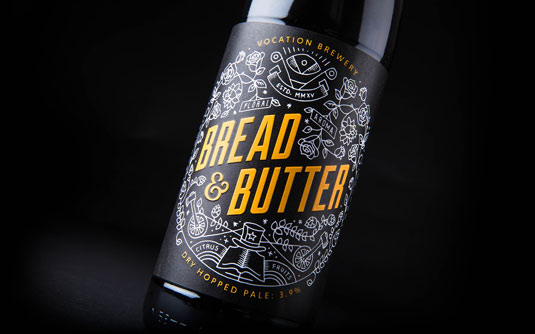
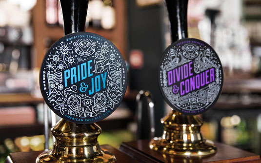
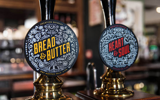
Vocation Brewery's punchy and distinctive branding designed by Robot Food reflects its bold, uncompromising beer.
Sign up to Creative Bloq's daily newsletter, which brings you the latest news and inspiration from the worlds of art, design and technology.
You are now subscribed
Your newsletter sign-up was successful
Want to add more newsletters?
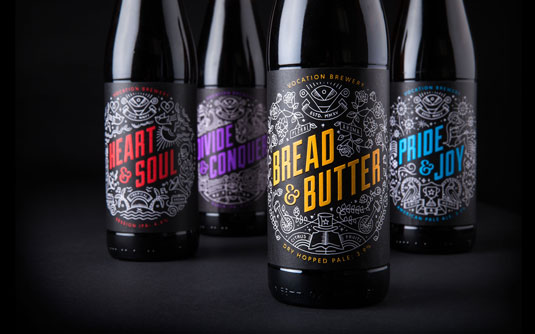
When the North's newest craft brewery were trying to create branding that would reflect their unique beers and fiercely independant approach to brewing, they needed some help.
Highlighting the company's uncompromising vision: a relentless persistence to make their beers bold, brave and exhilarating, the design team at Robot Food came up with a punchy and distinctive brand to make the product stand out from the crowd visually.
Discover some outstanding uses of colour in branding
Simon Forster at Robot Food remembers brewery founder, John Hickling contacting them after reading a blog post they wrote on beer branding. "His idea was to call his new brewery 'Brewery On The Hill', but we felt we could develop something far more compelling based on his story.
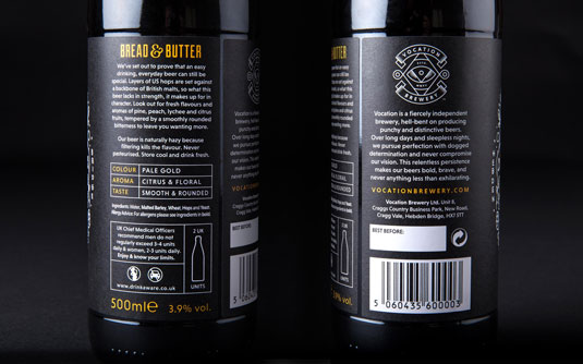
"Every detail was carefully considered. We wanted to balance handcrafted sensibility with bold graphic packaging design for a brand that reflects traditional values in a contemporary and eye catching way.
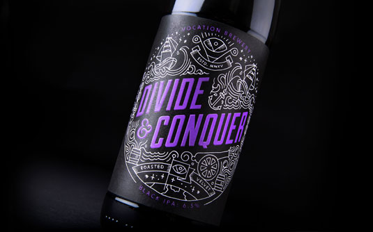
"The illustrations on each label are inspired by the tasting notes of the beer. The whole team had input in this and we illustrated them in-house around the bold Duke font in a colour that worked for each."
Check out Vocation Brewery to see the full extent of this top-notch branding.
Sign up to Creative Bloq's daily newsletter, which brings you the latest news and inspiration from the worlds of art, design and technology.
Liked this? Read these...
- Adobe launches radical new stock image service
- Hands-on review: Adobe Photoshop CC
- Hands-on review: Adobe Illustrator CC

The Creative Bloq team is made up of a group of art and design enthusiasts, and has changed and evolved since Creative Bloq began back in 2012. The current website team consists of eight full-time members of staff: Editor Georgia Coggan, Deputy Editor Rosie Hilder, Ecommerce Editor Beren Neale, Senior News Editor Daniel Piper, Editor, Digital Art and 3D Ian Dean, Tech Reviews Editor Erlingur Einarsson, Ecommerce Writer Beth Nicholls and Staff Writer Natalie Fear, as well as a roster of freelancers from around the world. The ImagineFX magazine team also pitch in, ensuring that content from leading digital art publication ImagineFX is represented on Creative Bloq.
