Behind the scenes of The Great Gatsby's typography
Take a look behind the scenes, as Like Minded Studio take us back to the beginning of their Great Gatsby branding project.
Sign up to Creative Bloq's daily newsletter, which brings you the latest news and inspiration from the worlds of art, design and technology.
You are now subscribed
Your newsletter sign-up was successful
Want to add more newsletters?
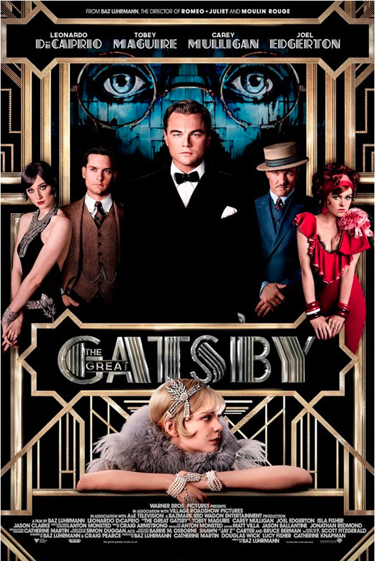
Fans of 3D movies are currently flocking to the cinema to see Baz Luhrmann's latest film The Great Gatsby. It's a great movie for all sorts of reasons - but what caught our attention most was the stunning use of typography to bring the period feel to life.
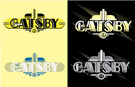
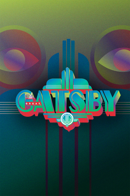
Like Minded Studio, based in Sydney, was the agency behind the project, with an aim to realise Luhrmann's vision and develop a bespoke Deco-styled logo reflective of the roaring '20s.
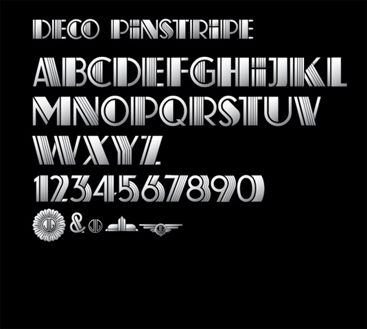
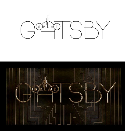
They also had the task of creating the all-important display typeface to accompany the main branding.
Article continues belowInspiration for the bespoke typeface came from the deco alphabet designs of K.H. Schaefer. Developing a system to combine solid and pinstriped characters in sequence when typing out words, Like Minded Studio customised and refined the letterforms to reflect the design of the main logo.
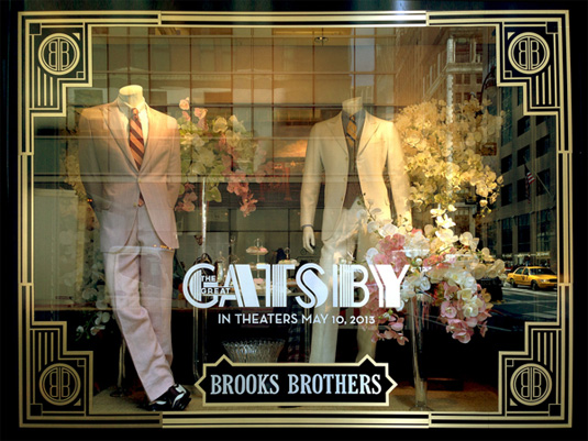
The final titles and logo were further rendered in 3D by Deva Studios to create a signature style for the movie.
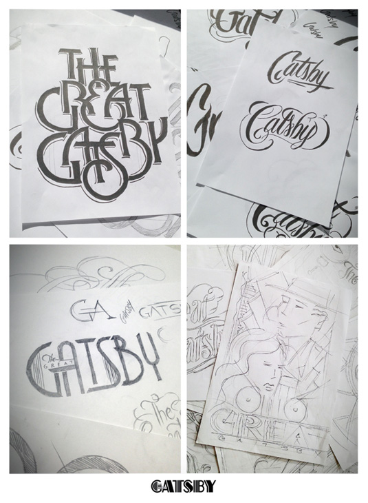
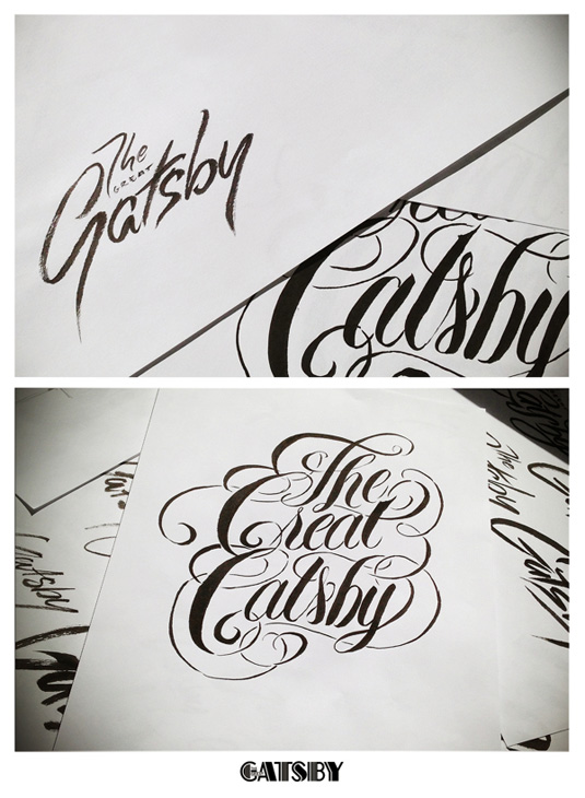
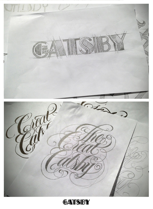
The design has received rave reviews from fans and critics alike. Personally, we love the the studio's decision to focus on the 'Gatsby' - allowing the name to be instantly recognisable whilst still including the full title. The studio went through a number of drafts when creating the branding, as can be seen in the sketches below:
See more work from Like Minded Studio over on their Behance page.
Sign up to Creative Bloq's daily newsletter, which brings you the latest news and inspiration from the worlds of art, design and technology.
Like this? Read these!
- Free graffiti font selection
- Illustrator tutorials: amazing ideas to try today!
- Great examples of doodle art
Have you seen a great example of movie typography? Let us know in the comments box below!

The Creative Bloq team is made up of a group of art and design enthusiasts, and has changed and evolved since Creative Bloq began back in 2012. The current website team consists of eight full-time members of staff: Editor Georgia Coggan, Deputy Editor Rosie Hilder, Ecommerce Editor Beren Neale, Senior News Editor Daniel Piper, Editor, Digital Art and 3D Ian Dean, Tech Reviews Editor Erlingur Einarsson, Ecommerce Writer Beth Nicholls and Staff Writer Natalie Fear, as well as a roster of freelancers from around the world. The ImagineFX magazine team also pitch in, ensuring that content from leading digital art publication ImagineFX is represented on Creative Bloq.
