How to design a logo for a music festival
How do you go about representing something as elusive as the excitement and energy of a music festival in a piece of design? Studio Output’s Becky Barker gives her view.
Sign up to Creative Bloq's daily newsletter, which brings you the latest news and inspiration from the worlds of art, design and technology.
You are now subscribed
Your newsletter sign-up was successful
Want to add more newsletters?

When you think about a festival, what’s the image that springs to mind? Rarely is it one of the festival’s logo or identity system. It’s the atmosphere of being packed in front of the main stage, the excuse to team wellies with any outfit, staying up to see the sun rise and the excitement of watching your favourite band.
It's very much about the feel and tone of the event, the emotional response – from landing the ticket to that long coach journey home. That becomes the identity of a festival. But how can you reflect all of that through a piece of branding design?
The identity of a festival is very much about the feel and tone of the event
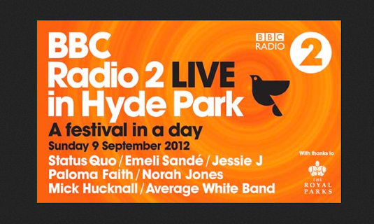
When we were presented with the brief for branding this year’s Radio 2 Live in Hyde Park, we really wanted to reflect that it’s an event for everyone, whatever their musical tastes. Our approach was ‘a festival in a day’ – experiencing everything you would at a longer festival, but being able to go home and have a nice bath afterwards.
Article continues belowThis thought process led to a circular illustration, segmenting the components of the event across the duration of one day. The audience could choose to attend it all, spend the day with their families, or just pop down in the evening with friends. This allowed us to be inclusive with the approach, appealing to as many audience groups as possible within the reach of Radio 2’s listeners.

Glastonbury is of course the Mecca of all UK music festivals. Something I really admire about its approach is that whichever huge artist may be headlining (and the choice every year seems to cause some kind of controversy), it is still ‘Glastonbury Festival of Contemporary Performing Arts’.
In this instance, Glastonbury is sticking true to the roots of the festival, reminding people it’s still something greater than just an item on the middle-class bucket list. The logo reflects this. Being honest I think it’s quite ugly, but I love it for being so. It never stereotypes the music of the event – the dancing people are having a good time, whatever they’re into.
I think the Glastonbury logo is quite ugly, but I love it for being so
Despite a few recent casualties, festivals are getting more popular year-on-year, and thus some of the larger ones, more mainstream. Whether this is due to the appeal from a wider demographic, or down to the growing sponsorship and advertising deals, there is no doubt in the shift of their appeal.
Sign up to Creative Bloq's daily newsletter, which brings you the latest news and inspiration from the worlds of art, design and technology.
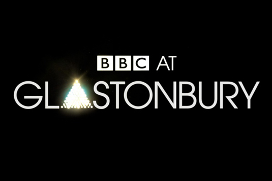
Our brief from the BBC for its ‘BBC at Glastonbury’ ident reflected this. We went back to that initial question – when you think of Glastonbury, what’s the image that springs to mind? The logo represents the iconic Pyramid Stage – something everyone can recognise – but now it’s the glare of the setting sun, or the surge of lights during a headline set.

The most powerful visual is the one that evokes your own experiences. It’s the role of design to help enhance this, fulfilling the festival experience – before, during and after the event.
- Words: Becky Barker is design director at Studio Output, a creative agency serving clients in the UK and beyond.
This article originally appeared in Computer Arts magazine
Like this? Read these!
- The ultimate guide to logo design
- Beautiful band logo designs
- Amazing uses of colour in branding

The Creative Bloq team is made up of a group of art and design enthusiasts, and has changed and evolved since Creative Bloq began back in 2012. The current website team consists of eight full-time members of staff: Editor Georgia Coggan, Deputy Editor Rosie Hilder, Ecommerce Editor Beren Neale, Senior News Editor Daniel Piper, Editor, Digital Art and 3D Ian Dean, Tech Reviews Editor Erlingur Einarsson, Ecommerce Writer Beth Nicholls and Staff Writer Natalie Fear, as well as a roster of freelancers from around the world. The ImagineFX magazine team also pitch in, ensuring that content from leading digital art publication ImagineFX is represented on Creative Bloq.
