Evocative milkshake branding takes a step back in time
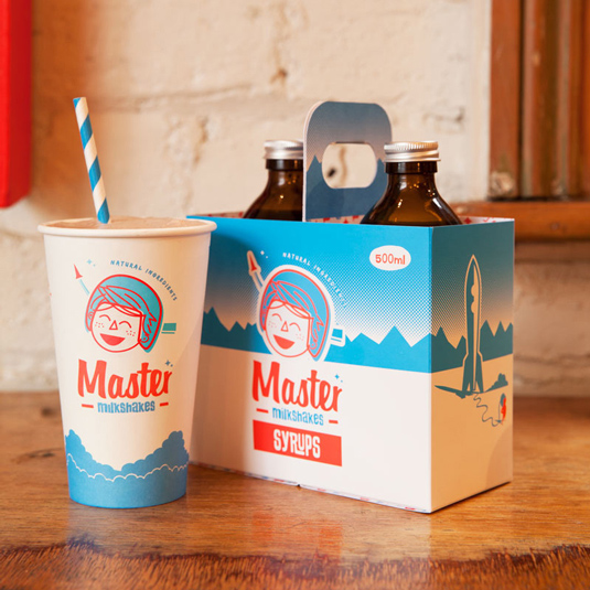
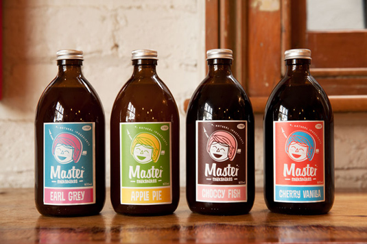
New Zealand designers transport Master Milkshakes back to the 1950s with this new brand identity and packaging design.
Sign up to Creative Bloq's daily newsletter, which brings you the latest news and inspiration from the worlds of art, design and technology.
You are now subscribed
Your newsletter sign-up was successful
Want to add more newsletters?
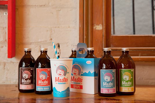
Auckland-based graphic design studio Fuman was recently commissioned to create a brand identity for Master Milkshakes. The brief required the inclusion of a hand-drawn character, which should have a "1950s retro vibe but not too 'hipster' - something that would have a timeless feel and stand out from the crowd".
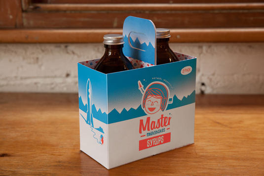
Reminiscent of the designs found in original 1950s soda shops, everything from the colour palette to the character illustration and stripy, blue-and-white straws works for us in this charming, fun new identity.
The only thing we have to admit to being slightly bemused by is the choice of packaging for the bottle, which looks somewhat out of place. As much as we love the overall, retro-style design, the thick, brown plastic container makes it hard not to be think of the medicine bottle that contained banana-flavoured Amoxicillin syrup we took as kids. What do you think?
Article continues below 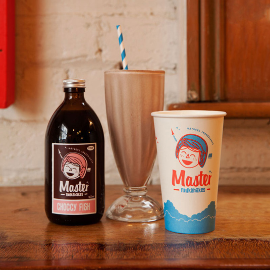
Have you seen any inspirational branding recently? Let us know in the comments.
Sign up to Creative Bloq's daily newsletter, which brings you the latest news and inspiration from the worlds of art, design and technology.

Kerrie Hughes is a frequent contributor to Creative Bloq, and was once its editor. One of the original CB crew, Kerrie joined the team back in 2013 after moving from her role as staff writer on 3D World. Since then she's written regularly for other creative publications such as ImagineFX, Computer Arts and Digital Camera World. After a stint working for the police, Kerrie is back reviewing creative tech for creative professionals.
