5 enticing examples of food branding
Your tummy will be rumbling after looking at these tasty examples of inspiring food branding.
Food branding needs to look enticing to any new customer - not only to get them to pick it up off the shelf, but to also get their tummies rumbling! Here, we take a look at some of our recent favourites.
01. La Gordita
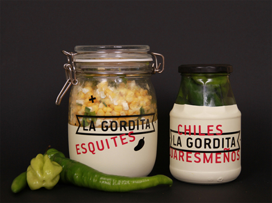
This minimalist branding was created by Quebec based designer and typographer Sarah Ouellet. We love the simple approach to this food branding, with the clear jars letting the food itself do the talking. The chosen font also works really, really well.
02. Blimpie
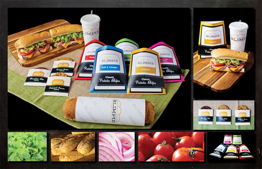
This food rebranding project was completed by Atlanta based designer Katie Bourgeois and sees a colourful yet simply striking approach. The potato chips are given a beautifully coloured trend, whilst the sandwiches sitck to minimal typography.
Article continues below03. Hey Pesto!
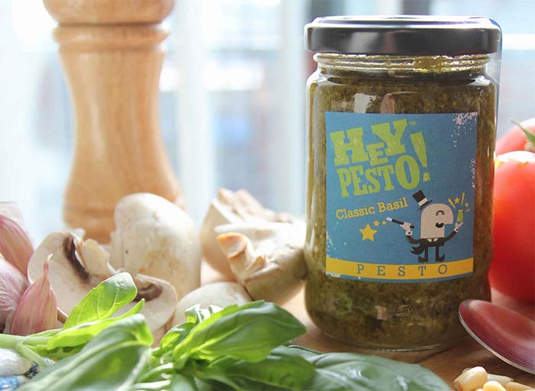
This cute food branding was created by UK based designer Scott Duffey. The illustrator has worked on a number of campaigns and brands but this food branding is the perfect mix of gorgeous typography and cute character design. The pun is pretty great too!
04. Dash
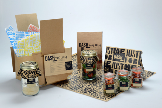
This stripped back food branding was created by Michelle McKeon. "My primary focus is making convenience food and its packaging frustration free, in terms of both physical and emotional aspects," McKeon explains. "I responded by designing an outline for a conceptual food brand which unites ideals of sustainability and the demands of convenience."
05. Reve
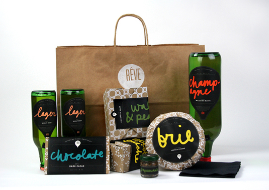
Reve was a food brand designed by Laura Berglund for an upscale hot air balloon company. "The champagne bottle was designed upside down to reference the shape of the hot air balloon," she explains. "Hand-generated typography was generated to keep in line with the friendly attitude, using only pops of bright color, yet black and kraft paper brown became the dominant colors, to keep it refined."
Exclusive offer: 20 per cent off tickets for new branding conference
Impact is an event you can't afford to miss - and we're offering Creative Bloq readers a massive 20 per cent off the ticket price. Simply:
Sign up to Creative Bloq's daily newsletter, which brings you the latest news and inspiration from the worlds of art, design and technology.
- Visit the website
- Enter your registration details
- Add this Promotional Code when prompted: FRIENDS20
Buy your ticket today!

The Creative Bloq team is made up of a group of art and design enthusiasts, and has changed and evolved since Creative Bloq began back in 2012. The current website team consists of eight full-time members of staff: Editor Georgia Coggan, Deputy Editor Rosie Hilder, Ecommerce Editor Beren Neale, Senior News Editor Daniel Piper, Editor, Digital Art and 3D Ian Dean, Tech Reviews Editor Erlingur Einarsson, Ecommerce Writer Beth Nicholls and Staff Writer Natalie Fear, as well as a roster of freelancers from around the world. The ImagineFX magazine team also pitch in, ensuring that content from leading digital art publication ImagineFX is represented on Creative Bloq.
