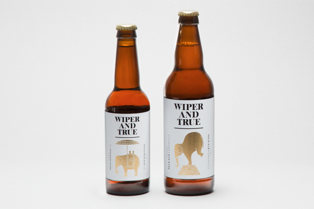
Image of the day: Wiper and True by StudioMakgill
Charlie De Grussa, from Brighton-based StudioMakgill, gives us some insight on the studio's branding work for craft beer company Wiper and True
Computer Arts: Tell us about the project ...
Charlie De Grussa: Wiper and True are a startup brewing company based in Bristol. We were asked to establish Wiper and True as a serious contender in the growing craft beer market. Beer has, for a while now, being going through something of a revival with new and more challenging beers being released. Although tastes are changing, the look and feel of beer generally is still stuck in a male dominated world of the traditional ale drinker.
It was important that we moved away from this overly male-orientated aesthetic that's common place in todays beer market and create something that would appeal to men and women alike. We wanted to encourage people who didn't really see themselves as beer drinkers to give it a try without alienating the diehard beer fans.
CA: How did you arrive at the finished design?
CDG: The idea comes from the heart of what beer is about, fermentation, a process that precedes human history. However, since ancient times, humans have been controlling the fermentation process, tweaking it and perfecting it to their own needs. The process of fermentation almost has a life of its own and we found the idea of mans discovery, experimentation and eventual mastery of it an interesting story.
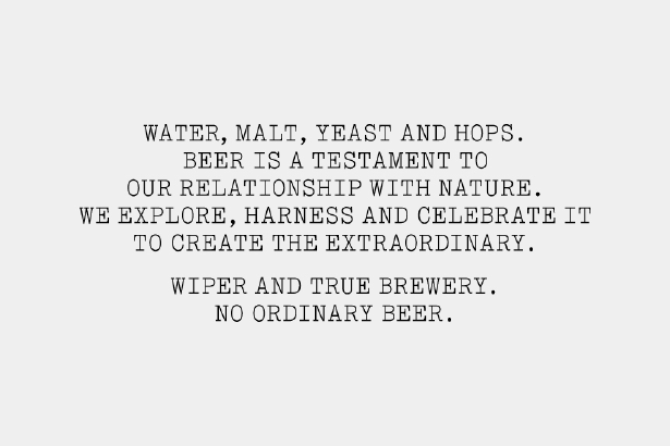
Man's ability to harness nature to create the extraordinary became the idea that is central to the brand and is summed up neatly in the following brand statement: Water, Malt, Yeast and Hops. Beer is a testament to our relationship with nature. We explore, harness and celebrate it to create the extraordinary. Wiper and True Brewery. No ordinary beer. Each range of beer that Wiper and True produce has its own illustration that plays on this relationship.
CA: Tell us more about the illustrations ...
CDG: As designers we usually work hard to make ideas as explicit as possible but with this we wanted a degree of ambiguity that would prick peoples curiosity. It took some time to find the balance between that ambiguity and making sure we left enough hints so that people could work it out for themselves.
As a result, the bottles feel quite unusual and as a range the idea is limitless, we are keen for Michael to start brewing more beer so that we can add to the family. For the identity we created a logo mark that locks up with each individual illustration creating a revolving identity with the beer that they produce at its heart.
CA: How did you put this project together – from conception to completion?
CDG: We usually start by researching around the subject and, in this case, we were very keen to get to the root of how beer has been and is perceived today. This had a lot of influence on the decisions that were made but while we believe in the value of research we also feel that designer's intuition plays an important role in creating engaging brands.
Sign up to Creative Bloq's daily newsletter, which brings you the latest news and inspiration from the worlds of art, design and technology.
We were very lucky, in this instance, in that we were working with a client that had a good understanding of the design process, but also trusted us enough and continues to do so to take a step back from the process. That's not to say it was easy, but having a client that trusts in your work makes the whole process a lot more rewarding.
CA: How long did the project take to complete and what was the most challenging aspect?
CDG: We tend to do most of our type and layout work in InDesign but the drawing of the illustrations was all done in Illustrator. How our time is broken up can vary greatly depending on the project. In this case, we spent several weeks working on three routes to present to our client. The route that we went with at this stage was probably the one that was the least resolved so where the second stage can sometimes be quite simple, in this case, another week was spent trying to tie together all the loose ends that didn't quite add up.
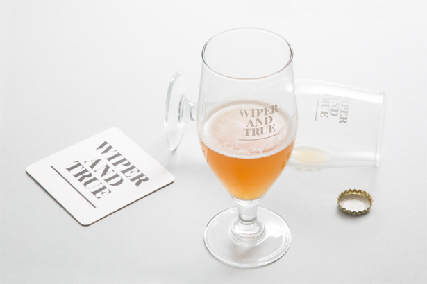
The most challenging thing about the project was probably the budget. Being a small startup company they didn't have a lot of money to spend so we had to be clever with how we spent it. Production-wise the labels were printed digitally, the foil effect achieved by printing cyan and magenta onto a silver foil paper. This was a new process for us but we were all very impressed with the results and it meant that the design was not compromised.
Find out more about Wiper and True at wiperandtrue.com, and check out more from StudioMakgill at studiomakgill.com
Subscribe to Computer Arts for your monthly fix of the world's best inspirational design work. Available on iPad, in print or on other digital devices.

The Creative Bloq team is made up of a group of art and design enthusiasts, and has changed and evolved since Creative Bloq began back in 2012. The current website team consists of eight full-time members of staff: Editor Georgia Coggan, Deputy Editor Rosie Hilder, Ecommerce Editor Beren Neale, Senior News Editor Daniel Piper, Editor, Digital Art and 3D Ian Dean, Tech Reviews Editor Erlingur Einarsson, Ecommerce Writer Beth Nicholls and Staff Writer Natalie Fear, as well as a roster of freelancers from around the world. The ImagineFX magazine team also pitch in, ensuring that content from leading digital art publication ImagineFX is represented on Creative Bloq.
