This Olympic bid identity is a colourful work of Nordic simplicity
Snøhetta's identity for Oslo's 2022 Winter Olympic bid mixes crisp typography with stunning aerial photography.
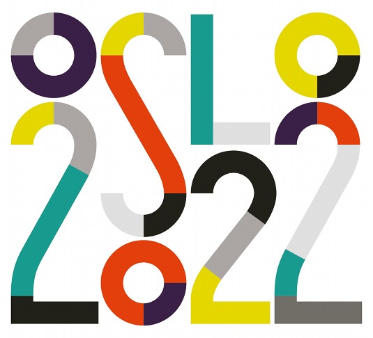
Tasked with creating a visual identity for Oslo's bid to host the 2022 Winter Olympic and Paralympic Games, architectural and design firm Snøhetta combined geometric shapes formed from the key 'O', 'S', '2' and '0' characters in a cheerful nod to the rings of the Olympic logo design.
"We tried to convey a visual language that could communicate the inherent simplicity and openness in Nordic culture," explains senior designer Henrik S. Haugan, adding that the firm combined two rather contradictory looks: "Bold and colourful meets the crisp dryness of a perfectly designed official document."
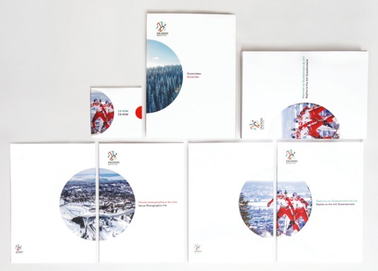
Stunning aerial photography plays a key role in Snøhetta's branding scheme for Oslo's Winter Olympics bid. "Oslo is one of the very few capitals in the world able to host most of the Winter Olympic events only minutes from the city centre," explains senior designer Henrik S. Haugan.
Article continues below 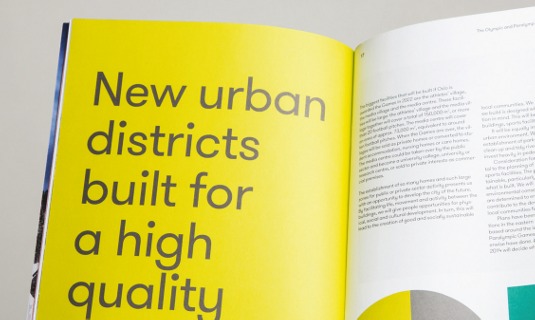
'Nordic Simplicity' was decided upon as the theme and Snøhetta used this concept as its guiding principle throughout the project.
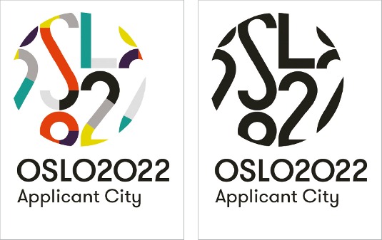
Snøhetta constructed a logo that played on the graphic shapes of the city's name, and the curve of the 'O' in particular, and combined it with colours inspired by the Olympic rings.
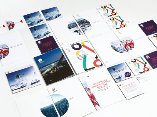
Motifs such as the circle appear throughout the wide range of print and digital collateral required, helping to tie the scheme together.
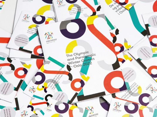
"We see design from the '30s and '40s as very typical for Oslo, thus we wanted the identity to have some of the same flavour," says Haugan.
Sign up to Creative Bloq's daily newsletter, which brings you the latest news and inspiration from the worlds of art, design and technology.
Given the sizeable audience for the work, it was important that the identity could appeal to groups as disparate as the International Olympic Committee and general sports-lovers.
This article originally appeared in Computer Arts issue 227.

The Creative Bloq team is made up of a group of art and design enthusiasts, and has changed and evolved since Creative Bloq began back in 2012. The current website team consists of eight full-time members of staff: Editor Georgia Coggan, Deputy Editor Rosie Hilder, Ecommerce Editor Beren Neale, Senior News Editor Daniel Piper, Editor, Digital Art and 3D Ian Dean, Tech Reviews Editor Erlingur Einarsson, Ecommerce Writer Beth Nicholls and Staff Writer Natalie Fear, as well as a roster of freelancers from around the world. The ImagineFX magazine team also pitch in, ensuring that content from leading digital art publication ImagineFX is represented on Creative Bloq.
