World famous race unveils new negative space logo
The Le Mans 24-hour motor race, one of the oldest in the world, has revealed an all-new identity.
Sign up to Creative Bloq's daily newsletter, which brings you the latest news and inspiration from the worlds of art, design and technology.
You are now subscribed
Your newsletter sign-up was successful
Want to add more newsletters?
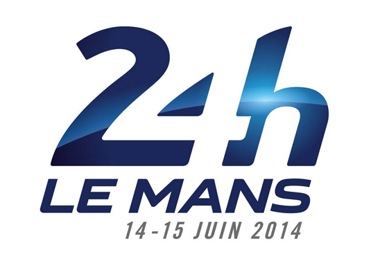
The legendary Le Mans 24-hour endurance race has received its first new logo for 36 years. The prominent feature of the new design is the use of negative space, which is becoming an interesting trend in brand identity.

The Automobile Club de l'Ouest, which oversees the event, chose this year to make the change as the 82nd running of the race to be held on 14-15 June is introducing a theme of innovation.
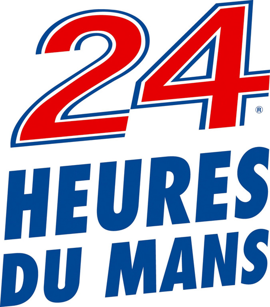
The previous logo dates back to 1978 and the 2014 race rebrand coincides with this year's massive overhaul of the race regulations as motorsport as a whole attempts to become more relevant to the socially and environmentally conscious modern era.
Article continues below 
The 24 Heures du Mans' new visual identity was conjoured up by sport-oriented design agency Leroy Tremblot. The official Le Mans website states: "An event like the Le Mans 24 Hours is based around a central dimension - its legend. And this legend has been carefully forged since 1923 thanks to four sacrosanct values: innovation, popularity, performance and variety. These four values can be found in the new logo, which also transforms the identity of the event to a brand concept."
Liked this? Read these!
- The 12 rules of logo design
- The psychology of logo shapes: a designer's guide
- Where to find logo design inspiration
What do you think of the new Le Mans logo? Tell us in the comments...
Sign up to Creative Bloq's daily newsletter, which brings you the latest news and inspiration from the worlds of art, design and technology.

The Creative Bloq team is made up of a group of art and design enthusiasts, and has changed and evolved since Creative Bloq began back in 2012. The current website team consists of eight full-time members of staff: Editor Georgia Coggan, Deputy Editor Rosie Hilder, Ecommerce Editor Beren Neale, Senior News Editor Daniel Piper, Editor, Digital Art and 3D Ian Dean, Tech Reviews Editor Erlingur Einarsson, Ecommerce Writer Beth Nicholls and Staff Writer Natalie Fear, as well as a roster of freelancers from around the world. The ImagineFX magazine team also pitch in, ensuring that content from leading digital art publication ImagineFX is represented on Creative Bloq.
