Rebranding the War of the Worlds for a new generation
How Fluid created a new logo, album art and branding for reborn '70s rock opera The War of the Worlds.
Sign up to Creative Bloq's daily newsletter, which brings you the latest news and inspiration from the worlds of art, design and technology.
You are now subscribed
Your newsletter sign-up was successful
Want to add more newsletters?
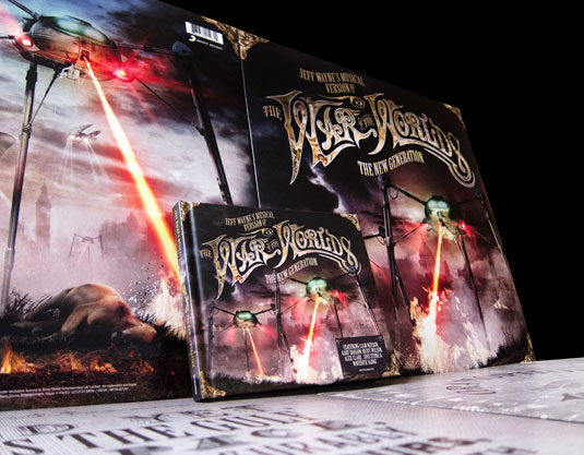
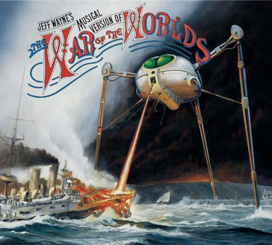
Jeff Wayne's 1978 concept album War of the Worlds is a big deal in the annals of rock history. Retelling the alien invasion story by HG Wells, it remains a bestseller to this day and has spawned multiple versions of the album, video games, DVDs, and live tours. So when Sony Music asked multimedia agency Fluid to create the branding for the latest stage tour and album release, War of the Worlds: The New Generation they jumped at the chance.
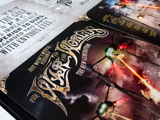
Fluid's work began with creating an updated version of the iconic War of the Worlds logo, before working on the album artwork alongside nine illustrations - which also later formed part of the Arena stage show visuals.
The album itself came in two formats: a hard backed 'Ecolbook' double CD and a double vinyl gatefold special edition, which also included a poster and oversized booklet. Fluid also designed the national press ads to accompany the album along with art directing full CGI animated online, television, and cinema trailers.
Article continues below 
Art director Steve Payne says of the task of reinterpreting such iconic imagery: "Initially, we felt quite daunted to be honest. I grew up being very aware of the artwork and wanted to make sure I gave such iconic imagery the respect it deserved."
Fluid decided early on that a hyper-real, not quite photo realistic, movie poster feel was the way to go. The images were created using Adobe Photoshop CS6 as the canvas to which everything was pulled together onto. Cinema 4D was used to model buildings, ships and the logo, with Maya used to create the Martian fighting machines, and Poser to create the figures, including cricketers, sailors and marching band.

Fluid worked closely with War of the Worlds creator Jeff Wayne and his team from the beginning. "It was very useful and important to know exactly where Jeff was coming from and to glean any additional information we could about each artwork to help with the reinterpretations," says Payne. "We also considered things like, if a Martian Fighting Machine fell, how would it actually fall? So real world physics also played a part."
Something which was important to the original artwork was showing a view of a very English way of life. "To bring something new to this we decided it might be cool to move that moment in time captured in the first painting onward to a few moments later," explains Payne. "The marching soldiers had continued on a little further and had started to turn a corner, the cricket match had carried on, even the clock hands have crept round."
Sign up to Creative Bloq's daily newsletter, which brings you the latest news and inspiration from the worlds of art, design and technology.

"Everything from the trains to the soldiers uniforms were researched so they would be authentic to the period and then modelled as before in 3D. For example, we had to reference exact details of Victorian london such as the precise distances between St Pauls and other landmarks from the point on Primrose Hill from which certain views were shown: the level of perfectionism involved was pretty incredible.
"Once everything was in place we then worked on creating the atmosphere and lighting which would befit an underground world and capture it's vastness and scale. This then took a couple of weeks to get to a finished stage and included giving an aged appearance with subtle sepia tones. Then a grading process similar to film was used to darken the shadows and bring out the highlights; this gave the stylised effect."
Watch this! The War Of The Worlds: The New Generation
Liked this? Read these!
- The 20 best album designs from music's greatest decade: the '70s!
- How to brand a logo: 15 design trends for 2012
- The art of print ads: 50 stunning examples - click here

The Creative Bloq team is made up of a group of art and design enthusiasts, and has changed and evolved since Creative Bloq began back in 2012. The current website team consists of eight full-time members of staff: Editor Georgia Coggan, Deputy Editor Rosie Hilder, Ecommerce Editor Beren Neale, Senior News Editor Daniel Piper, Editor, Digital Art and 3D Ian Dean, Tech Reviews Editor Erlingur Einarsson, Ecommerce Writer Beth Nicholls and Staff Writer Natalie Fear, as well as a roster of freelancers from around the world. The ImagineFX magazine team also pitch in, ensuring that content from leading digital art publication ImagineFX is represented on Creative Bloq.
