Stunning shop branding smells a bit fishy
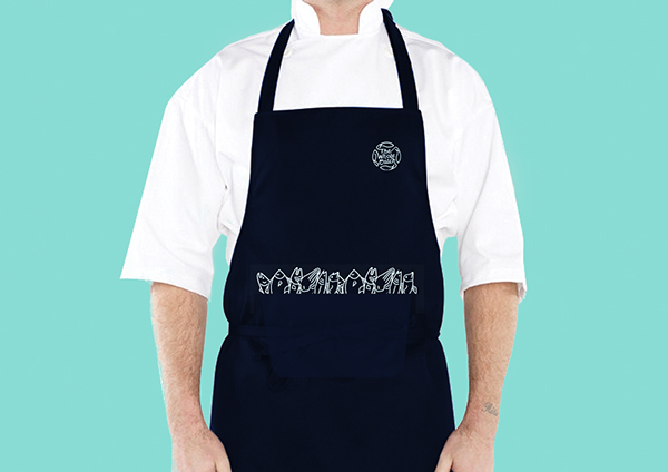
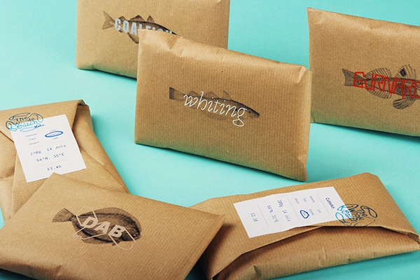
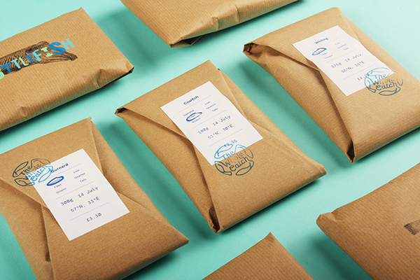
Sustainable seafood is given the packaging it deserves with this beautifully put-together branding.
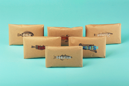
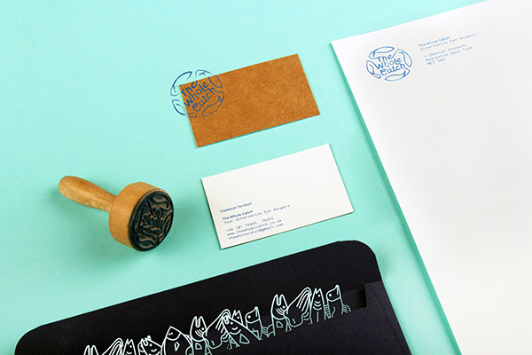
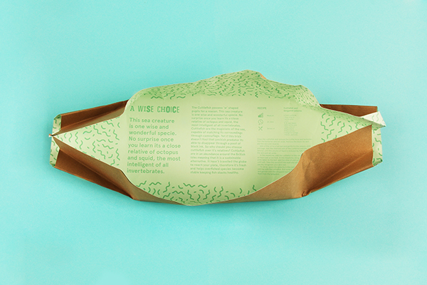
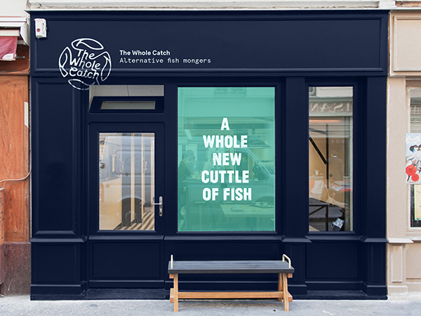
There's some outstanding uses of colour in branding - from Coca-Cola to Facebook - colour can often be the one thing the brand is remembered for. Here, designers Cameron Turnbull and Tom Walker take turquoise to the max, with this beautiful and inspiring branding for a local fish monger.
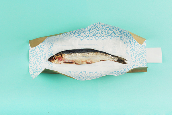
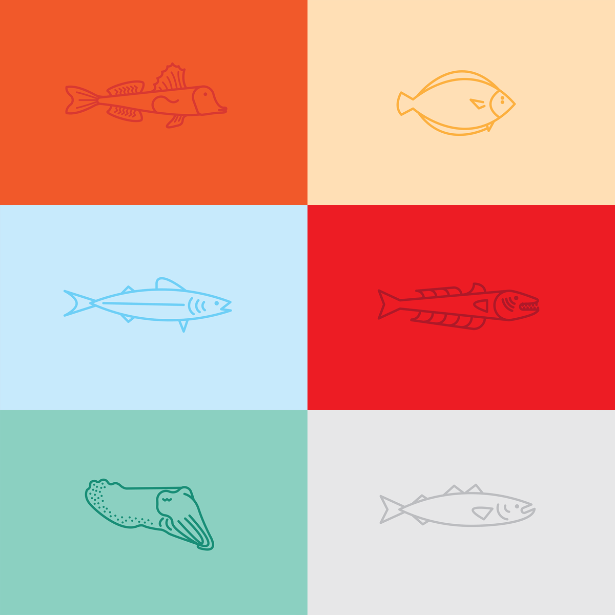
"The characteristics and individuality of each fish are revealed through the packaging to inform the consumer and ultimately gain popularity. A serious issue tackled in a light hearted way to target a broader spectrum," Walker and Turnbell explain.
Created for an alternative fish shop dedicated to selling lesser-known, sustainable seafood in order to help rebuild the already decimated species, it's an extremely important and worth-while project to further the message of sustainable eating.
Article continues below 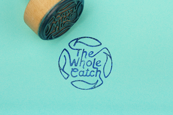

Have you seen any inspiring branding work? Let us know in the comments box below!
Sign up to Creative Bloq's daily newsletter, which brings you the latest news and inspiration from the worlds of art, design and technology.

Sammy Maine was a founding member of the Creative Bloq team way back in the early 2010s, working as a Commissioning Editor. Her interests cover graphic design in music and film, illustration and animation. Since departing, Sammy has written for The Guardian, VICE, The Independent & Metro, and currently co-edits the quarterly music journal Gold Flake Paint.
