Dutch media company's eye-catching branding
Combining typography and a sleek colour scheme, designer Leon Dijkstra proves less is more with this brilliant branding.
Sign up to Creative Bloq's daily newsletter, which brings you the latest news and inspiration from the worlds of art, design and technology.
You are now subscribed
Your newsletter sign-up was successful
Want to add more newsletters?
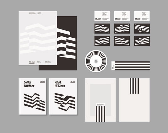
Tin Can is a new Dutch production company working across four main fields: TV, branding, online and events. And that’s all Amsterdam- based graphic designer Leon Dijkstra needed to know to give the brand its striking new identity.
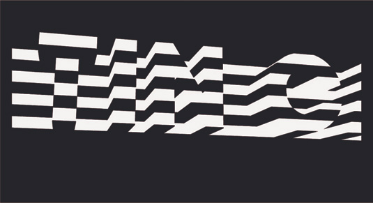
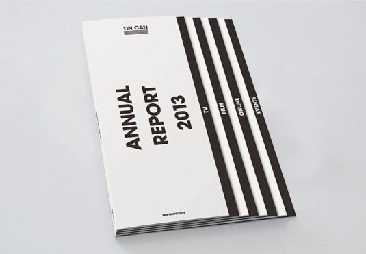
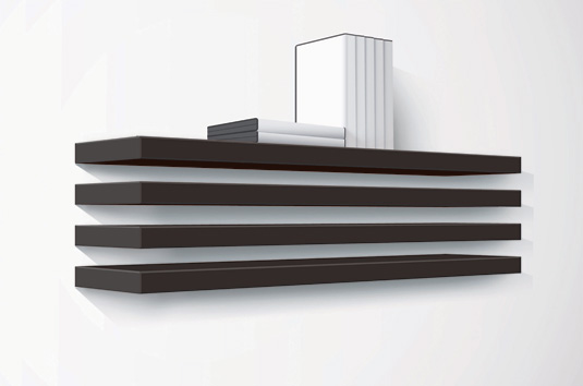
The project is brilliant in its simplicity, consisting of just two fundamental elements: typography and four lines, each representing one of Tin Can’s disciplines.
"These lines became the main format for the entire identity," Dijkstra explains. "They are adaptable to different types of content and applications - as typography, on objects, for interior design and so on - resulting in an identity that works in 2D, 3D and also as moving images."
Article continues belowA brand identity that combines typography and a crisp design concept? We couldn't love it more!


See more inspirational work over on Leon Dijkstra's website.
This showcase was originally published in Computer Arts issue 213.
Like this? Read these!
- Free Photoshop actions to create stunning effects
- Create a perfect mood board with these pro tips
- The best Photoshop plugins
Do you think this branding works well? Let us know in the comments box below!
Sign up to Creative Bloq's daily newsletter, which brings you the latest news and inspiration from the worlds of art, design and technology.

The Creative Bloq team is made up of a group of art and design enthusiasts, and has changed and evolved since Creative Bloq began back in 2012. The current website team consists of eight full-time members of staff: Editor Georgia Coggan, Deputy Editor Rosie Hilder, Ecommerce Editor Beren Neale, Senior News Editor Daniel Piper, Editor, Digital Art and 3D Ian Dean, Tech Reviews Editor Erlingur Einarsson, Ecommerce Writer Beth Nicholls and Staff Writer Natalie Fear, as well as a roster of freelancers from around the world. The ImagineFX magazine team also pitch in, ensuring that content from leading digital art publication ImagineFX is represented on Creative Bloq.
