10 ways to produce perfect prints
Your work might look great on screen, but how will it turn out on paper? Follow Andy Brown’s tips
Understand RGB vs CMYK

Knowing that you can see a larger range of colours through a monitor than can be printed using CMYK colour palettes will stop you being disappointed if the colours don’t come out how you were expecting, especially with bright greens and oranges. Setting up a CMYK colour profile in InDesign, Photoshop or Illustrator stops your computer from showing you colours that aren’t achievable in print.
Check how text looks
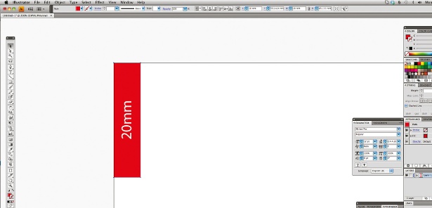
Text is something that’s very difficult to judge on the computer screen, because you can zoom in and out, so it’s tricky to get a sense of what the size is actually like to read and to look at. Even a rough black and white printout on a laser printer will help you at this point, well before you send it to the printers.
Use the right resolution
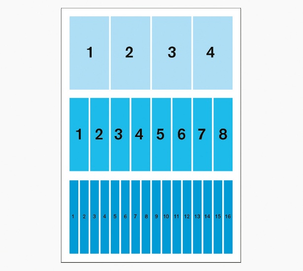
A 300dpi resolution is a good one to aim for usually, but if you want to blow the image up a little then you can often get away with 200dpi, especially with something to be viewed from a distance, such as a billboard. Your screen won’t give you an accurate representation, though, so print it off to check.
Set up crops and bleeds
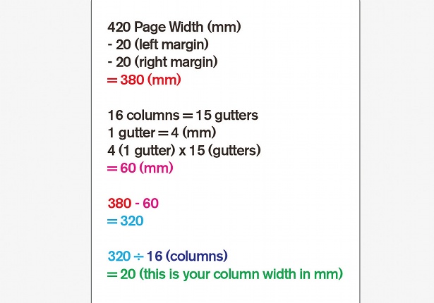
Crop marks tell the printer what size to trim the page to: they’re in the options when you’re exporting a document as a PDF, so aren’t difficult to set up. The bleed acts as a buffer around the artwork to help the printer, who will rarely get it spot-on, to avoid having non-printed edges. Three millimetres is standard for brochures and flyers, but it can be larger.
Ask the experts
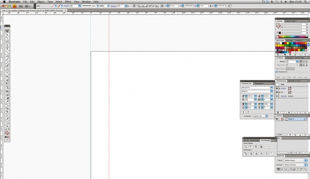
Cultivate a really good relationship with your printers. Call them up when you have a question: they’re the guys who know how to get the best results, after all. Get on the phone, build up a solid relationship and ask lots of questions. Some of those questions will inevitably seem like stupid ones, but that’s okay, at least you’ll learn how to solve that issue next time.
Pick your paper
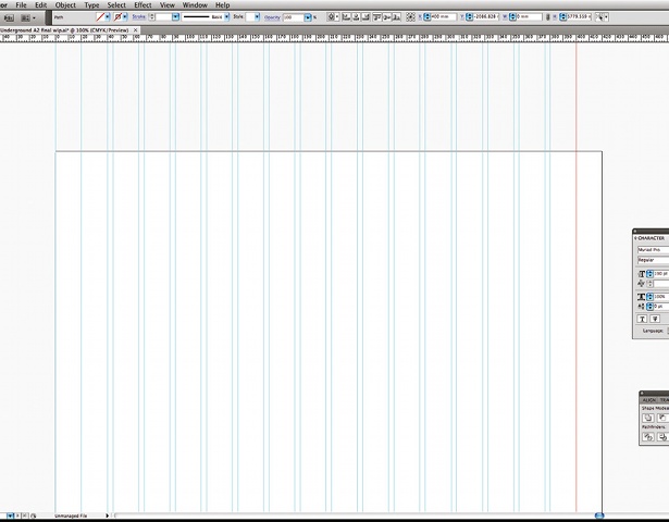
Be aware of how different types of paper produce different results when choosing how to print your work. Gloss and silk papers, which are coated, produce a stronger, sharper image with far brighter colours, whereas uncoated papers with a rougher, more natural feel will result in less punchy colours because the ink bleeds into the paper more.
Get file formats right
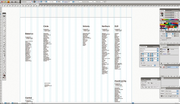
When you’re working with photo images, you’ll use bitmap files, such as TIFFs, JPEGs or PNGs. In The Print Handbook, we recommend saving your image files as PSDs or as TIFFs, since these formats keep the best quality. Try to keep vector images as vector files as much as you can: even saving them as 300dpi bitmaps causes a loss of quality.
Daily design news, reviews, how-tos and more, as picked by the editors.
Add bright spots
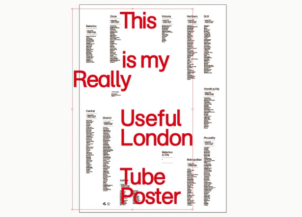
One way to compensate for the smaller range of colours available in CMYK printing is by adding in a spot colour, especially if you know that a colour is particularly important to the overall piece and want to give it extra impact to really make it shine. Set it up as a spot colour in your file at the start, so you’re not trying to transfer it from CMYK colours later.
Demand to check proofs
For certain complicated jobs, it’s well worth getting a printer to produce a proper proof for you to check before they print a whole batch of your work. It will cost you a little extra, but if you’re unsure of something then it will enable you to know that the file has gone across in the right way without any bugs.
See beyond the screen
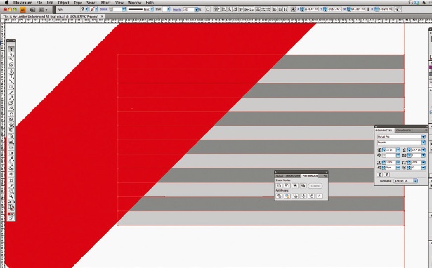
You can try to carry across a final image exactly how it appears on your screen, but don’t forget that printing also gives you completely different and exciting options that your computer screen can’t show you, such as foils, metallic inks or textures. These are always worth thinking about, since they can transform the feel of a design. Don’t be limited by your computer.
Icons: Dan Gray
Find 20 stunning examples of calendar design over at Creative Bloq.

Thank you for reading 5 articles this month* Join now for unlimited access
Enjoy your first month for just £1 / $1 / €1
*Read 5 free articles per month without a subscription

Join now for unlimited access
Try first month for just £1 / $1 / €1

The Creative Bloq team is made up of a group of art and design enthusiasts, and has changed and evolved since Creative Bloq began back in 2012. The current website team consists of eight full-time members of staff: Editor Georgia Coggan, Deputy Editor Rosie Hilder, Ecommerce Editor Beren Neale, Senior News Editor Daniel Piper, Editor, Digital Art and 3D Ian Dean, Tech Reviews Editor Erlingur Einarsson, Ecommerce Writer Beth Nicholls and Staff Writer Natalie Fear, as well as a roster of freelancers from around the world. The ImagineFX magazine team also pitch in, ensuring that content from leading digital art publication ImagineFX is represented on Creative Bloq.
