Add depth with organic textures
Amy Harris reveals how to create your own textures and apply them to your work for an on-trend, handcrafted feel.
Using textures can be a great way to add detail and interest to your illustration, giving it a unique, authentic twist.
In this project, I'll show you how texturing can really enhance your work - whatever your personal style. Using a mixture of traditional and digital techniques, I'll guide you through the process of applying textures to your illustrations to create tactile appeal.
This tutorial takes you back to basics by helping you make and find your own textures - so roll up your sleeves and think hunter-gatherer. I'll also explain some basic Photoshop techniques, experimenting with blending modes, colour and layering to get the most out of your textures. The final result will be a woodland scene, but of course you can apply the techniques and concepts in this tutorial to any piece of work you choose.
Article continues belowClick here to download the support files (11MB)
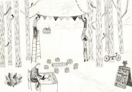
01 Start by doing a basic sketch of your illustration - or you can build on an existing piece of work. I'm going to be using a mixture of found and handmade textures, so think about the type of aesthetic you want and get cracking with some mark-making. Since I'm going to be creating a woodland illustration, I've sourced textures that reflect this type of organic, natural imagery.
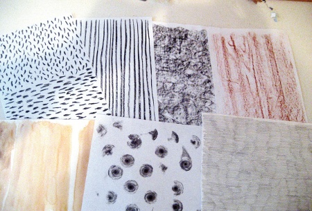
02 It's best to experiment with different materials to get a variety of effects. Rubbings, charcoal, pencils, crayons and watercolours are all great for textures and creating hand-drawn patterns. Try working with different papers for varied outcomes. To create a delicate, soft texture, blend different watercolours on different surfaces. If you're working completely by hand, choose appropriate colours for your illustration, but try to create contrast. Once you're happy with your creations, put your textures aside - we'll be coming back to these later.
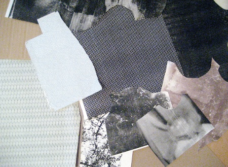
03 Now it's time to gather some 'found' textures. The inside of an envelope can be a treasure trove for new patterns and textures, so start looking around and collecting. I've used a selection of cardboards, textured papers and old photocopies (these can produce a nice, vintage print effect). You'll find some of these to work with on your cover disc, but you can add a real personal touch by sourcing your own.
Sign up to Creative Bloq's daily newsletter, which brings you the latest news and inspiration from the worlds of art, design and technology.
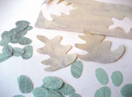
04 Now, gather up all your textures and experiment with producing imagery, cutting up different materials and playing with collage. Combine this with your hand-drawn elements, and build up your illustration. For the next stage, you'll be digitally experimenting with your textures in Photoshop and composing the illustration, so fire up your scanner and create a new Photoshop file. Scan in all your textures and any hand-drawn elements.
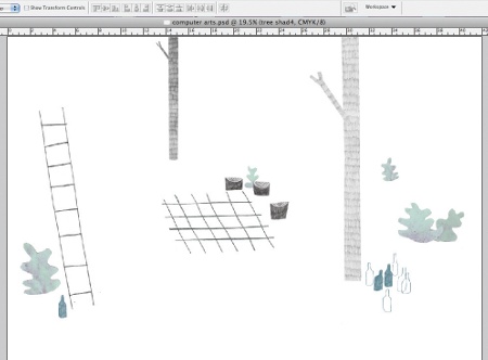
05 Look back at your initial sketch and place any hand-made textures or drawn elements into position in your main Photoshop file. Having some basic outlines of the elements you want to create can also be helpful when you're setting the scene. Now for using your textures: I'm going to start by creating some trees for my woodland scene.
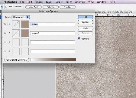
06 Open up a texture in Photoshop. I want to use a limited colour palette, so I'll be changing the colour of my textures before I apply them to my image. To do this, go to Image>Mode>Grayscale, and then Image>Mode>Duotone. Select your preferred colours in the Duotone Options box (a second colour adds depth), and hit OK. Depending on whether your final image is for print or screen, change the Image Mode to CMYK or RGB (Image>Mode), select all and paste the textures into your main Photoshop file. Repeat this with all the textures you wish to use in your image.
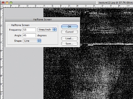
07 To achieve a grainy effect, open a new texture and go to Image>Mode>Grayscale, and then Image>Mode>Bitmap. Set Output to 300pixels/inch and set Use to Halftone Screen. Play with different settings in the Halftone Screen panel, then click OK. Now change the image back to Grayscale (Image>Mode> Grayscale>Size Ratio:1). You can use this image as it is, or you can apply the duotone technique from step 6.
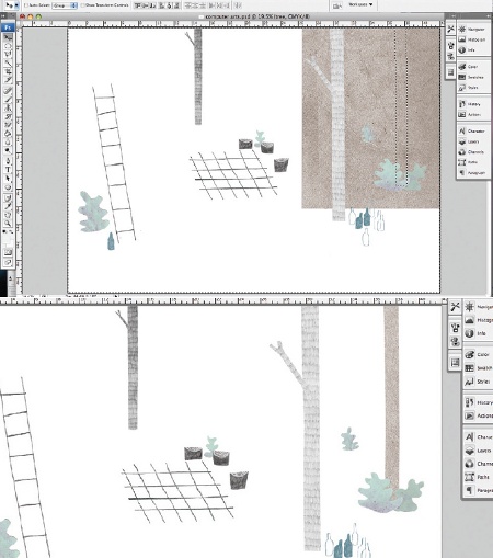
08 Start creating different elements by highlighting your hand-drawn shapes. Use the Magic Wand tool, or cut around them with the Polygonal Lasso tool. Make sure your chosen texture layer is placed underneath and selected, then click Select>Inverse and hit Delete. Here, I'm left with a cut-out textured tree. Play with the levels (Image>Adjustments>Levels), colour and lightness (Image>Adjustments>Hue/Saturation) until you're happy. Repeat this with different textures, and begin composing your illustration with your new features.
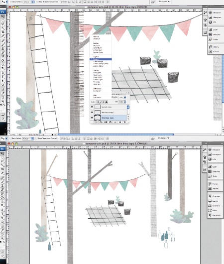
09 I've added elements created from a mixture of pencil, watercolour and cardboard textures. To add some extra detail, I've built up a tree texture with a hand-drawn pencil pattern. I placed this layer on top of a tree, and deleted the white using the Magic Eraser tool. I then changed the Blending Mode to Screen, to add a rough, lined effect. Blending modes are found at the top of the Layer dialogue box. You can experiment with blending modes to create your own, layered textures.
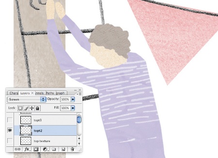
10 Continue to add to your composition. I created people by cutting and combining coloured textures. Trace them from your original sketches or cut them out by eye from your textures. Again, I've layered these with hand-drawn marks and played with the blending modes to vary the effect.
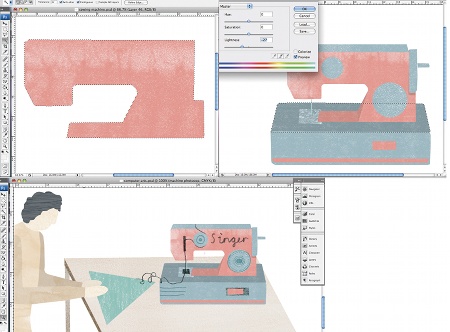
11 Next, I added a table, chair, blackboard and sewing machine, but with a 3D twist. To create a similar effect, select one of your textures and trace the shape of the object (step 8). As before, click Select>Inverse and hit Delete to leave a textured silhouette. Select some areas using the Polygonal Lasso tool, and make them lighter (Image>Adjustments>Hue/Saturation) for a sense of perspective. I've used two colours and added detail with hand-drawn elements (using blending modes for effect).
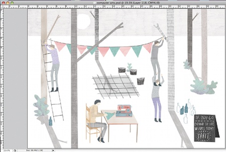
12 Finish off by playing around with your composition and adding some final touches. Any tweaks of colour and contrast can be done at this stage, too, so adjust these until you're happy. I'm putting in some shadows and a skyline to bring it all together and add some extra depth. And you're done!
Amy Harris
UK-based freelance illustrator Harris works across disciplines to bring her ideas to life in both two and three dimensions. www.amy-harris.co.uk

The Creative Bloq team is made up of a group of art and design enthusiasts, and has changed and evolved since Creative Bloq began back in 2012. The current website team consists of eight full-time members of staff: Editor Georgia Coggan, Deputy Editor Rosie Hilder, Ecommerce Editor Beren Neale, Senior News Editor Daniel Piper, Editor, Digital Art and 3D Ian Dean, Tech Reviews Editor Erlingur Einarsson, Ecommerce Writer Beth Nicholls and Staff Writer Natalie Fear, as well as a roster of freelancers from around the world. The ImagineFX magazine team also pitch in, ensuring that content from leading digital art publication ImagineFX is represented on Creative Bloq.
